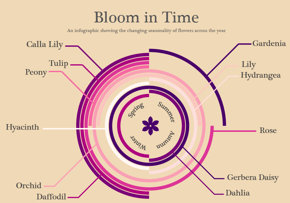
Good golly Miss Molly, this one was quite a doozy to make. Let me start off by saying it is no easy task to create round shapes in Tableau. But it is possible.
This viz was inspired by a couple things I came across last week. First, my colleague Ben Moss does a pretty neat practice where he tries to recreate infographics and visual data representations he comes across, whether or not they have been created in Tableau. It’s an awesome way to build on your Tableau skills and get some design ideas for a variety of types of data.
While browsing through my Pinterest feed, I came across this visualization that shows when fruits are in season across the year:

I’m a sucker for colour and minimalism, so this caught my eye and I thought “hm, I wonder if I could do this in Tableau.”
It’s particularly challenging to recreate infographics if they have not originally been created in Tableau. This is because you don’t really have anything to work off of; you are completely on your own in creating the calculations and building the dataset that you need to input.
Fortunately, for this visualization, I wasn’t totally on my own. Bora Beran has written a blog post outlining how he created a Radial Treemap in Tableau using table calculations and custom SQL inputs (link). Unfortunately, Bora doesn’t give too many details of how to reverse engineer his chart, and it is with good reason. The calculations involved in creating curved lines in Tableau are pretty complex, and very sensitive to the details that you put into your view. That is why, if you want to create your own radial treemap, Bora recommends simply formatting your data the same way as his original input and then replacing the data source in Tableau. However, this wasn’t going to work for my treemap because I was using seasonality rather than sales; I had to create my data from scratch.
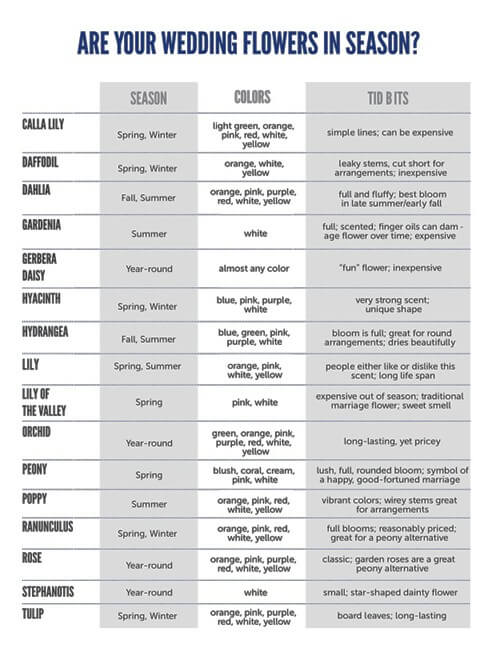
Although Bora emphasizes that folks shouldn’t try to recreate his chart with different data formats, I wanted to challenge myself and see if it could be done. On top of my healthy addiction to all things bright and colourful, I am also a fierce femme, and have been intensely craving spring flowers lately (come on April!). So I decided to create a seasonal chart based on information in the Hill Country Wedding Blog.

When you download Bora’s workbook, it is dang near impossible to figure out how he has constructed things. However, SAF Business Analytics has recorded a YouTube video showing you how to reconstruct Bora’s own treemap (link). There is no way I could have figured things out without this video, so shout out to SAF Business Analytics for saving me from busting an artery!
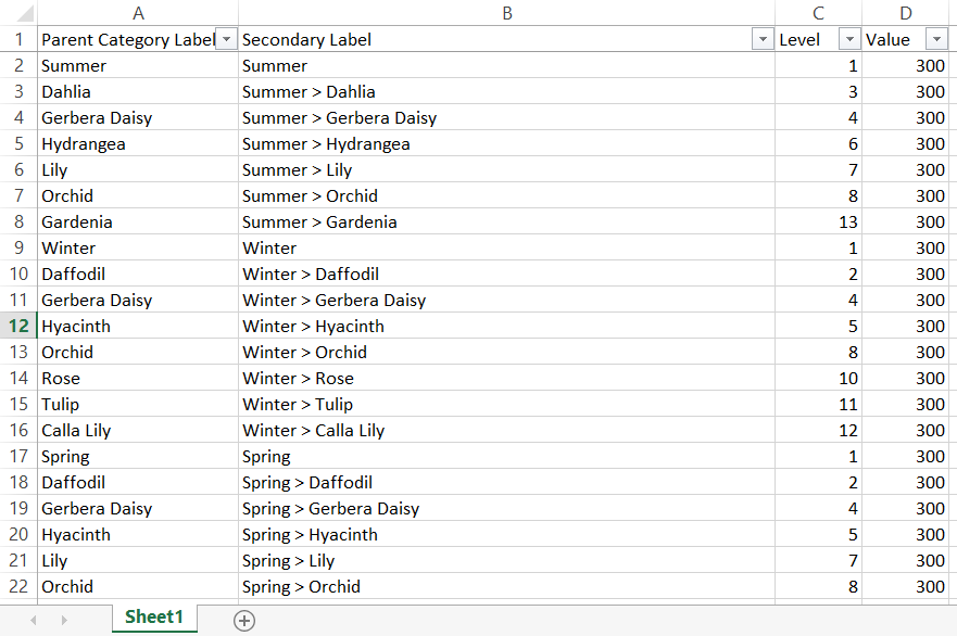
Essentially the first thing you need to do is copy Bora’s Custom SQL input that creates several path dots between 1 and 203. Then, you recreate Bora’s calculations, drag them into the view, and make sure that all your table calculations are performed on the correct level of detail. In my case, since I wasn’t really interested in drawing my arcs based on sales, the only thing I did differently was change “Sales” to a “Value” input that was the same across all categories and subcategories. In order to draw my flower arc lengths in their respective seasons, I added rows under each Parent Category of the season the flowers belonged to:

Data that I created and used to create seasonal arcs
So it is totally possible to reconstruct Bora’s radial treemap with a different kind of dataset, but I won’t lie, it’s a PAIN. However, if you’re willing to put some time into it, follow SAF Business Analytics video, you can create some pretty rad seasonality visualizations

