Ever needed to switch between two chart types on your dashboard - maybe you want to conserve a little room? Here's a way to do it!

Step 1: Build your charts in separate worksheets.
Step 2: Create your parameter.
(This will be used to select which chart you want to view)
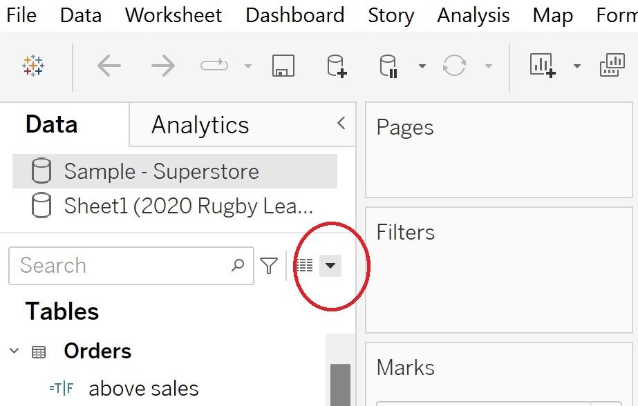
- Right-click the drop down arrow in the Data pane and select 'Create Parameter'.

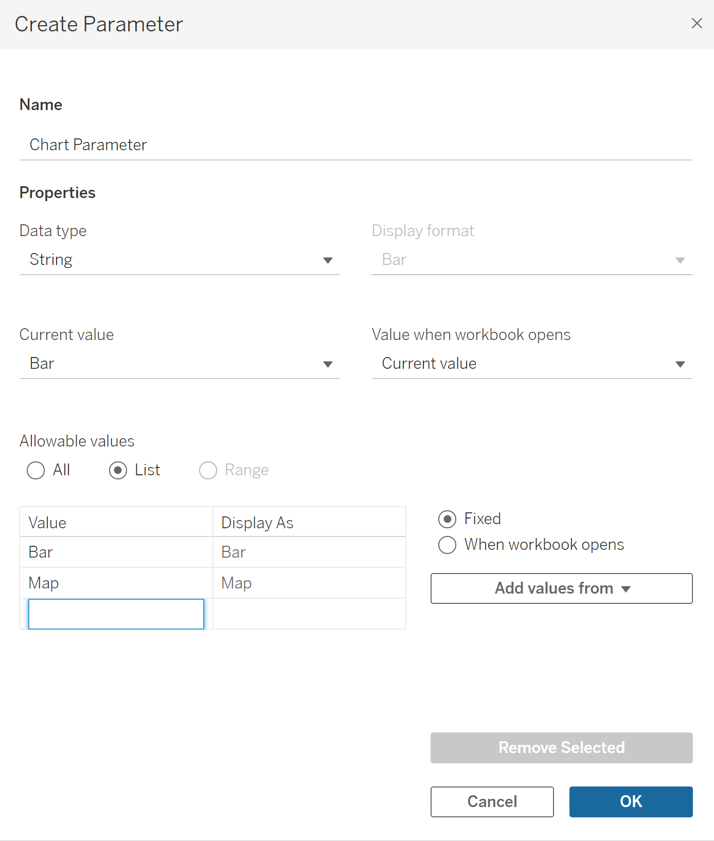
- Under 'Name', type the name of your parameter (maybe something like 'Chart Parameter'), under 'Properties' in 'Data type' choose 'String' and in 'Allowable values' select 'List' and list the names of the charts you want to switch between. You can also then go back into 'Current Value' and choose which chart you want to set as the default.

Step 3: Show parameters.
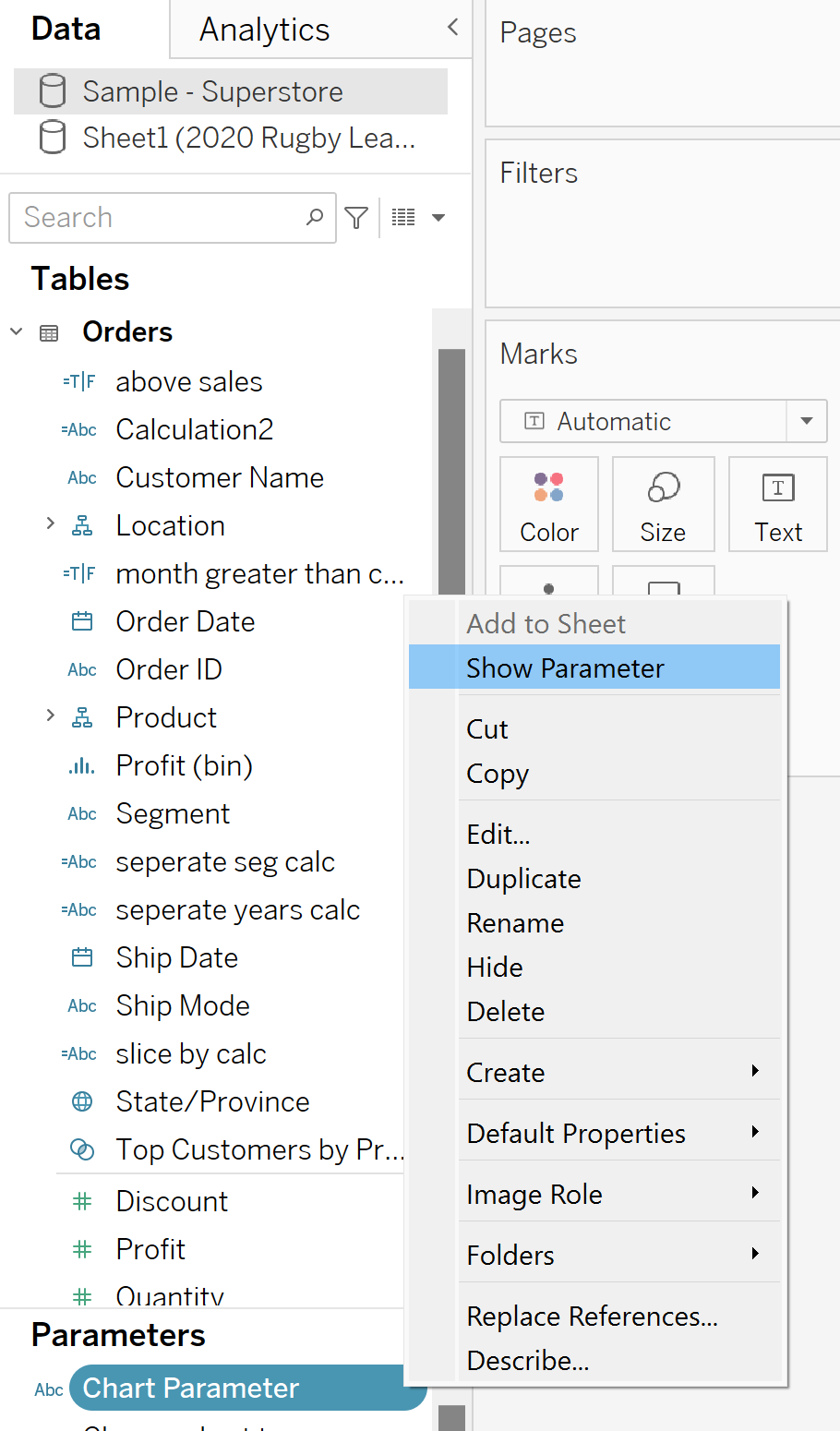
- In both chart worksheets, click the drop down next to your parameter and select 'Show Parameter'.

Step 4: Create a calculated field for your parameter.
The parameter you are creating is going to be used as a filter, to filter through each chart, however parameters cannot be used in the Filters pane. So to combat this...
- Create a calculated field from the same Data Pane drop down arrow, name it something relevant (maybe Chart Parameter Calculated Field) and simply enter your parameter name below.

Step 5: Filter the charts.
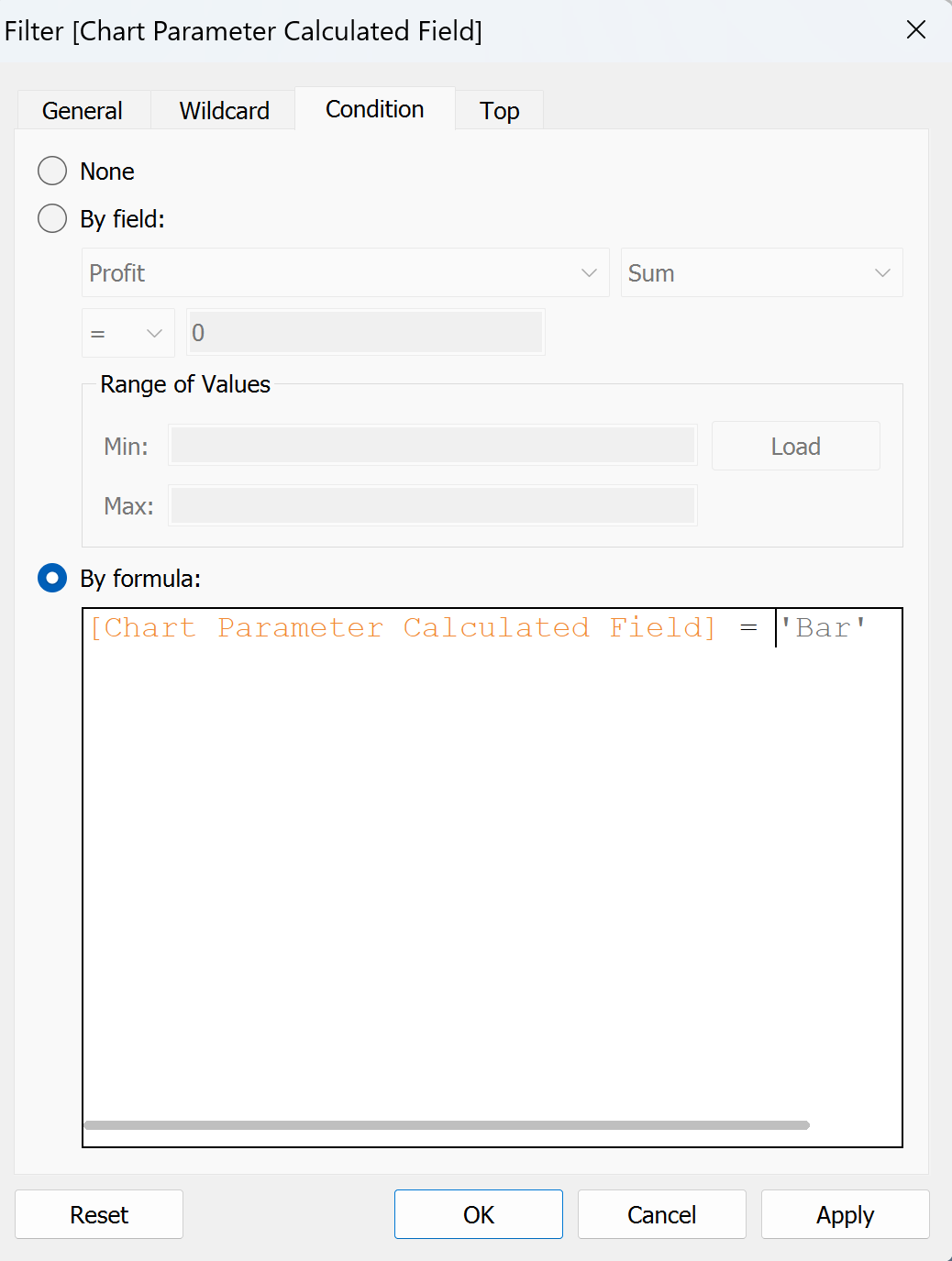
- Drag your new calculated field into the Filters pane of your first chart and click on the condition tab in the window that will appear. Inside here, select 'By Formula:' and write a calculation which states that the calculated field is equal to the name that you gave to the chart that you are currently on. So for example, if you are on your bar chart you would write...

Repeat this step on each chart, changing the name that the calculated field equals to the name of your current chart each time. (Ensure that the spelling of your chart name is exactly the same as the spelling in your parameter and that the name is wrapped in ' ' as above otherwise this won't work!)
Step 6: Create the dashboard.
- Insert a vertical (or horizontal) container onto the dashboard.
- Drag your first chart into the container ensuring that the border of the container is dark blue and the entire inside of the container is grey when you hover over it - this is very important to ensure that it is positioned correctly.
- Drag your other chart into the container, again, ensuring that the border of the container turns dark blue and the bottom of the container is grey when you hover over it while placing your charts - this is very important to ensure that they are positioned correctly.
- You should now only see the chart that is selected in your parameter in your container.
- Double check that your parameter is working by switching to your other parameter option and if your chart changes correctly you're good to go!
- Finally, hide both of the chart titles by right clicking on them and selecting hide.
And you're done! Best of luck on your parameter journey and if you have any questions feel free to reach out - nadia.holloway@theinformationlab.co.uk
