


Today was day 2 of dashboard week which focused on design (BIG FAN). Our brief required us to create a Marvel infographic (again, big fan).
This is the dataset we were given: https://data.world/fivethirtyeight/avengers?ref=thedataschool.co.uk
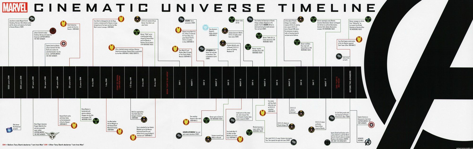
After a bit of research for inspiration I settled on creating something like this:
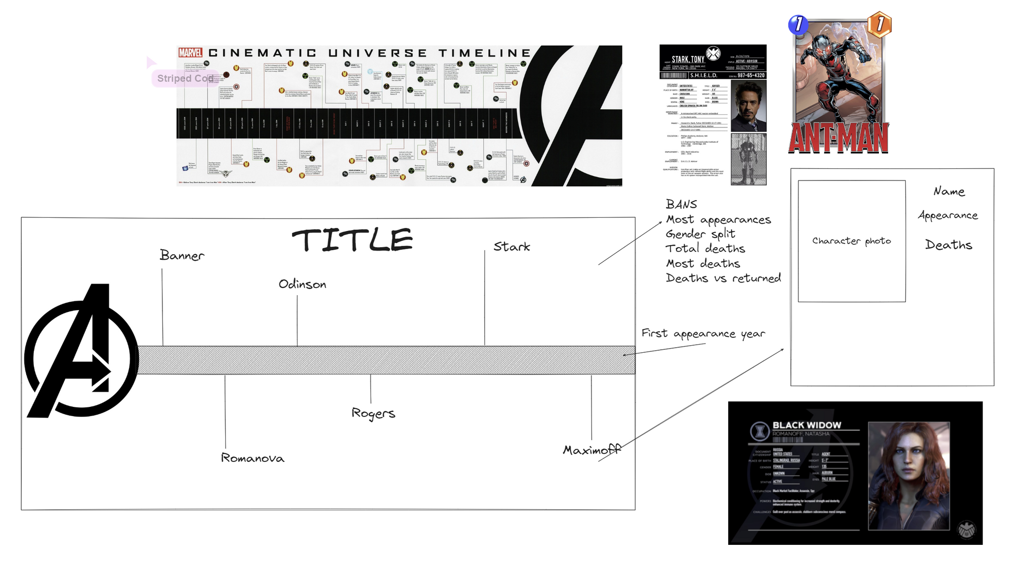
From this I decided to sketch a plan on excalidraw with my inspiration around it:
Creating the timeline:
I started by dragging Year onto my column shelf and the Count of Appearances onto my row shelf twice (I knew I wanted to created a sort of lollipop chart so needed two of the same pills on my rows, and then I went ahead and dual axised them and then synchronised the axis).
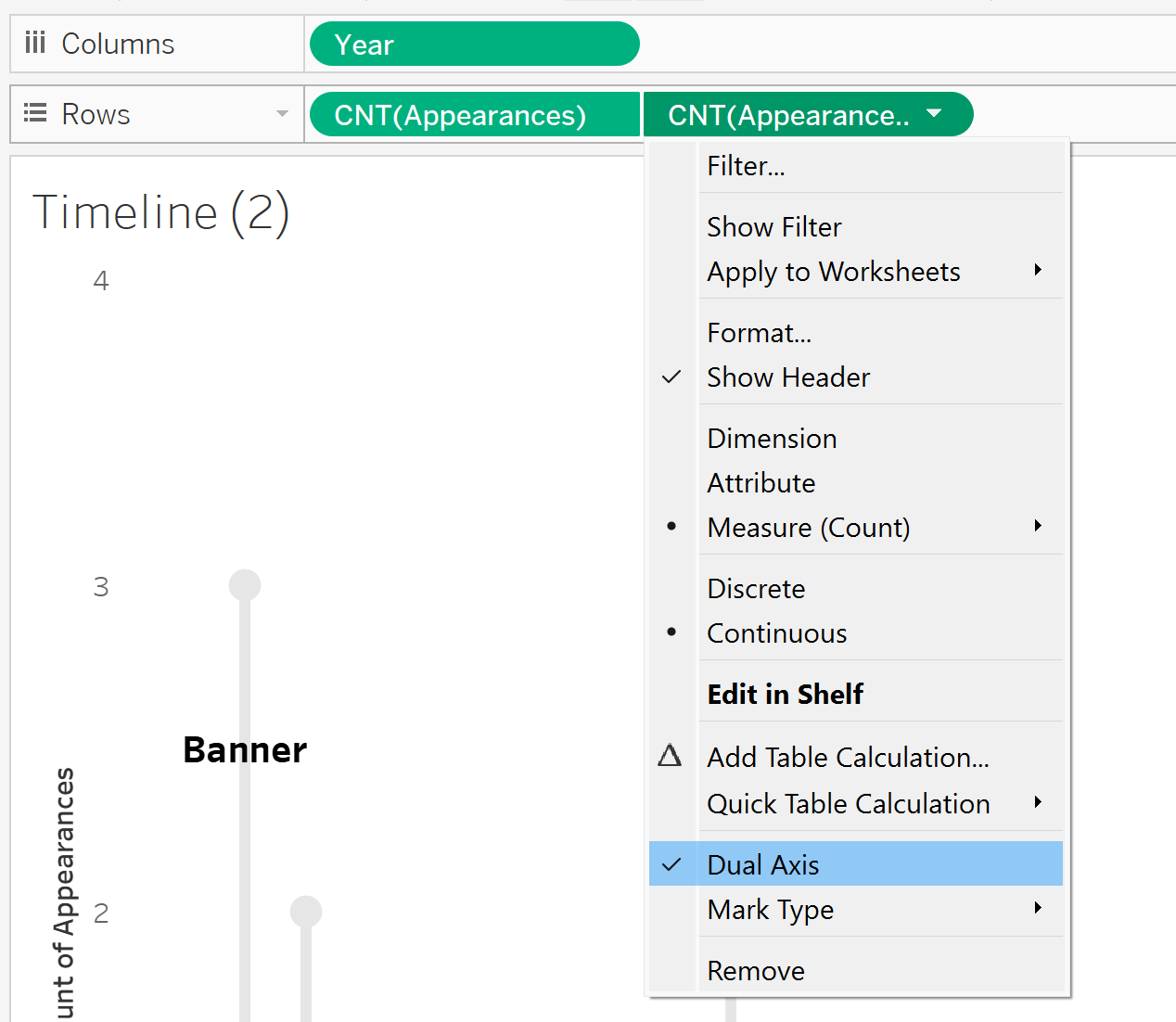
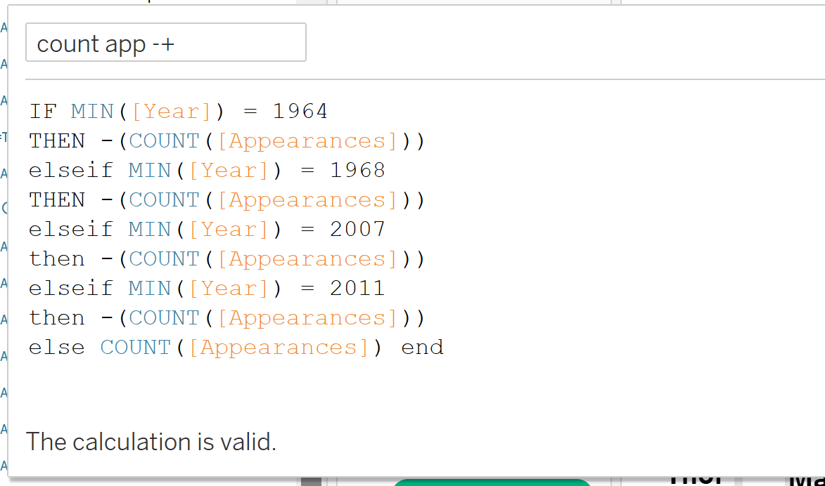
I knew I wanted an even distribution of lines going above and below the year timeline like the inspo pic I found so I created a calculation to convert some of the years into negative numbers:
I then replaced the two Count of Appearances pills on my row shelf with my new calculation.
Just cosmetic changes needed to be done after that! In my marks card I changed my first calculation to a bar and my second to be a circle and adjusted the sizes and colours. And finally I added the names of each character onto the lines by dragging names onto label in the marks card on my first calculation.
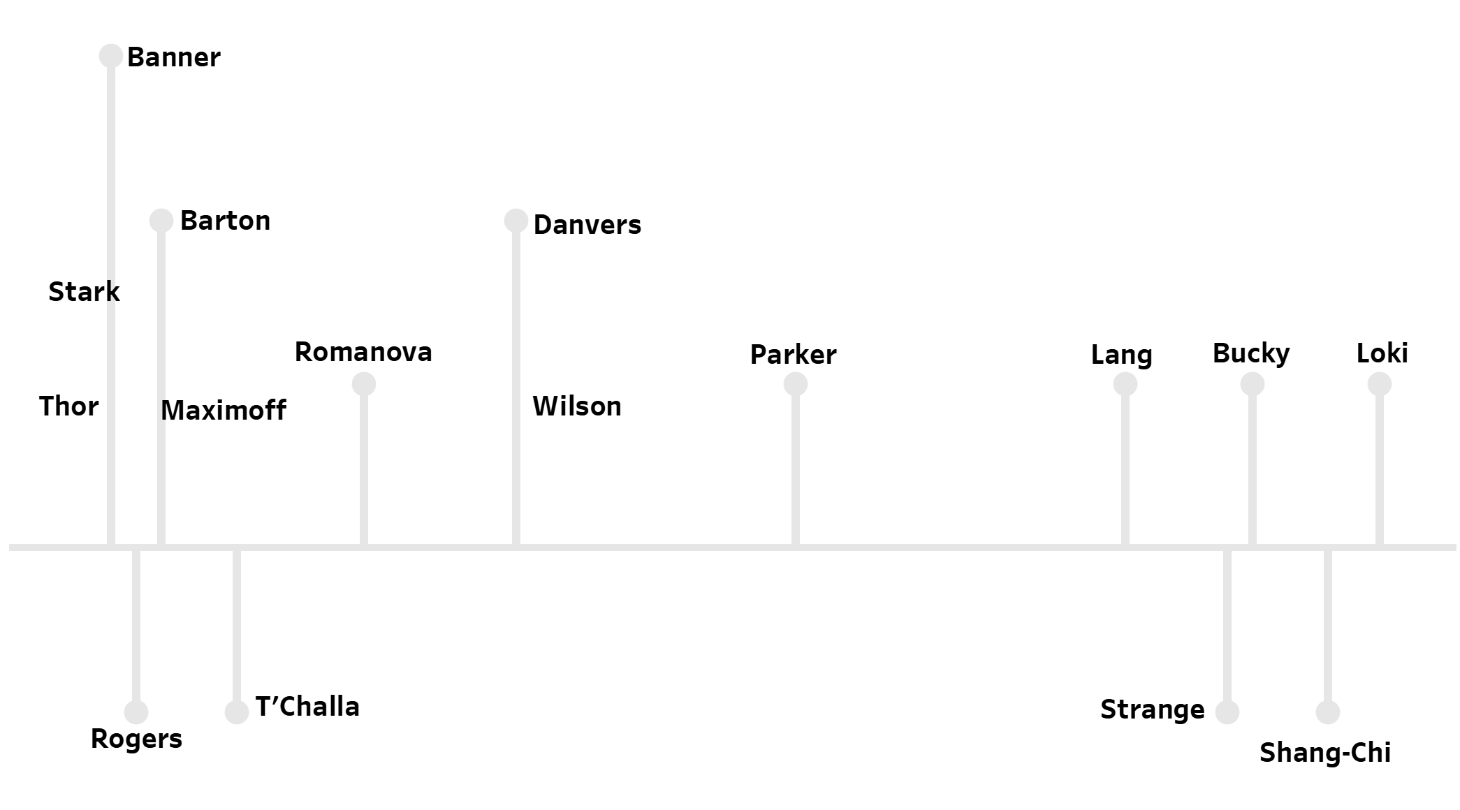
And there we have it!
Here's a link to the finished dashboard, do check it out and give it a like if you enjoyed it!
https://public.tableau.com/app/profile/nadholloway/viz/DashboardWeekDay2-MarvelInfographic/Dashboard12?publish=yes