


When changing categorical axis on power BI its easy to create a Tile with a changing axis. To do this make a Parameter with the fields you would like to chose between.
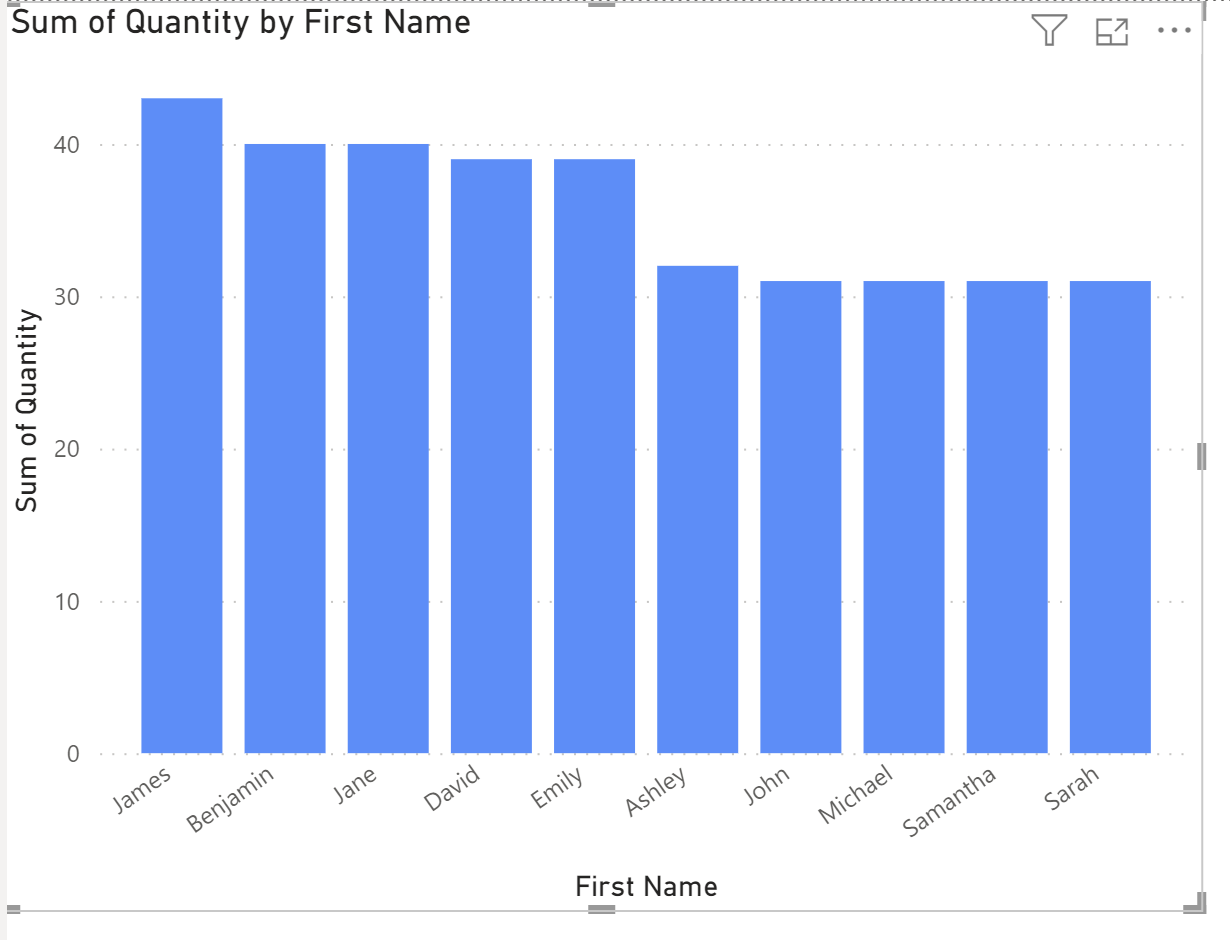
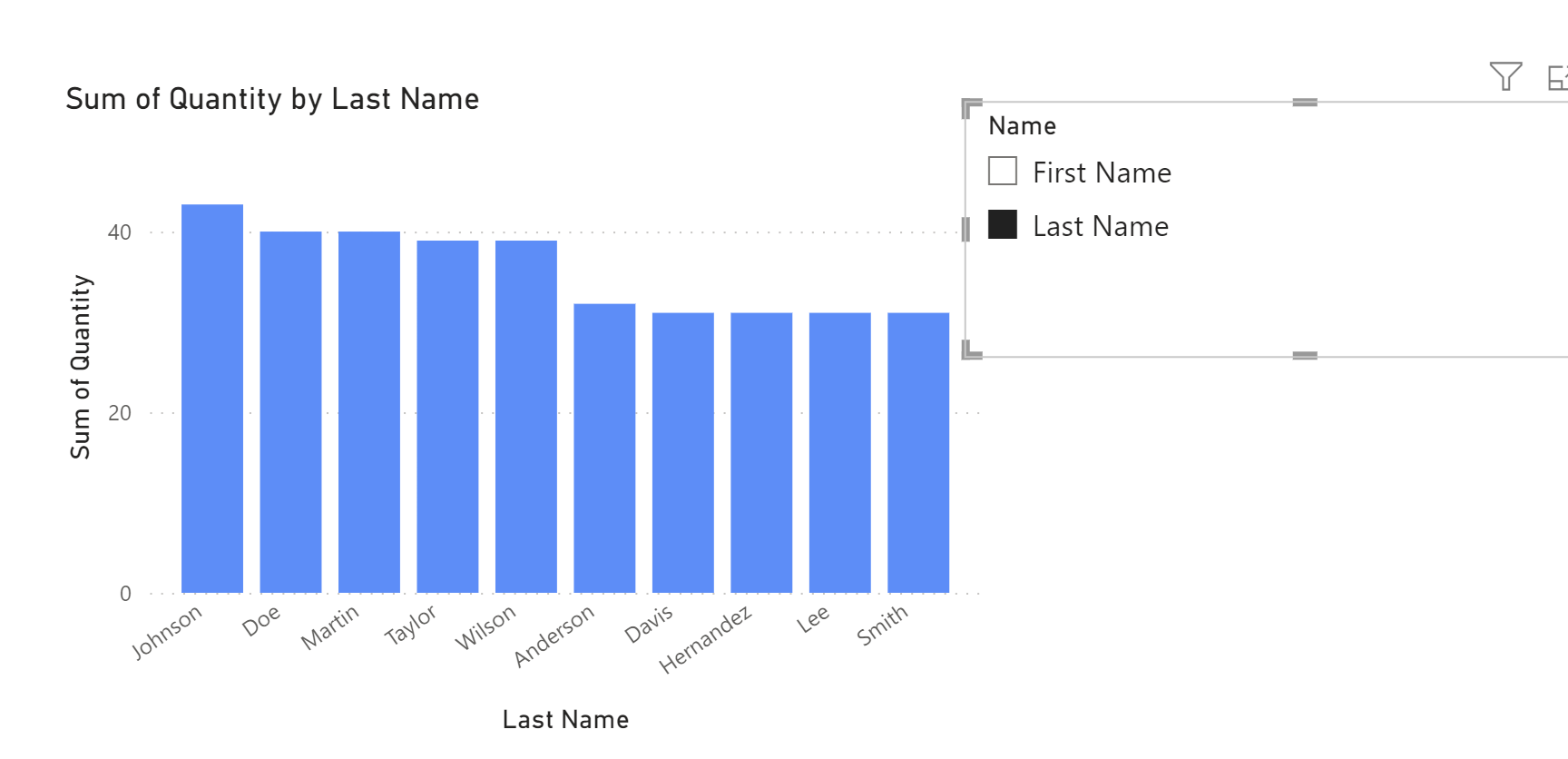
To do this first build the chart you want to change, I'm going to build a bar chart with first name vs Quantity of sales.
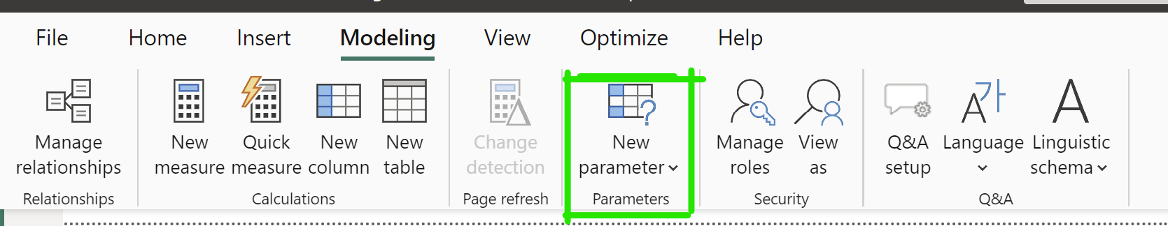
Now to change the categorical axis we need to make a parameter
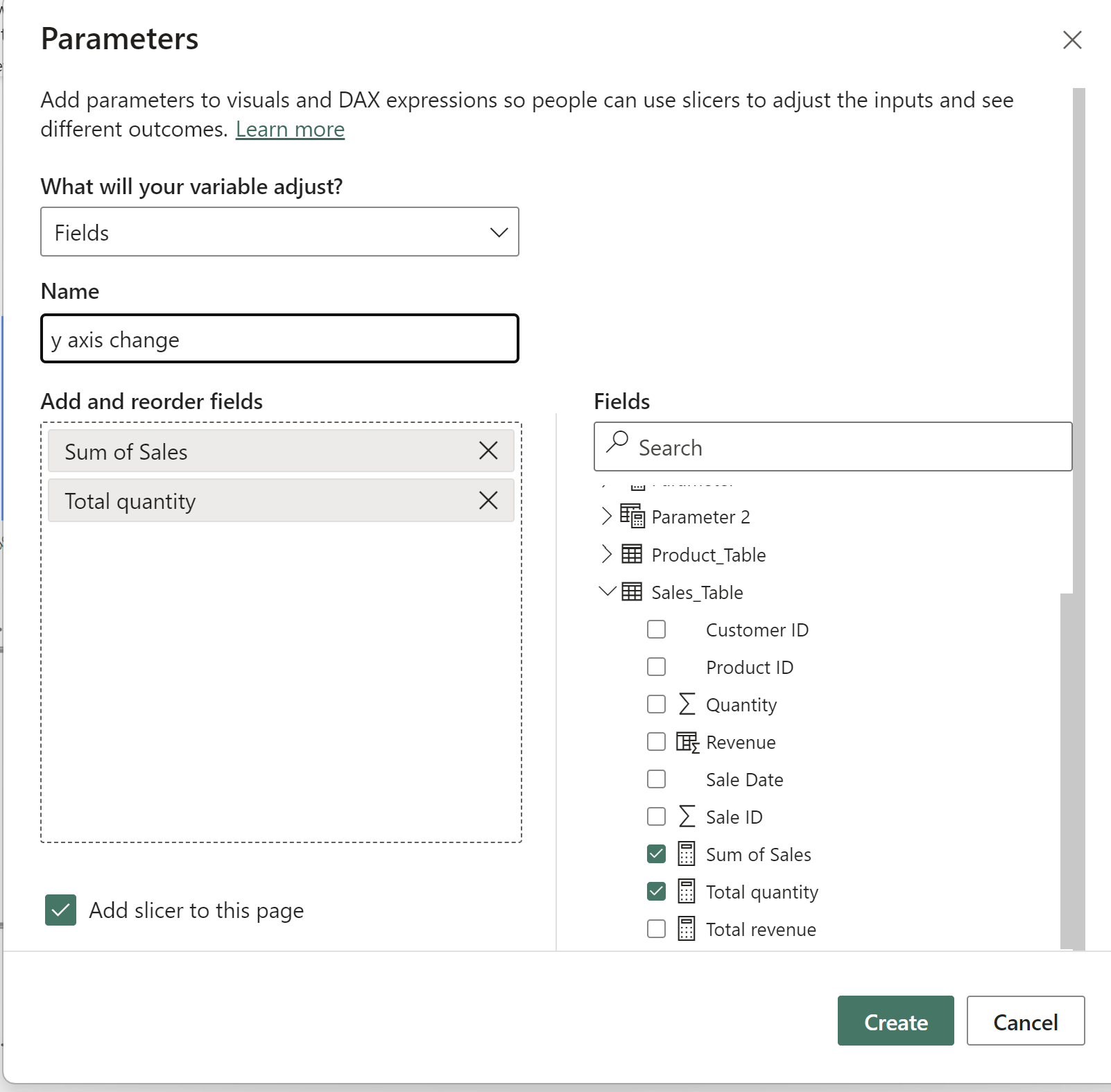
To do this under the modelling tab select new parameter
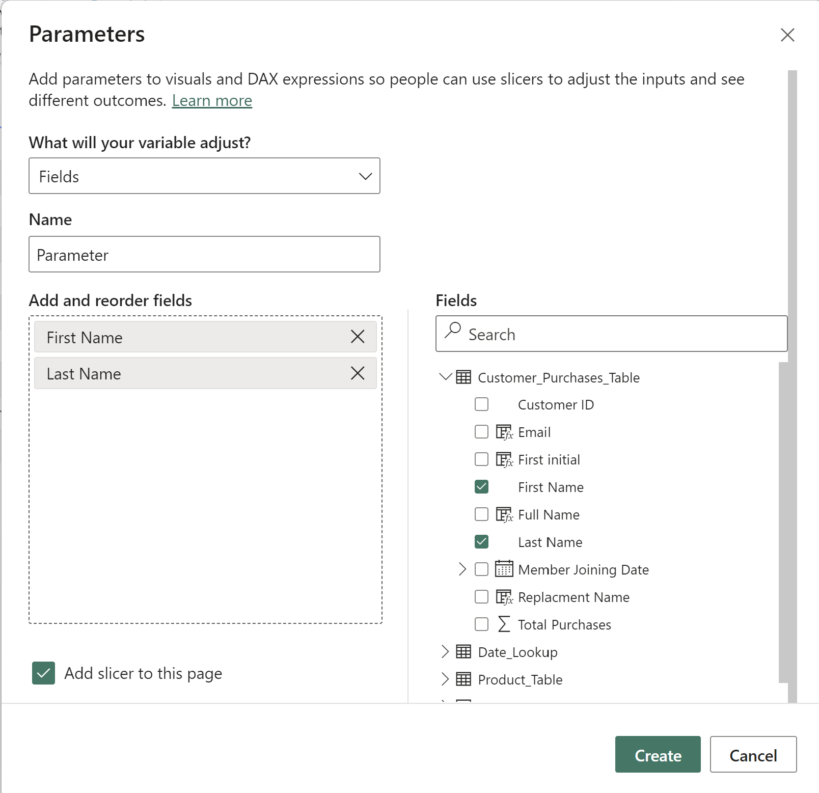
Under the parameter select fields and then drag the fields to the left hand pane, So in this case I will be swapping between first name and last name
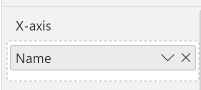
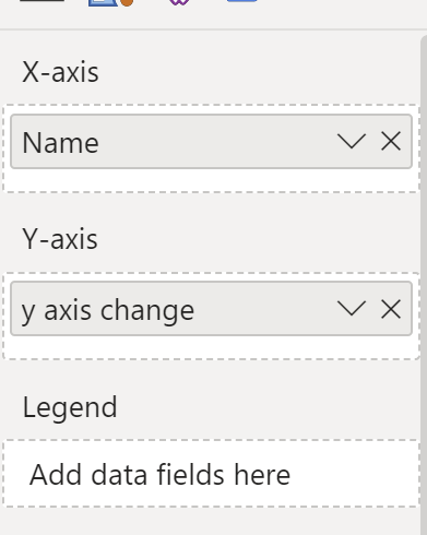
Now move the parameter to the x axis of the chart
and this will then allow the user to change the categorical axis
When creating the same field with measures it becomes a little more complex as they need to be turned into calculations first.
For quantity first make a calculation Called "Total quantity" where
Total Quantity = SUM([Quantity])
and do the same with sales Where Total Sales = SUM([Sales])
Now create a parameter and input both calculations into the parameter as shown below
then drag this on to the Y-Axis of your graph and you should now be able to change the y axis
Now the user can select the axis they want to see