Tooltips in visualizations serve as crucial navigational aids that enhance user comprehension and interactivity. They act as bridges, filling in the gaps between what is immediately perceivable and the underlying details of a dataset.
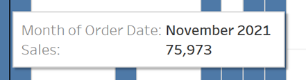
Tooltips provide contextual information when hovering over a certain element of a dashboard to provide more detail on the specific data underlaying the visualization without bombarding the user with too much at once. A good tooltip should enhance the user’s exploration of the dashboard and find the balance between clarity and depth.
A good shortcut for editing these tooltips on a sheet is if you press “ALT + W + O” Then you can edit all the tooltips at the same time.
Once you have pressed this you will be presented with the following pop-up
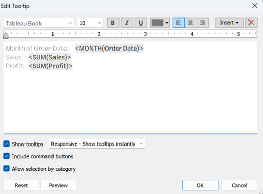
If you have multiple graphs on the same sheet this will allow you to edit all of the graphs at the same time.
In this example I have sales and profit on the same Axis so I am able to edit the tooltips for both simultaneously.
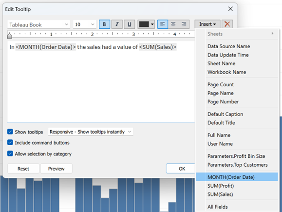
If you want to insert a value, for example in this case I would like the tool tip to reference a specific month! – Click the insert button on the right hand side and input the dimension or measure you would like to reference.
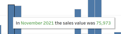
Format these however you like and now our tooltips however you like and how our tooltips have changed from the standard tooltips to ones that look like this