


When creating a dashboard, there are several fundamental principles in to follow to make the dashboard easy to understand and navigate.
Spacing:
We want to divide the contents of our dashboard evenly, leaving plenty of space for the user to be able to understand the different sections were covering. In Tableau, We can utilise blank containers to create fixed spaces between different sections. Keeping to the same sized blanks will ensure each object is distributed evenly.
Uniformity:
Having a uniformed display ensures better readability. You want to have all of your headers, text and even BANs in their own font, colour and size. Having said that, you may intentionally set a particular figure/text to a different format to make it stand out. Also, aligning everything in uniformity adds to the design.
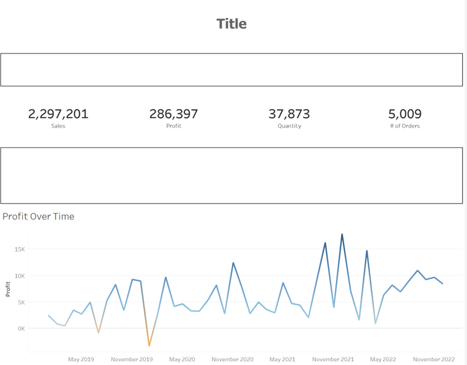
Story telling:
The choice of charts and user interactive features adds to the narrative effect of the Viz. Make sure these are utilised correctly. For example, when comparing figures, a Bar chart will better display the highest vs the lowest figures when compared to a Pie chart. However, a Pie chart may be used to display the dominance of one group over may other (kind of like a packman shape).
Colour choice:
As well as storytelling, the choice of colour also adds a balanced view of your Viz. You should try to avoid sharp/bold colours and instead try light colours. Also, take advantage of the opacity function in the layout section of the dashboard. This is quite handy if your stuck with a colour you have to use without making the Viz straining to the eyes.