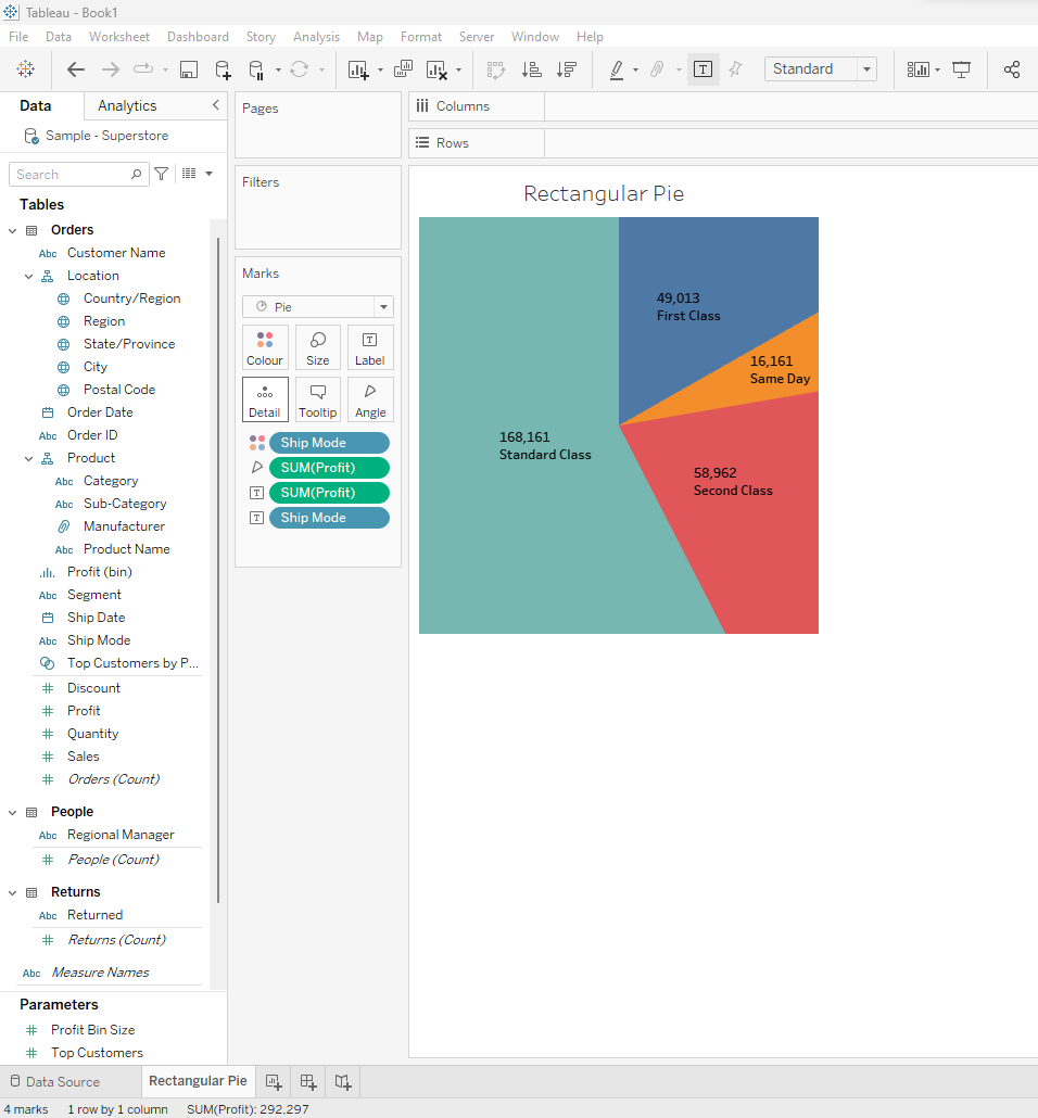
If we talk about a Pie Chart, we all have a same image in our head: a circular pie chart. It can be 2D, or it can also be a 3D version of Pie Chart (but please please, don't ever try to create a 3D Pie Chart for whatever reason except for memes). I am writing this short article to actually break this strong stereotype down by showing you, that a pie chart can also be rectangular.

But seriously, it's actually lot simpler than you think. It doesn't require any advanced calculated fields or anything like that, but still it can be a good alternative in case you're bored with the regular pie chart. As long as it does make sense in showing what you want to deliver in your dashboard, you can implement it and make your colleagues put a puzzled face, wondering why it looks like a Treemap Diagram, while it also looks like a Pie Chart at the same time.
Alright. This is what i want to show you.

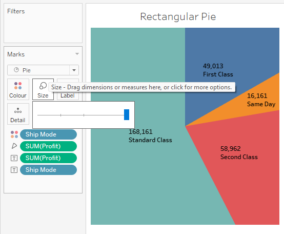
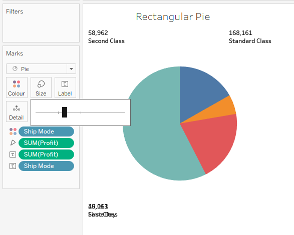
The magic behind it is a single mouse click-and-slide, and to be specific, to resize the pie chart. Watch this.


It's actually still a circular pie, but it is so oversized that it fills the whole rectangular frame, which we tjhen see it as a rectangular pie chart. It's no super technique, but it's nice to see some variations every now and then. There you go, the rectangular pie. Feel free to confuse your friends and teachers with that!
Footnote
Whether you display the pie chart as a round pie or in a rectangular manner, should not affect the value that is shown in the chart itself. The reason being, pie chart doesn't take the length value, or the volume of each slice, but instead it utilizes the angle of each slice, which stays the same, both in rectangular and in circular form.
