


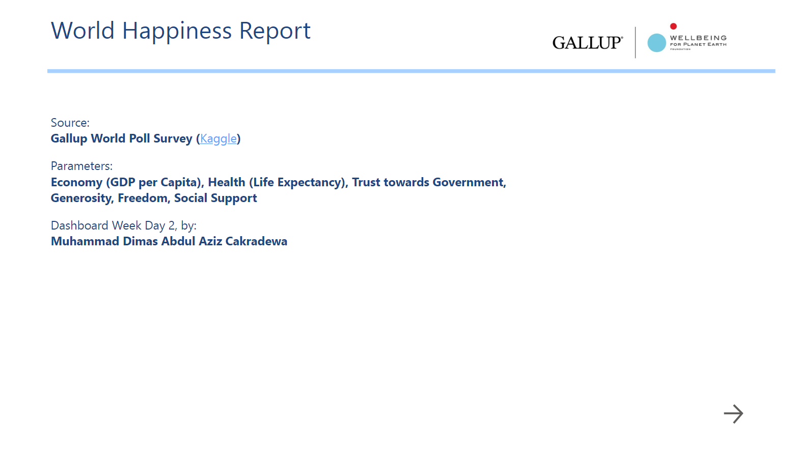
On the second day of the dashboard week, we get to work with the dataset that tells the information about Global Happiness Index for (almost) all countries, from year 2015 to 2019. The data is downloadable from Kaggle, meaning it is an open data, free to use. The "Happiness Level" is calculated using six metrics: wealth, health, trust towards government, freedom, generosity, and social support. This time, we ned to work with Power BI instead of Tableau, which means from the cleaning part until the dashboarding (or reporting), everything will be done within Power BI and Power Query environment. It was challenging because I haven't been using Power BI in the last few months. But all in all it was a fun and productive exercise.
Shortly after taking a look at the data, I decided to go to a specific direction of analyzing the data, where I examine the metrics, compare their patterns and see if there's any meaningful insights that I can deliver. In this case, I specifically focused the analysis on the wealth aspect, to see how the wealth score index goes in comparison with other aspects, as in whether any or some of them are correlated with each other. It is not about trying to find out cause and effect, but rather to see the proportionality between the metrics. In addition, to make it more fun, I tried to create a small quiz, to have more interaction with the audience during the presentation.
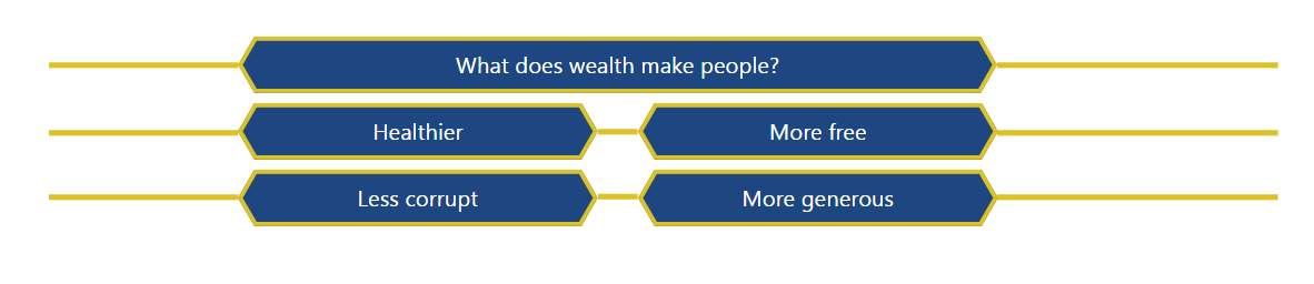
In the end, it was a short but fun and interactive report displaying the correlation between the wealth aspect compared to these four aspects, as a clustered bar chart. You can try interacting with the quiz here: https://app.powerbi.com/groups/me/reports/ba7bbda8-ffec-4c51-b166-4b4c85209f1e/ReportSectiond50c0440b01430102582?ctid=80891290-9de3-4bb8-b1a3-8aa844ede963&experience=power-bi&bookmarkGuid=Bookmarkbf74201c64a8cdeed72a
I did mean to use this day two of the dashboard week as my chance to improve my presentation by adding more interactivity element, both to the report/dashboard and to the presentation itself. Hence the quiz.