I'd like to post another one of my latest Tableau Dashboard here; one of few that I find interesting, design-wise. It might not be the easiest-to-understand dashboard. It might be just a bunch of repetitive, similar looking bar charts thrown into a single dashboard. But I've been learning a LOT recently; trying to up my game in data visualization and practice my analytical skills while still having lots of fun doing it.
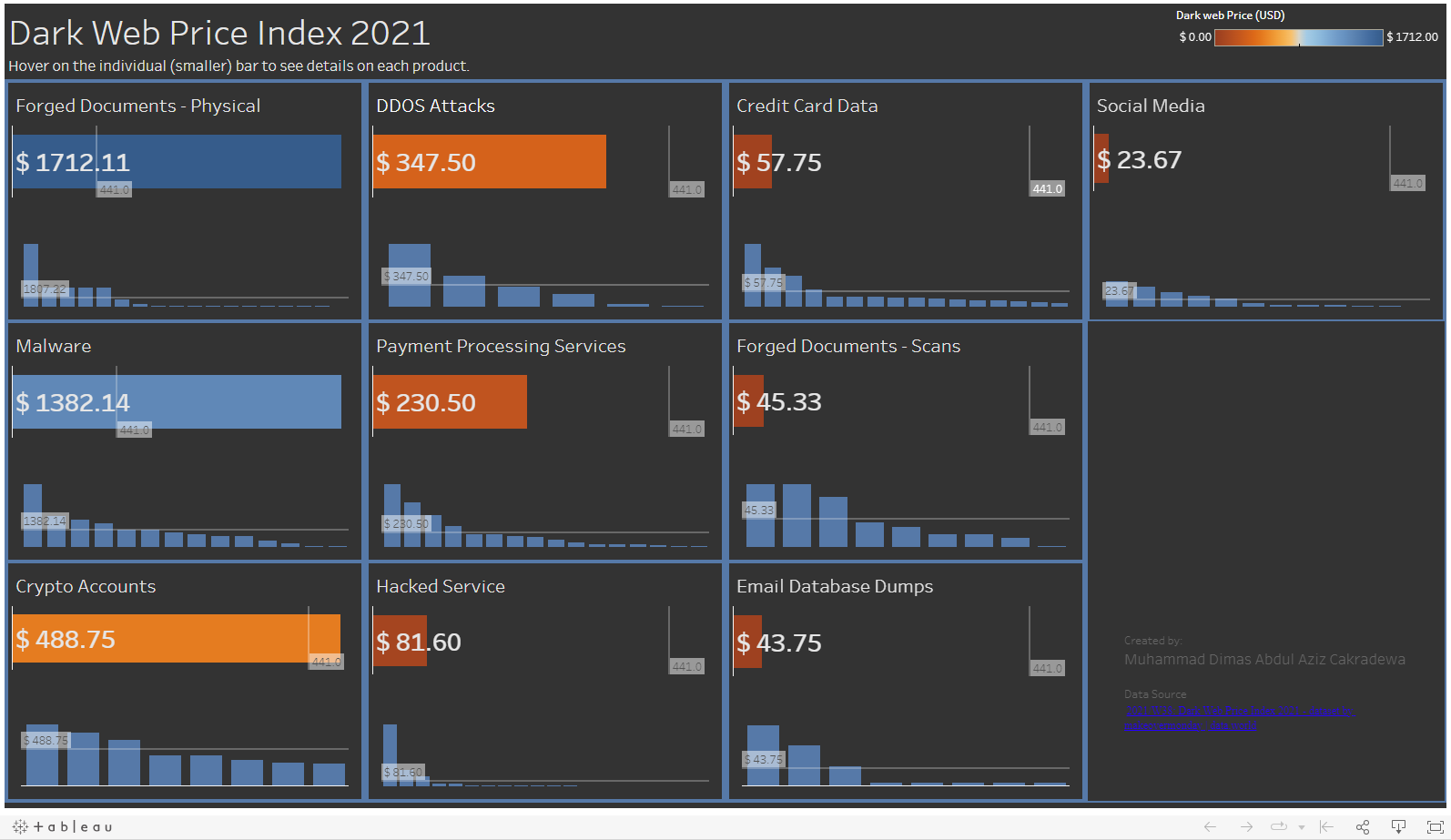
In this practice, I tried to create a card-styled dashboard, where you see smaller boxes arranged together to create a (supposedly) meaningful dashboard. Each card contains all the info you need from a variable, and you'll see a few cards with similar formatting, so the user knows that the numbers, charts, and colors represent the same attribute of those variables. For example, the bigger bar shows the average price of each product category, while the smaller bar represents the individual price of a product. You will need to interact a little bit with it, i.e. hovering over the individual small bar to show the product name and its price on the right side of the dashboard. The faint grey line tells about the overall average product price for all product categories.
This might not be the most efficient dashboard for this type of data, but the learning process is where most of the fun lies 🤓 and man do I love the dark theme.
Link: MoM 2021 W38 - Dark Web Price Index 2021 | Tableau Public