


Intercept lines are a useful tool for visualizing trends and deviations from averages in data. In this article, we will provide a quick guide for creating an intercept line like the one depicted below:
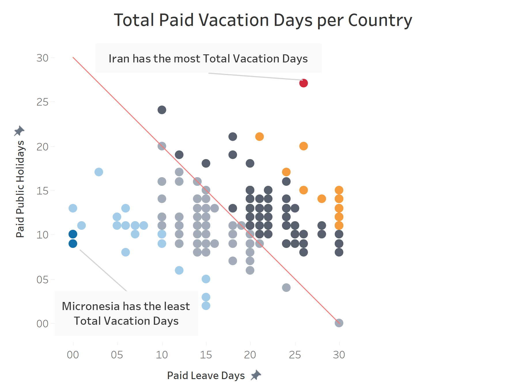
The above trendline/intercept line depicts the average total vacation days across the globe. Two main observations can be made regarding this intercepting line.
First, it follows a negative slope, forming a backslash across the diagram; second, it crosses the x and y intercepts at a value of zero.
Mathematically, these two observations can be depicted with the equation:
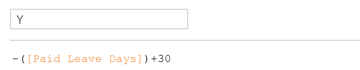
Y= -X +30
First, we must identify our X and Y variables to reproduce this variable in a graphable format. This is simple, as we can draw the information from our graph axes. The X variable is "Paid Leave Days" and is the variable we require to form our calculation. Therefore, our calculation is as follows:
Y = (-)[Paid Leave Days] + 30
Now we are aware of the calculation we need to form, we can build a calculated field. We can call this calculation "Y", with "(-)[Paid Leave Days] + 30" in the calculated field, e.g.:
By dragging this new pill into the rows section, and aligning the axes, we have begun to build the intercepting line. Add in your variables, in this case: "countries", and in the analytics pane, drag a trendline into the "Y"-linear option
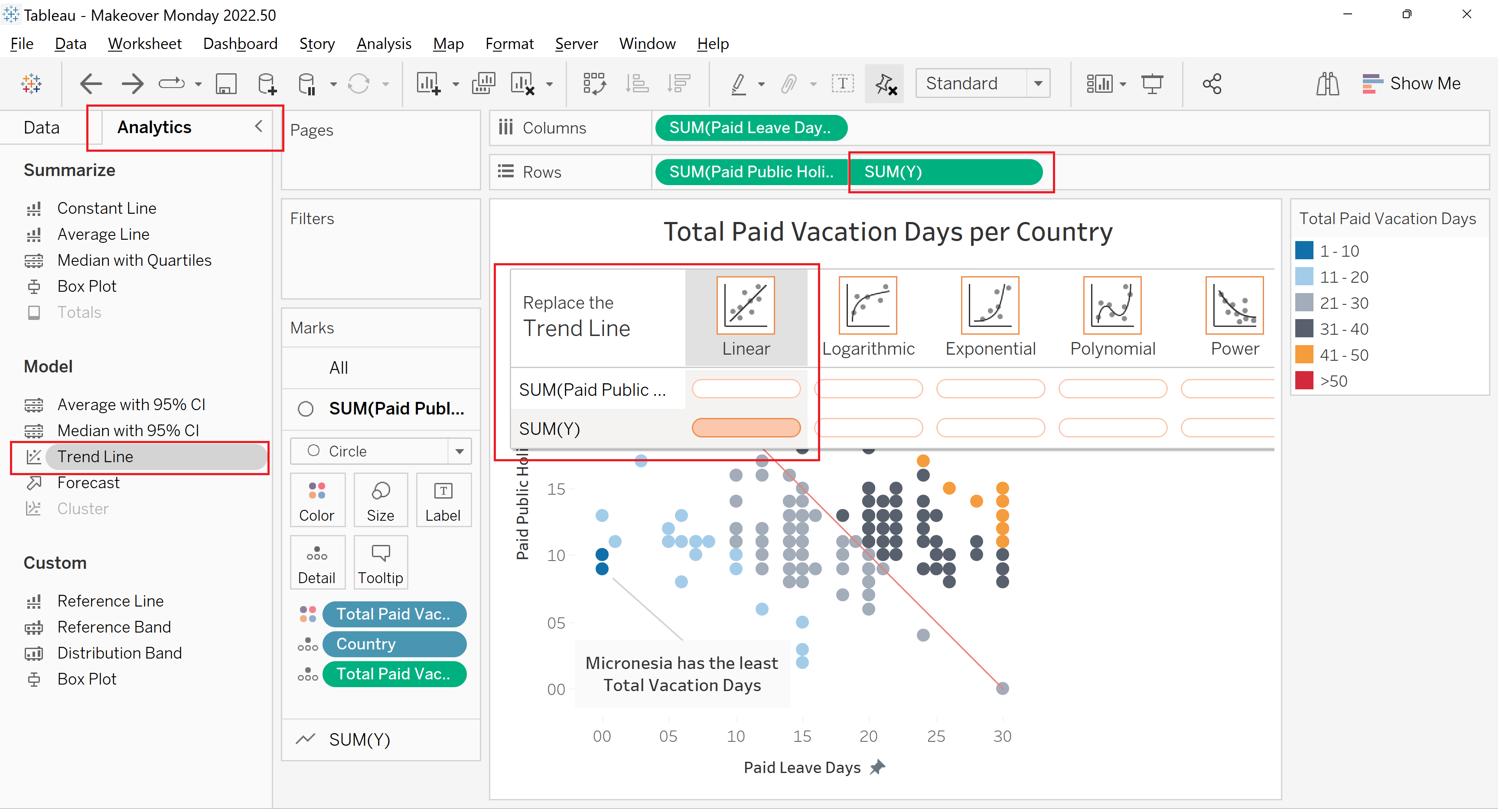
The negative y-intercept should now be functional. If you have any further questions, feel free to reach out to me at morgan.a.rennie@theinformationlab.co.uk