


Deviating from my original plans for Tableau practice over the winter breakaway, I thought it would be more beneficial to explore a new and interesting dataset, so with a trending IMDB dataset on Kaggle, I found my way to a dataset on Paramount+ movies and tv shows. This dataset interested me as it provided information on actors, directors, movies, and their ratings across two different excel documents, as well as The Information Lab's history with Paramount. Having spent so long on Alteryx the last few days, I took the opportunity to explore these data sets and produce more cross-referenced data before designing a dashboard to present and provide a base of exploration for the data. The Paramount+ dashboard provided the opportunity to further my skills in producing dashboards, including my first utilisation of multiple pages.
Preparation
Starting Data
The data retrieved from Kaggle was created to list all shows available on the Paramount+ streaming service. The data was scraped in May 2022 containing data available in the United States. This dataset contains over 2800 titles (movies and tv shows) and almost 28000 Actors and Directors that were involved in the production of this media. The two separate .csv files were cross-referenced using a unique movie ID.
Dashboard Planning
The first task was to figure out what information I could glean from the data provided, and produce a user-friendly way to explore this data. Using Excalidraw, I produced a rough layout for my dashboard, including 2 separate pages. The first page would allow for the exploration of individual actors and directors, utilising filters at the base of the page, the user would be able to observe the individual's highest and lowest-rated movies available on Paramount+, as well as see their overall rankings on IMDB and TMDB. This would allow the user to find movies that stared actors they know they like.
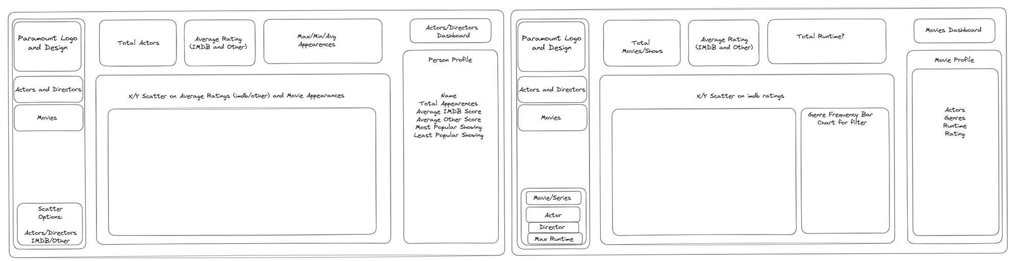
The second page would allow the user to explore data on the movies and tv shows available on Paramount+, filtering for specific actors or directors, as well as filtering and observing the genre range across the streaming platform. By selecting a movie, the user would be provided further information, including a description of the movie, the genres that it crosses over, and the actors in the movie.
Alteryx Manipulation
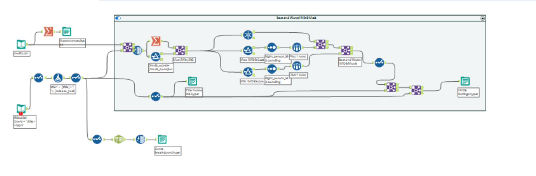
To streamline this data visualisation, additional databases were constructed. One new data source separated out the grouped genre tags assigned to the movies, allowing the user to filter on the genre. A second database was source was created to assign the actor/director's highest and lowest-rated movies, and a third database was built to streamline the count of the actor's appearances across titles within the streaming service. This was my first use of Alteryx outside of completing challenges, with no guidance on how the outflowing data could look, it allowed me to experiment and explore new uses of Alteryx.
Dashboard Building
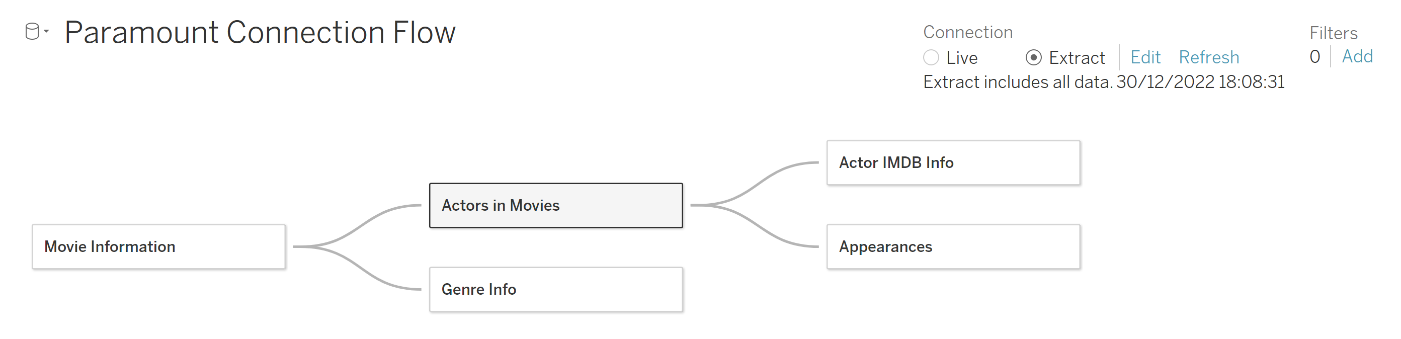
These new sources were connected in my first utilization of the Tableau data source connector, allowing cross-database referencing.
Using the excalidraw draft as a rough guide, I then set out to produce the dashboard.
Colour Palette
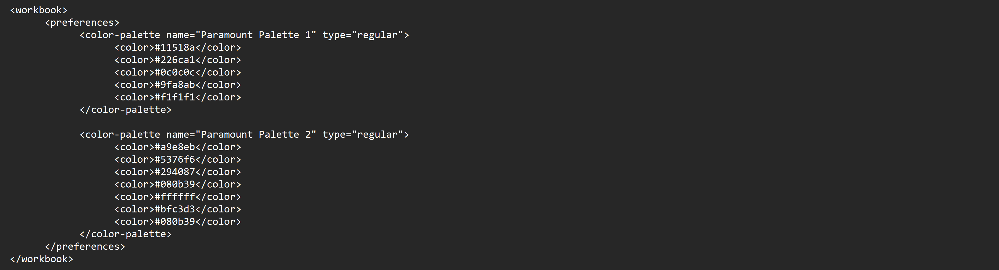
Quickly I decided that it would be best to utilise a colour palette that mimicked the Paramount+ style guide, using a colour picker and following the method set out in an earlier blog post on designing Tableau colour palettes, I brought the colours that I was going to need into Tableau.
Final Product
The final product aligns closely with the initial design, following a strong central colour scheme.
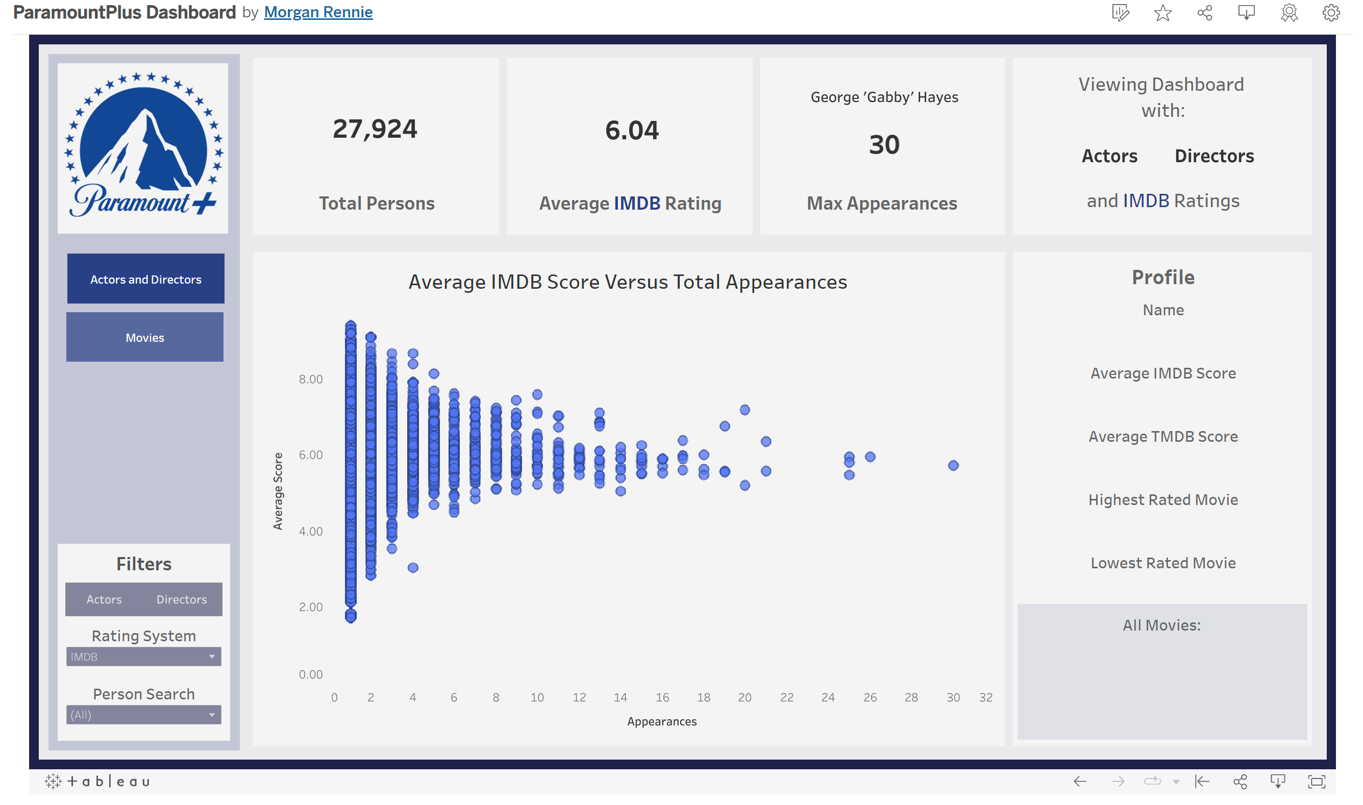
The first page allows the user to explore actors, directors, or both - viewing how many appearances they have across the Paramount+ streaming services, and how they rate on average - using a dynamic filter to allow the user to view IMDB and TMDB ratings. One limitation here, however, is that with fewer appearances, there is less data to infer an actor's average ratings. Additionally, this can lead to both the highest-rated and lowest-rated movies being the same.
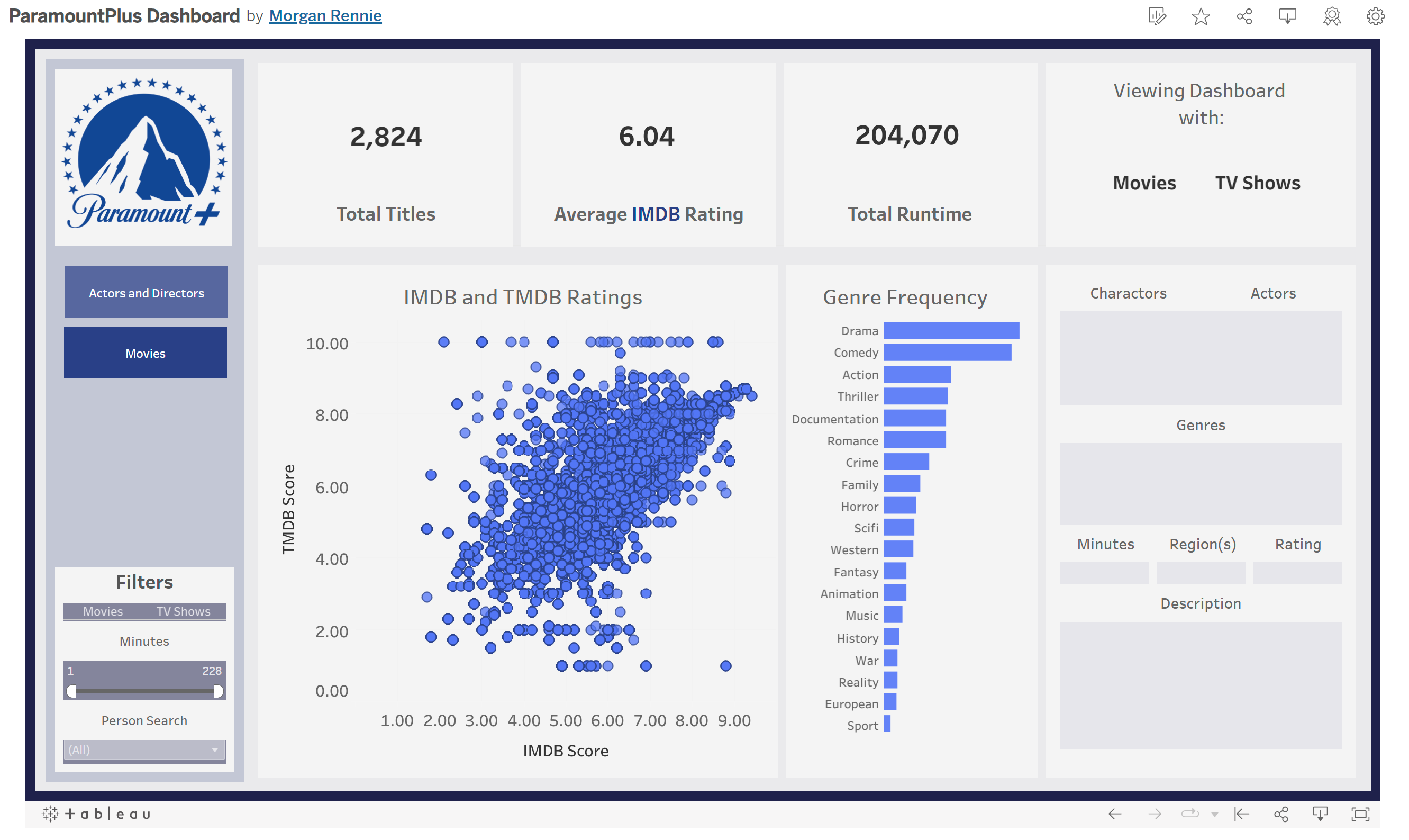
The second page allows the user to explore individual movies and tv shows (or both) that are available on the paramount+ streaming platform. Utilizing the filters on the left of the screen, and toggling the genres, the end user can find media that they are interested in watching. This dashboard could be improved with the use of sets in the genre bar chart, allowing the user to search multiple genres. Additionally, it could utilize tooltips to a greater degree to explain features and the use of the dashboard.
I thoroughly enjoyed the production of this dashboard as media is a subject I am very interested in, and I look forward to producing similar dashboards in the future. I was very happy with how the colour scheme turned out, and have enjoyed producing a user-friendly dashboard.