Hello all,
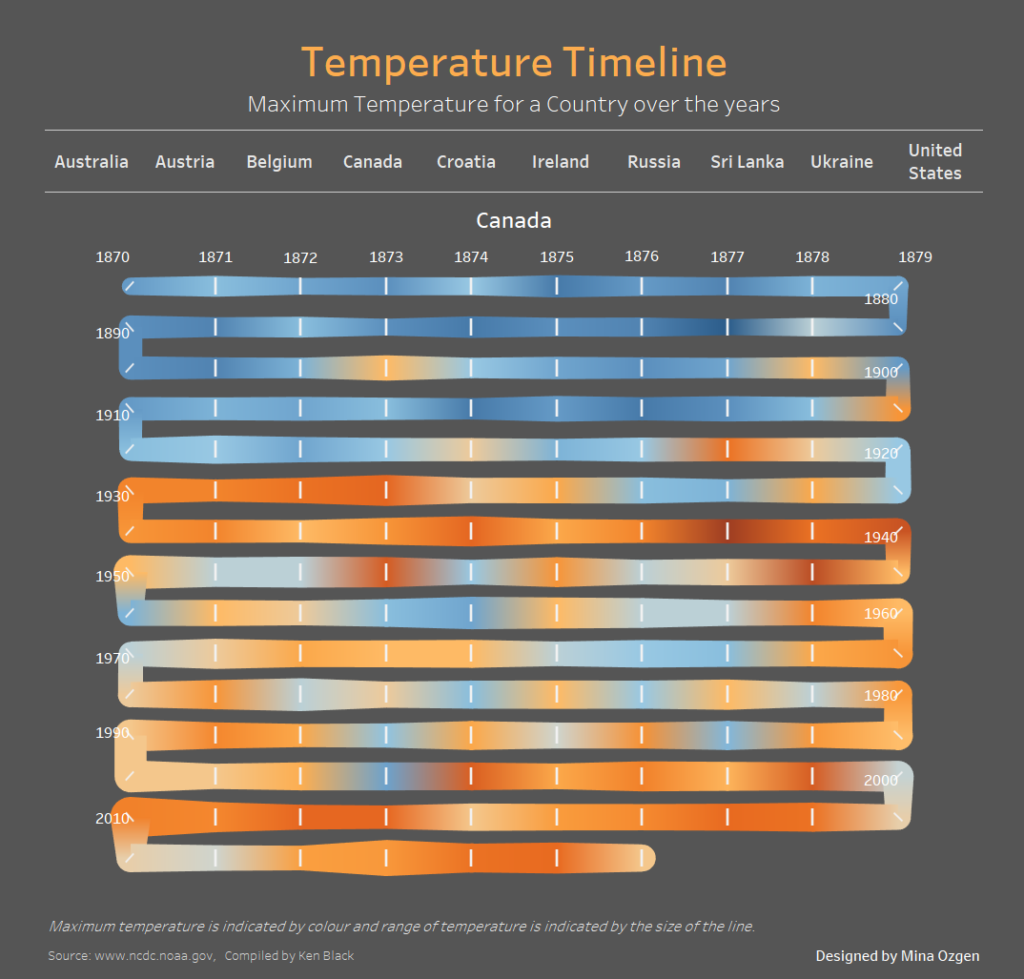
For those who followed my dashboard week series (or have found this blog through other means) and were curious how I made the timeline chart for my temperature timeline piece, just follow the steps detailed below to create your own timeline chart or as I prefer to call it, a snake chart.

The Problem
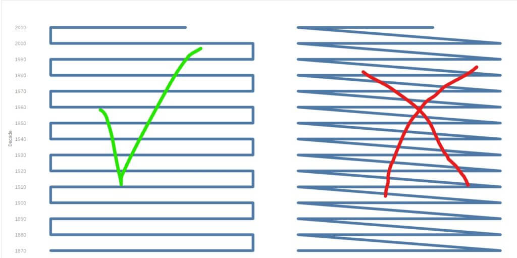
Essentially what we are trying to make is a line chart where each horizontal line is a decade, each mark is a year and the path wraps down to the next row on the same side as it ends. It would seem we need to make a field for decade and a field for the last digit of that year (0-9). This would enable us to plot each row as a decade and 10 columns (0-9) as each year in that decade. If we then put year onto path we would be able to see the timeline progression. However, we would not be done here because the line would jump across, not wrap down to the same row.

In order to make the pathing wrap we have to switch where the digit starts on every other row, so we need another digit calculation which would decide whether to place the digit in normal order or “reverse”. To summarise we need a decade calculation, a digit calculation and a logical calculation deciding to return either digit or reverse digit.
Below I will detail how to achieve these calculations.
Create Calculations
First, you will need a string version of your date/year field with just the four digits of the year in it.
Call this “Year”, then use this field to calculate the next few below:
Decade
INT(Left([Year],3)+”0”)
Digit
INT(Right([Year], 1))
Digit for TL
IF INT(LEFT([Year],3))%2=0 THEN
IF [Digit]=0 THEN 9
ELSEIF [Digit]=1 THEN 8…
ELSEIF [Digit]=9 THEN 0 END
ELSE [Digit] END
Digit for TL requires that you create 10 IF/ELSEIF statements to account for each digit and what it should swap with in order to become reversed.
Visualising the Snake
Make sure that all of the calculations are set to dimensions.
With mark type set to line put:
Decade on rows (and change to continuous)
Digit for TL on columns (and change to continuous)
Year on path
Then put your measure on colour and if you have anything relevant visualise on size then do so (I used temperature range for size and maximum temperature for colour).
Make sure to reverse the decades if you want it to read from oldest to newest year.
As a bonus if you want to add unique shapes to your corners make a Shape field containing this calculation:
Shape
IF INT(LEFT([Year],3))%2=0 then
IF [Digit]=9 OR [Digit]=0 THEN 1
ELSE NULL END
ELSE
IF [Digit]=9 OR [Digit]=0 THEN 3
ELSE NULL END
END
If you use this blog to make a public facing timeline (snake) chart please tag me, @MinaOzgen on twitter, so that I can see how it is being used!
Any questions or issues please feel free to ask for assistance.
