In Power BI, you can utilize a column containing RGB color codes to enable conditional formatting for various visualizations. By mapping specific RGB values to data points in your dataset, you can dynamically adjust the colours of bars based on certain conditions or criteria. This allows you to visually represent the inherent color associated with given item from your dataset in your reports.
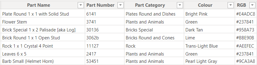
PowerBI by default will recognize the colour associated to the RGB codes, so the only thing that needs to be ensured is their presence in the datset. They have to be however presented in the exact format of hash symbel (#) followed by a combination of 6 numbers and letters.
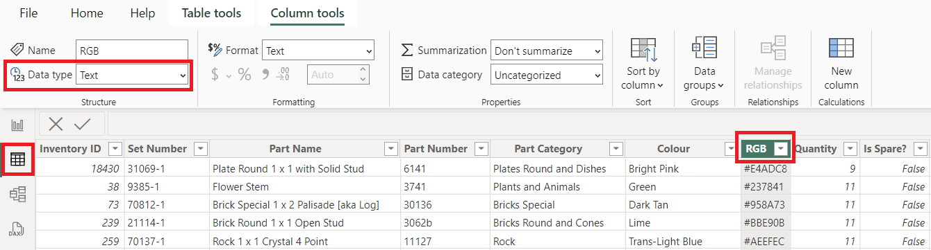
Once You upload the data to PowerBI, navigate to the Table View on the left hand side, select the column with RGB codes and make sure that the Data Type of this field is set to Text.
Once that's done, You can navigate back to the Report View and apply the colour coding to your visualisation.
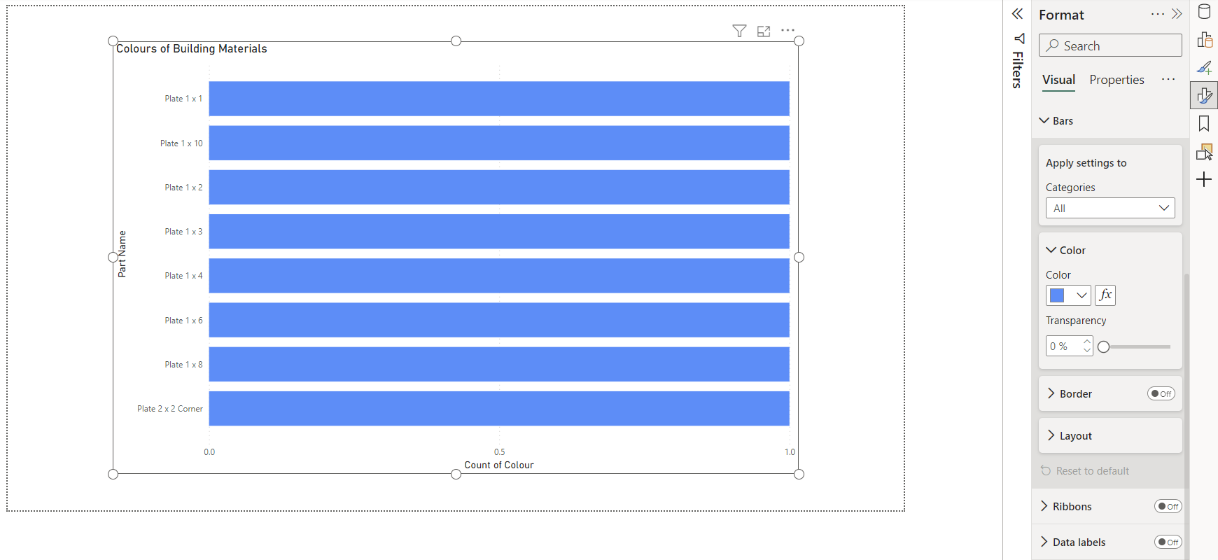
- Select the chart with data points for colour coding.
- Open the Format window of your visualisation from the right-hand side pane.
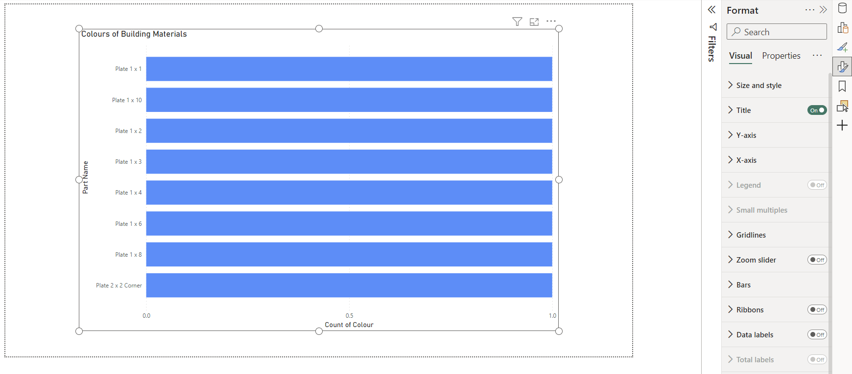
- From the Visual tab in the Format window, select the element of the visualisation that You'd like to colour.
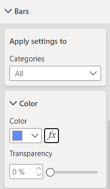
- Open the Conditional Formating window ([fx]) from the Color tab of your selected visualisation element.
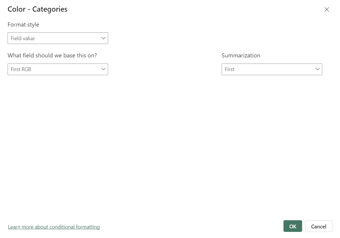
- Set the Format Style to the "Field Value" and specify that the field by which the conditional formatting is done in your visualisation is the one with the RGB colour codes.
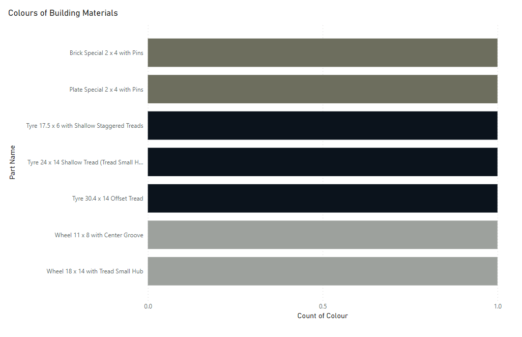
Once the changes are confirmed, the colours will be automatically applied to the visualisation.