Here is a quick tutorial on adding a customizable point to the end/start of your line chart. We are aiming to produce the below chart.
How to Build
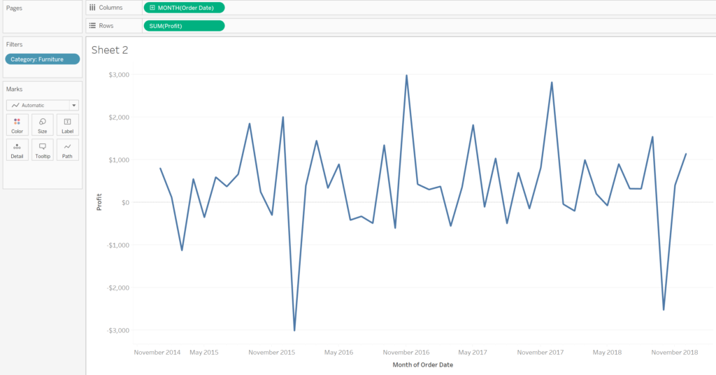
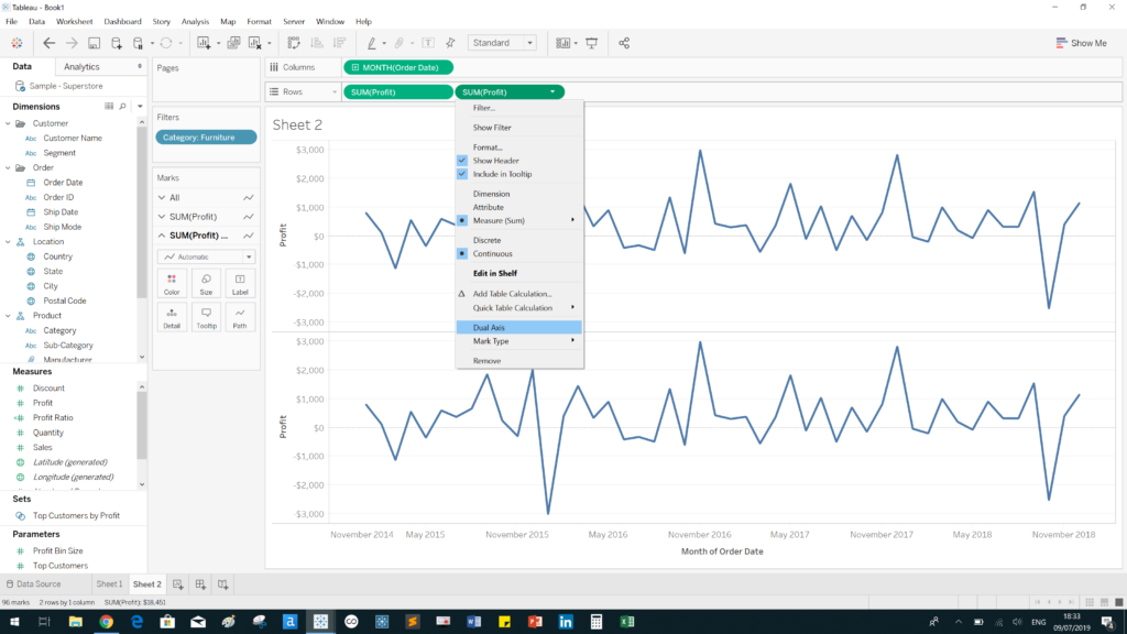
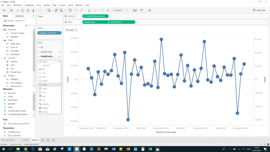
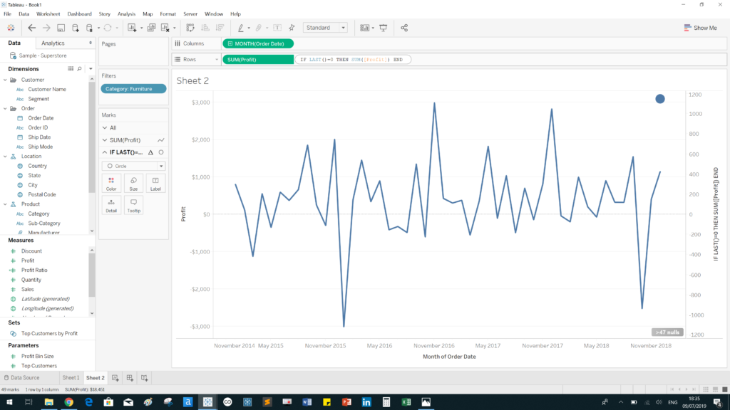
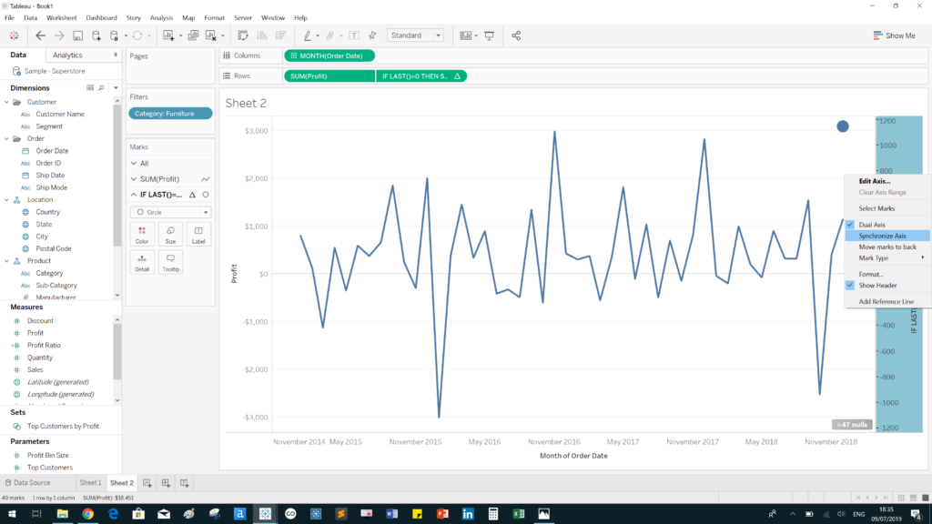
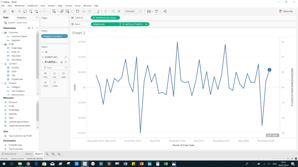
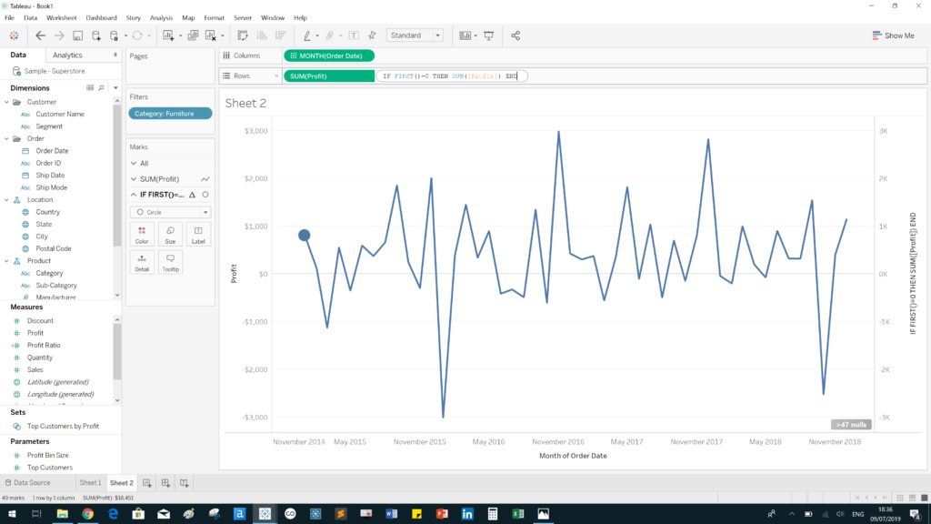
1. Start by building this chart using Superstore data. The chart shows profit over time (continuous months) for the furniture category. 2. Drag [Profit] onto the rows shelf and right click it. Select “Dual Axis” to overlay both charts.3. This creates a dual-axis chart. Change the second profit field on the marks card to a circle on the marks card. This results in one of the overlayed charts consisting of points along the line of the other chart.4. Perform an ad-hoc calculation in the rows shelf. The calculation is an IF statement of the following structure: IF LAST()=0 THEN SUM([profit]) END 5. Synchronize the axes by right-clicking the axis and selecting “Synchronize Axis” 6. Success! We no have a point on the end of our line.7. We can also insert a point at the start of a line using the FIRST() function in the same way we used the LAST() function.
You can add use this to create charts with custom shapes by selecting Shapes rather than Circle. This allows a lot of customization! Try playing around with it. You may not need to do this if you simply need a point to highlight the most recent value at the end of the line.
Further Reading
Check out this blog on dual axes charts written by Robert Headington (DS13):