I recently created a Pareto chart and in the requirements, I had to indicate the 80% threshold of sales so that the user could trace it to the percentage of products which constituted that sales. I found table calculations as an alternative in doing this and I thought its worth sharing.
To better illustrate this, I will take you through how to create a simple Pareto Chart. The Pareto principle opines that 80% of the effects come from 20% of the cause. Using this idea, we can answer the question of whether 20% of products sold accounts for 80% of sales in Superstore.
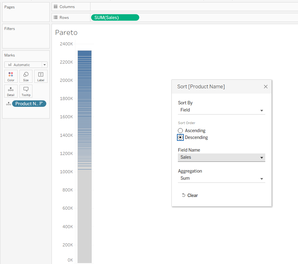
First drag sales unto rows and Product name unto details in the marks card and sort Product name by sales descending.
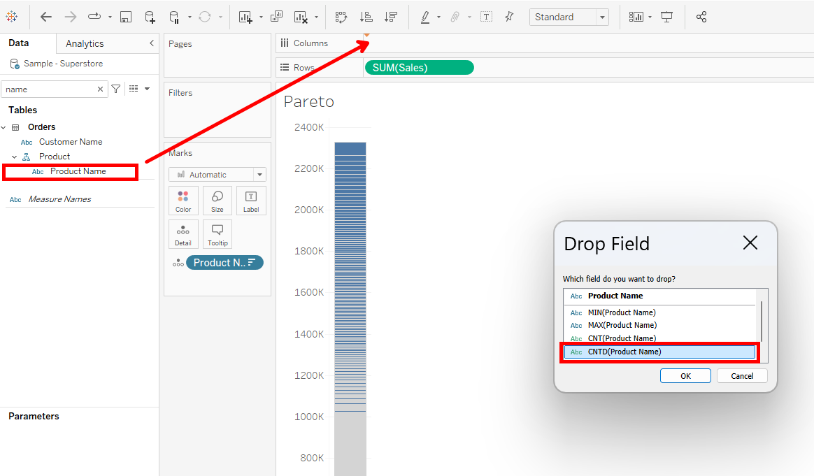
Right click on Product name from the data pane and bring it unto column shelve selecting count distinct.
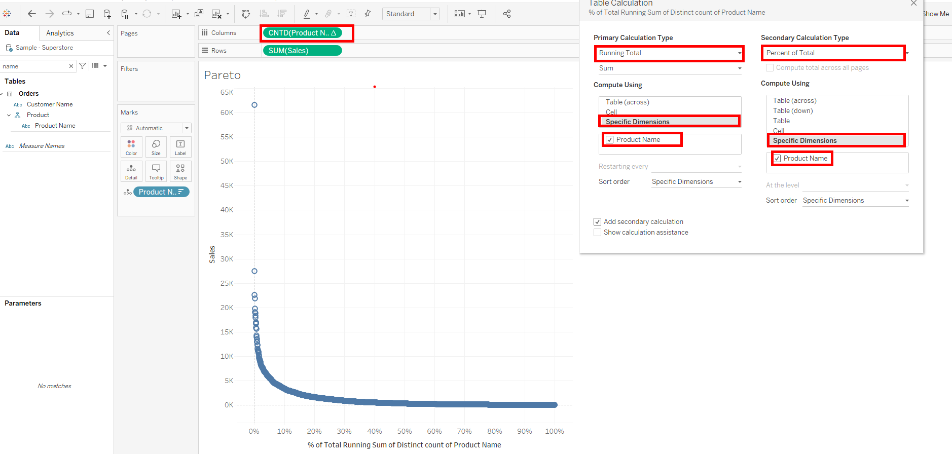
Right click on the count distinct product name and add two table calculations; a primary and secondary one.
1. Running Total on specific dimensions and ticking Product name.
- Tick add secondary calculation and create a Percent of Total on specific dimensions, ticking product name.
In both table calculations, what the selection of specific dimensions and ticking of product name does is that it tells Tableau to calculate a running total for all the Product names and further use that running total to compute a percent of total for all product names. It also locks in the calculation so that no matter the positioning of the dimension in view, the results stay same.
Repeat what we did for distinct count of product name on sum of sales.
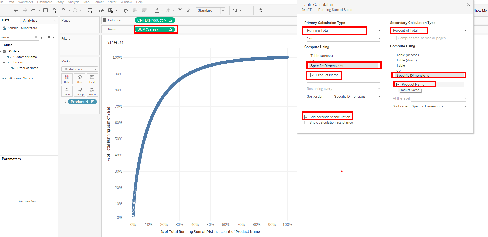
Change marks to Line
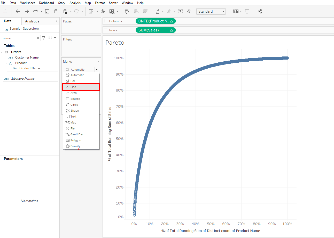
After changing our marks to line, we can now use table calculations to find the 80% of sales point on the line. The calculation will employ a lookup which looks a point before and after the required point and says if the point before(lookup(),-1) is less than the required point and the point after (lookup(),1) is more than the required point, then give me back the required point.
Lets call that point 80 Dot in our calculation:
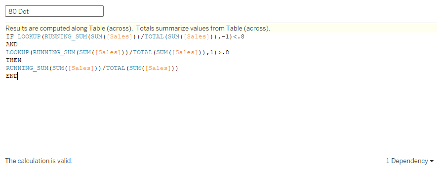
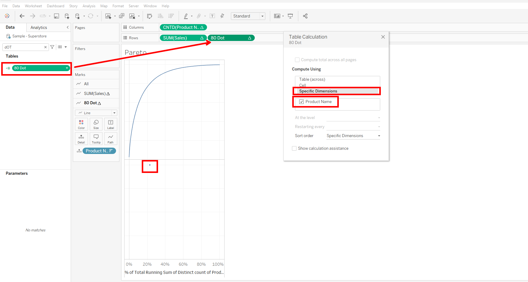
Drag 80 Dot unto rows and configure it on specific dimensions and selecting Product name.
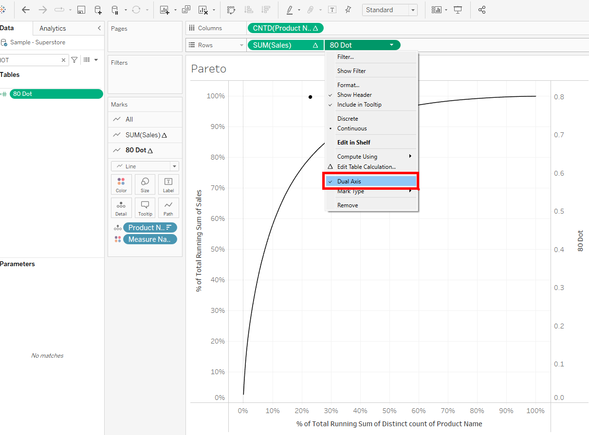
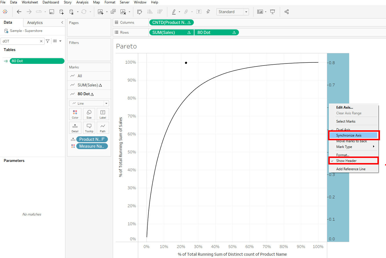
Right click on 80 Dot and select dual axis.
Click on the axis and synchronize, not forgetting to untick show header.
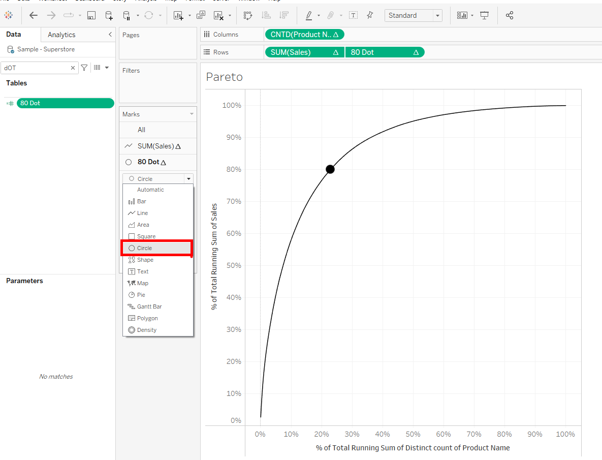
Change the mark to a circle, and increase its size.
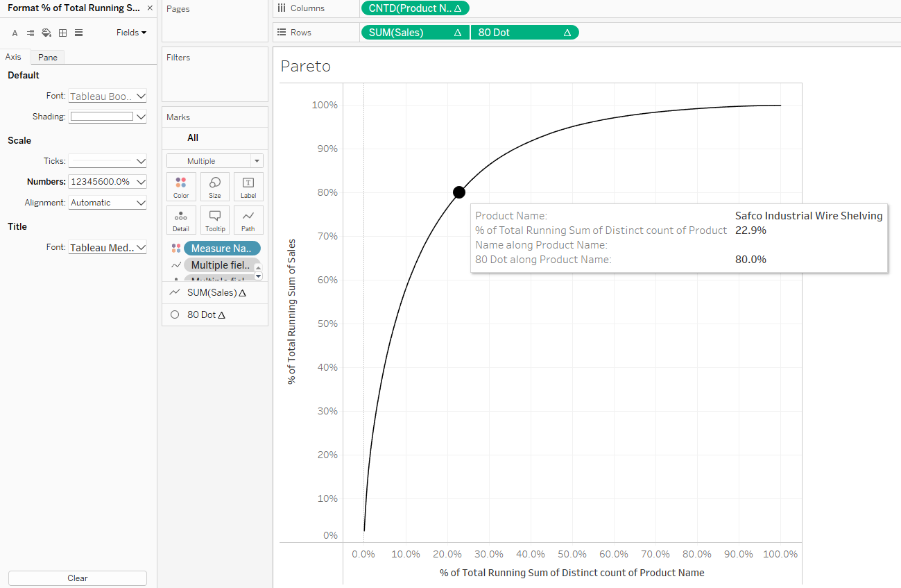
Hovering on the point tells us that 80% of sales is made up of 22.9% of products sold and not 20%. We need to note that this point created is static and could be made dynamic by using a parameter in our calculation.
I appreciate we can bring on reference lines to make our Pareto more insightful but for the scope of this write up, we will stick to this. I hope you find this useful.
