


In my last blog my bump chart looked incomplete since I had not placed my dimensions which were countries on colour. In instances where we want to stick to one colour for all the countries, we can use highlighters to show the trend for each country with just some few steps.
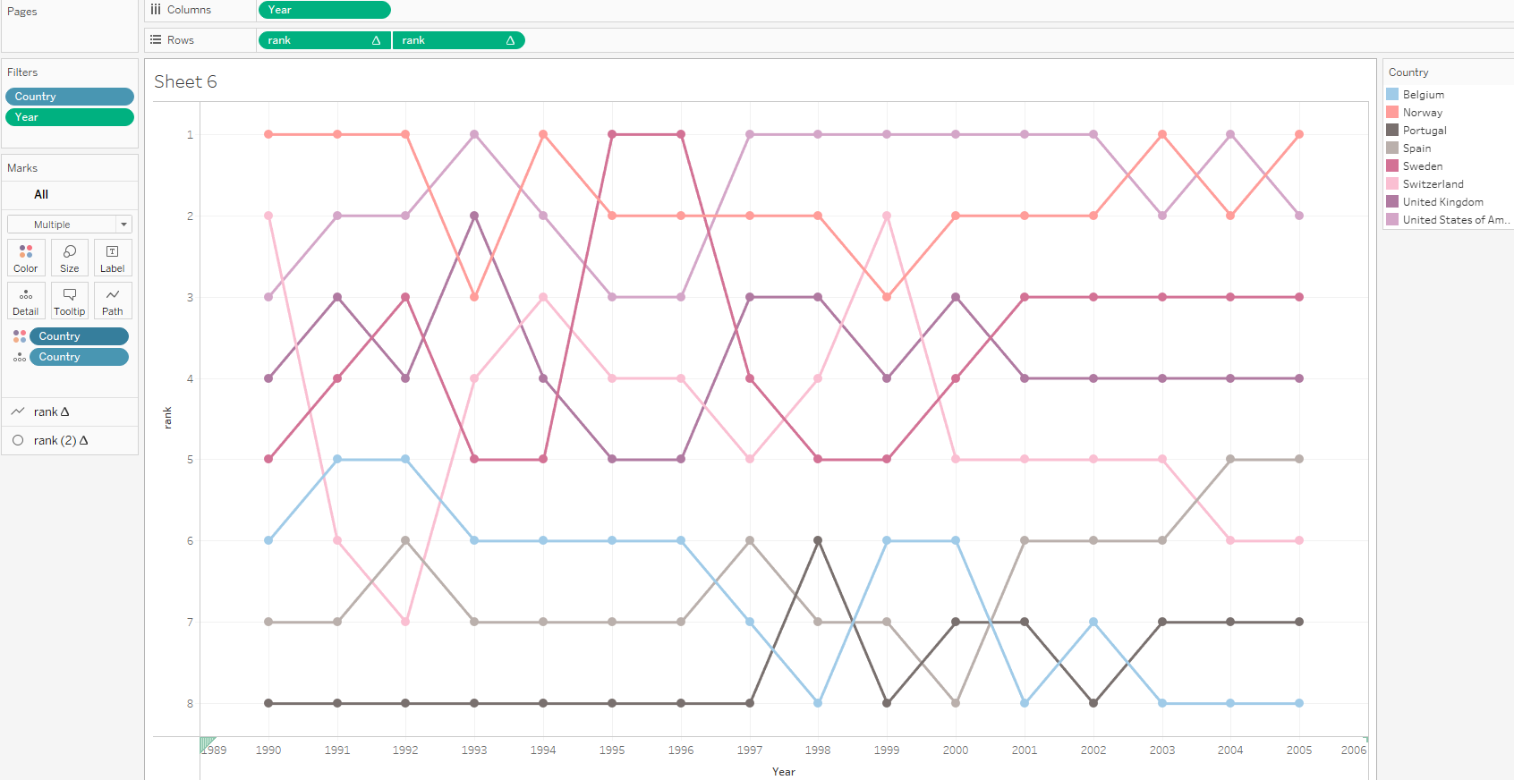
So this is how my bump chart would look like this if countries was placed on colour.
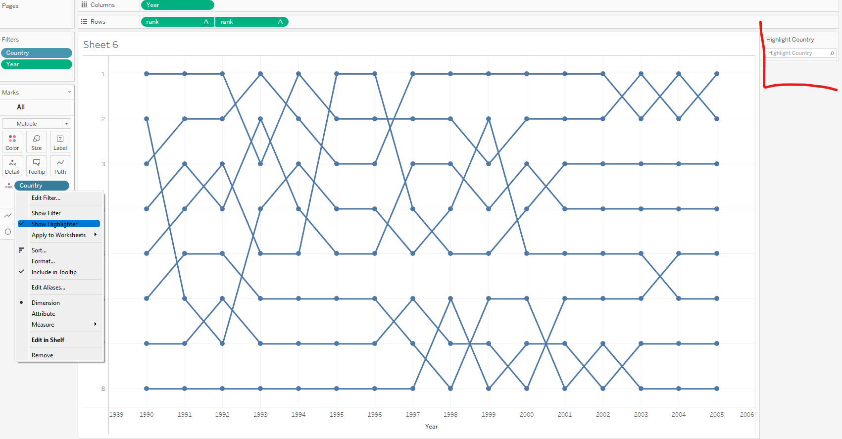
However when you want to show loads of countries on a bump chart through colour, the story could be misleading since multiple countries are going to be represented by same colours hence making your analysis inaccurate. In such instances, sticking to one colour and using highlighters is recommended. Clicking on the drop down by the country dimension on detail and selecting show highlighter brings up the highlighter card.
If the list of dimensions is a long one, highlighters allow for a search.
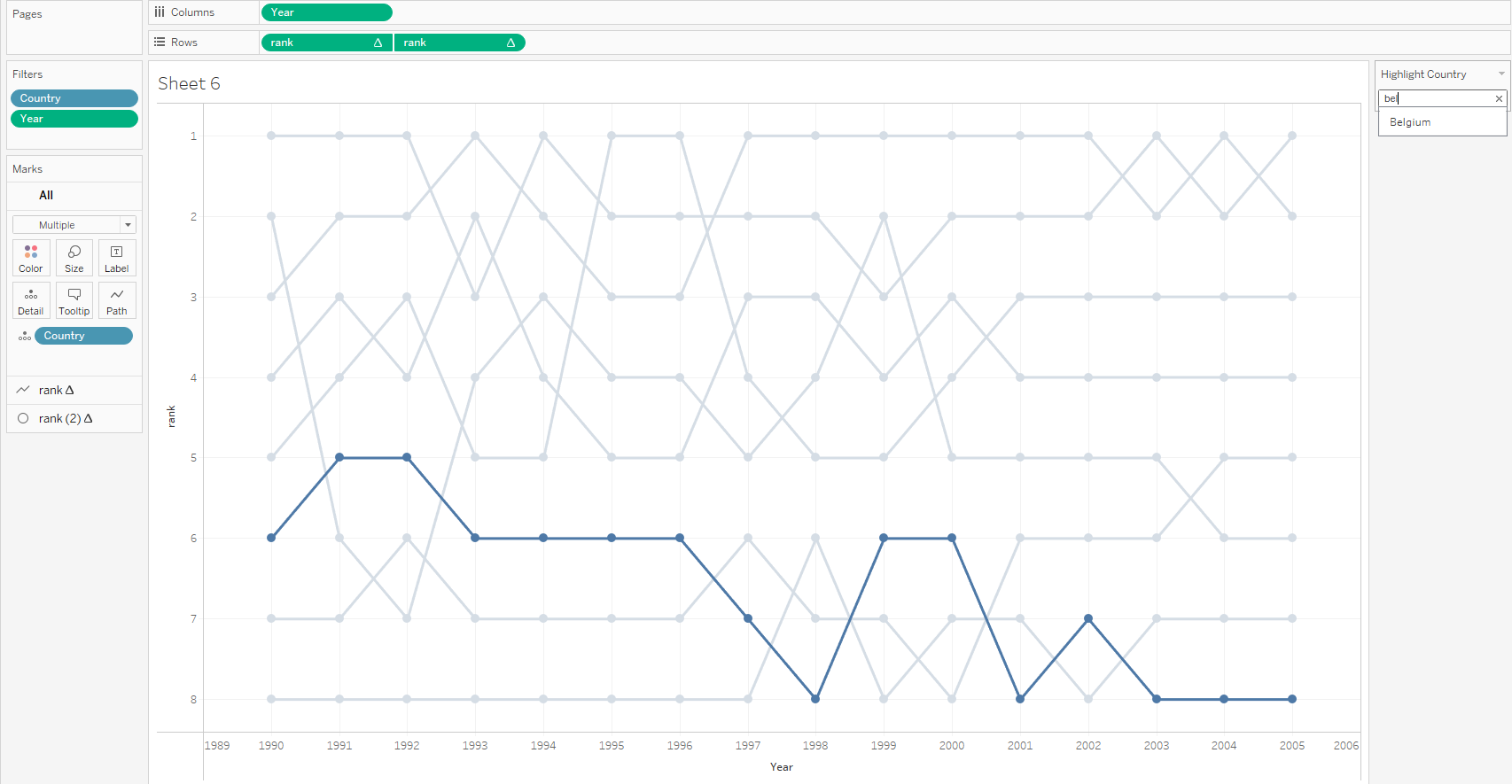
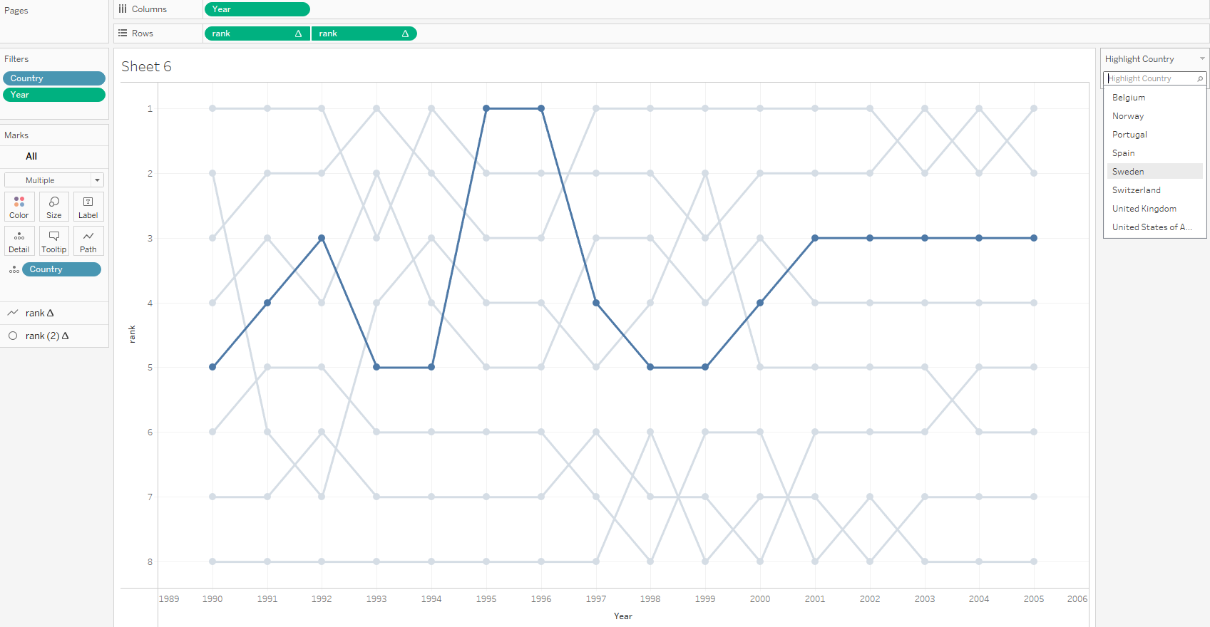
However, since we have only 8 countries in this example a flip through won't be a bad idea.
I hope this tip helped and thanks for reading.