In our analytics journey, we sometimes want to compare what is happening in this month as compared to the past month. This is usually shown as KPIs to assess current month metrics against the previous.
In this blog, I will take you through the steps to achieve this. Since these calculations are likely to be repeated when creating executive summaries, I shall also demonstrate how to organize a group of calculations into a folder. This becomes useful when handing over your work to a colleague or sharing you workbook.
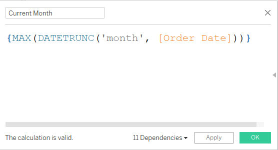
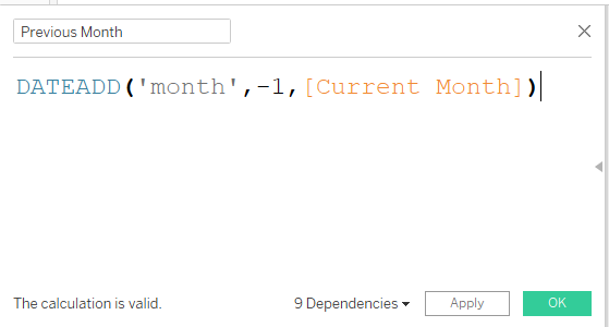
- Create the Current Month and Previous Month calculations.
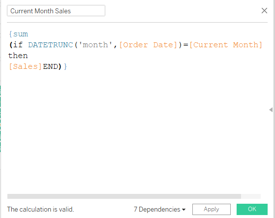
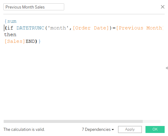
2. Create current and previous month sales.
3. Create the change in sales calculation and create 2 extra calculations for when the change is negative or when the change is zero or positive.
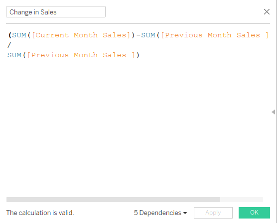
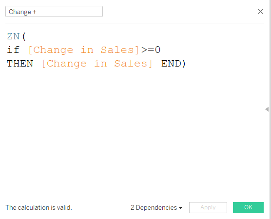
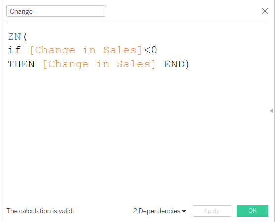
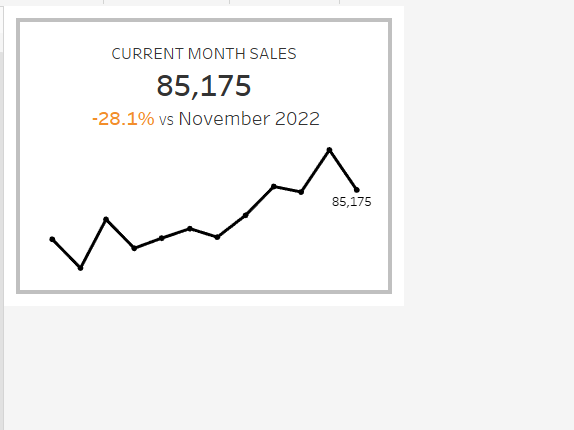
Now that the calculations are done, we can use them to create a KPI card with a sparkline. Drag continuous month of order date to column, sales to row and filter to the last 12 months.
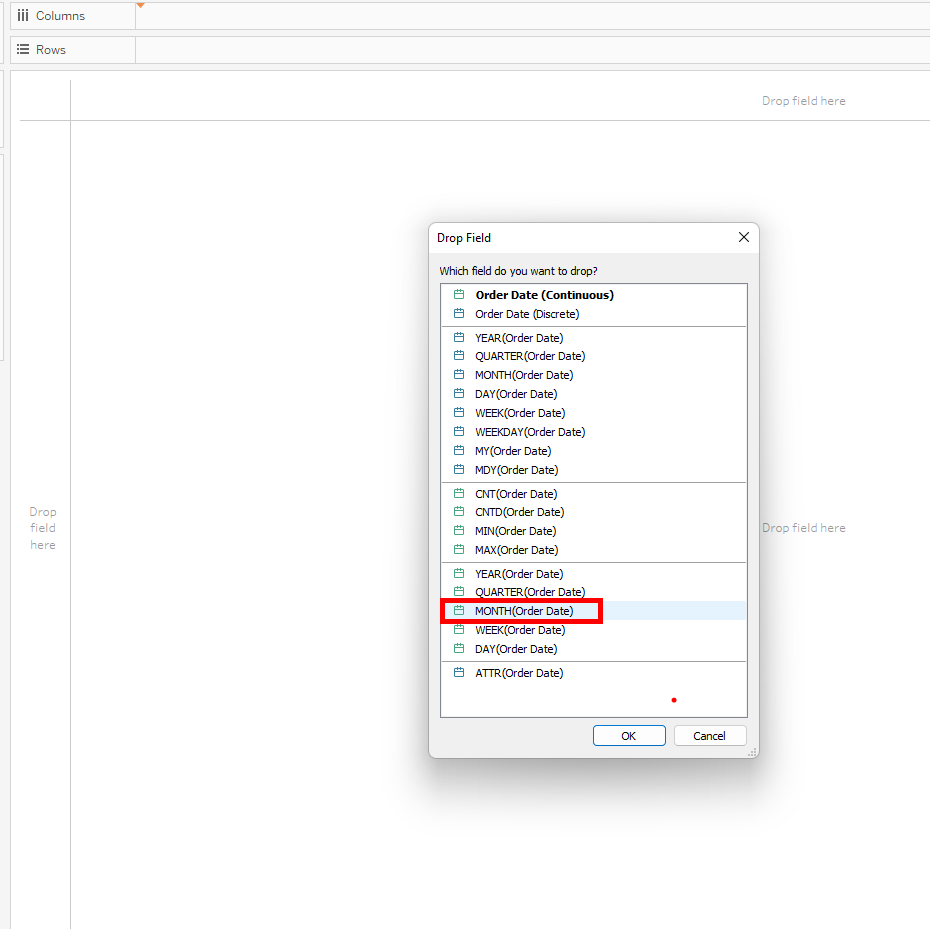
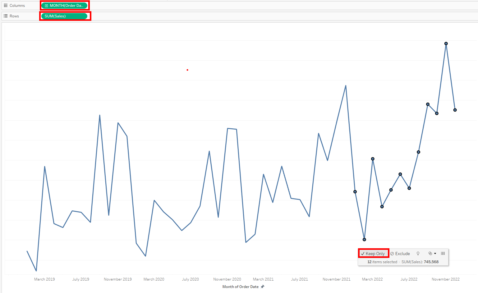
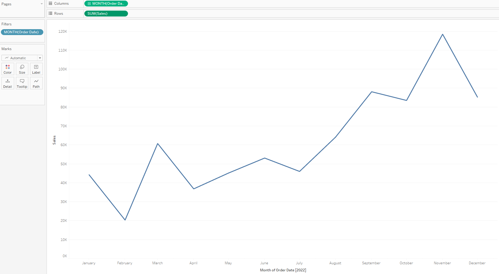
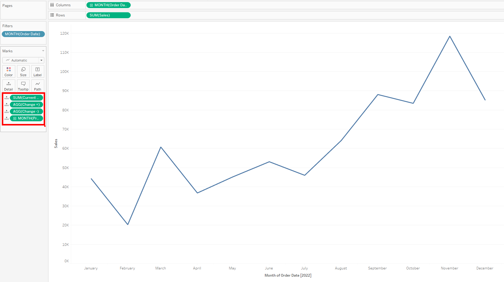
4. Drag Current Month sales, Previous Month (change to continuous month), Change + and Change - to the detail mark.
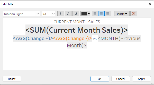
5. Edit title by inserting these calculation's, formatting the fonts and color coding change + and change -.
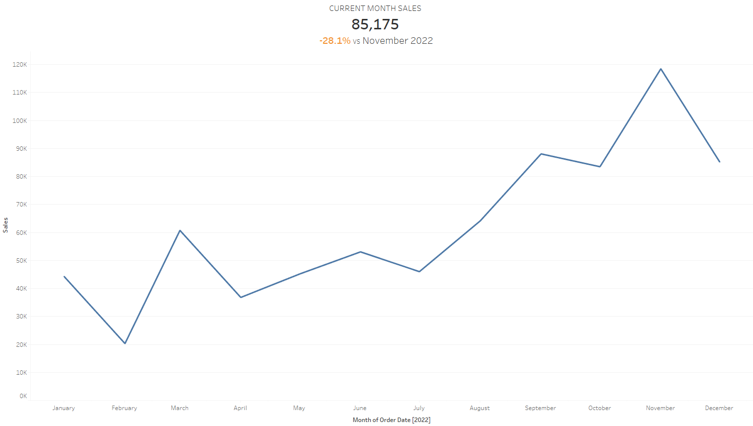
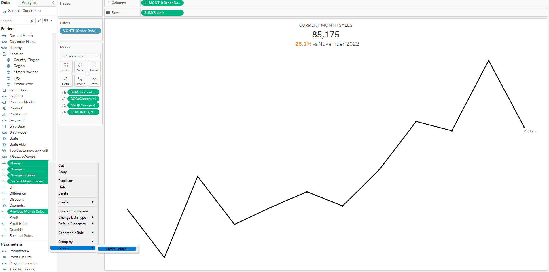
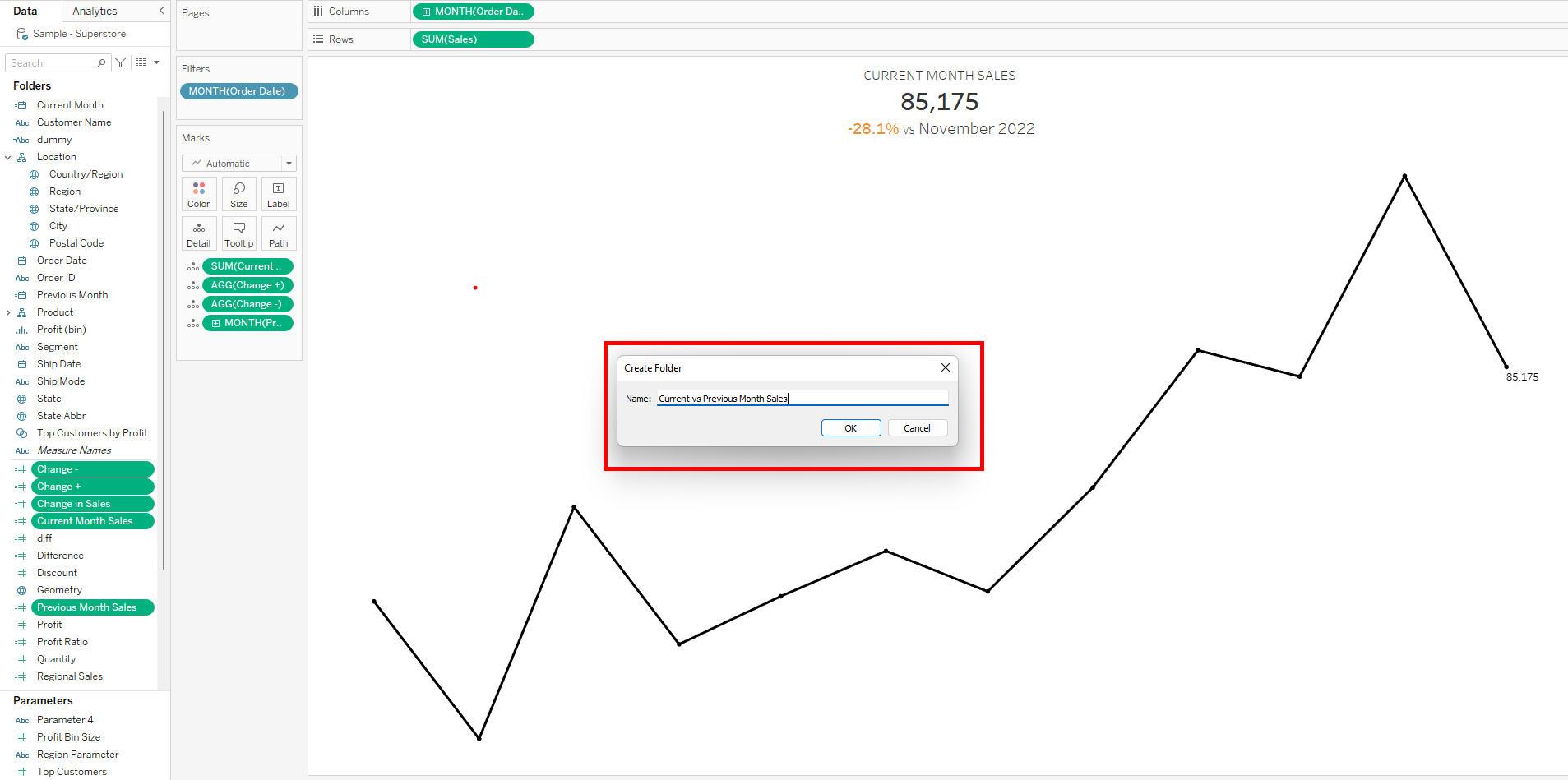
6. After a bit of formatting, the sheet can be used as a KPI card on bigger dashboard but before that lets package all our calculations into folder. CTRL click on all the calculations, click on drop down on one of the pills and select folders, create folder and name the folder as you wish and click ok.
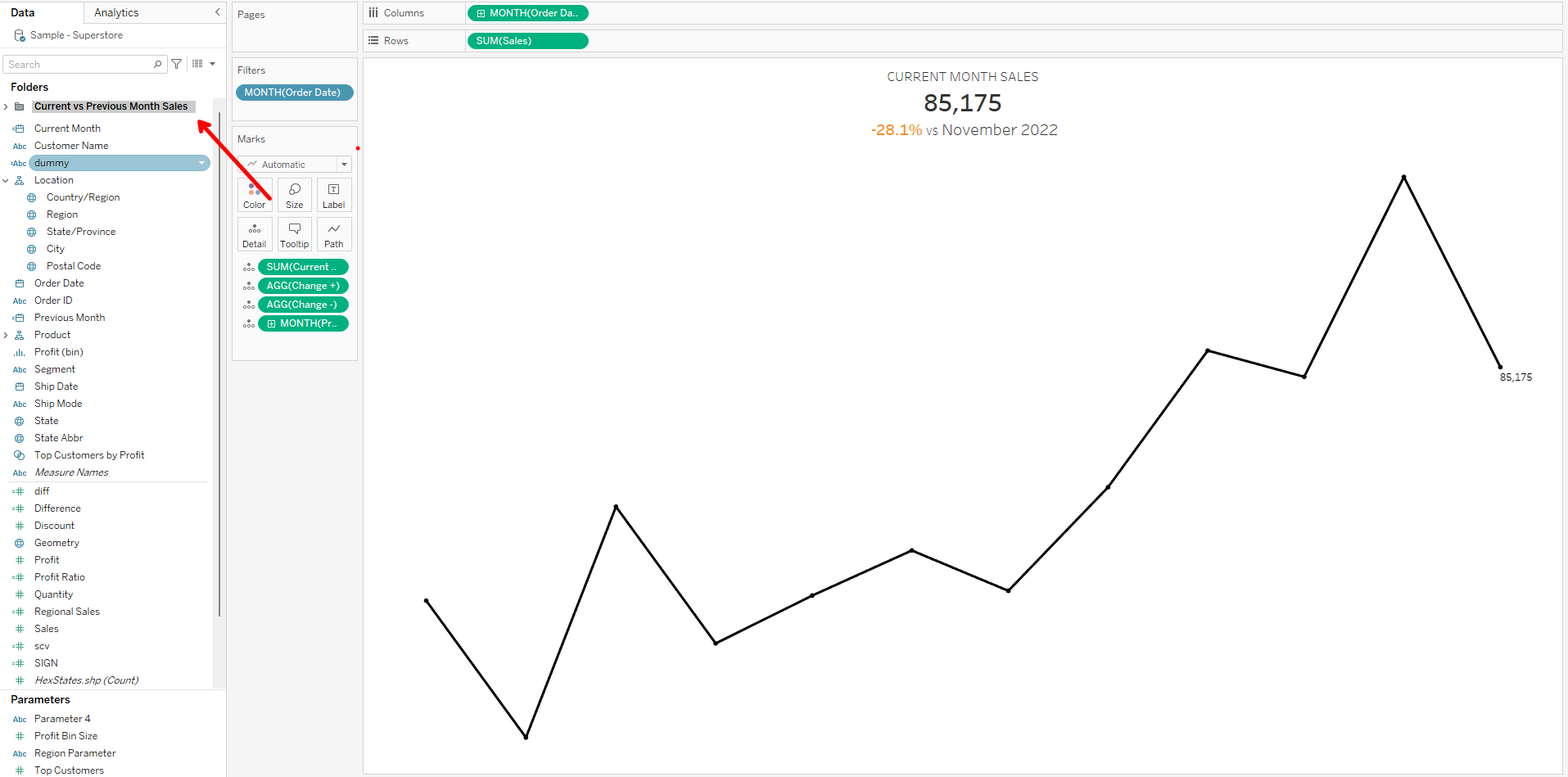
The final version could look like this 400 x 300 pixel KPI card.
I hope this tip was useful and thanks for reading.
