


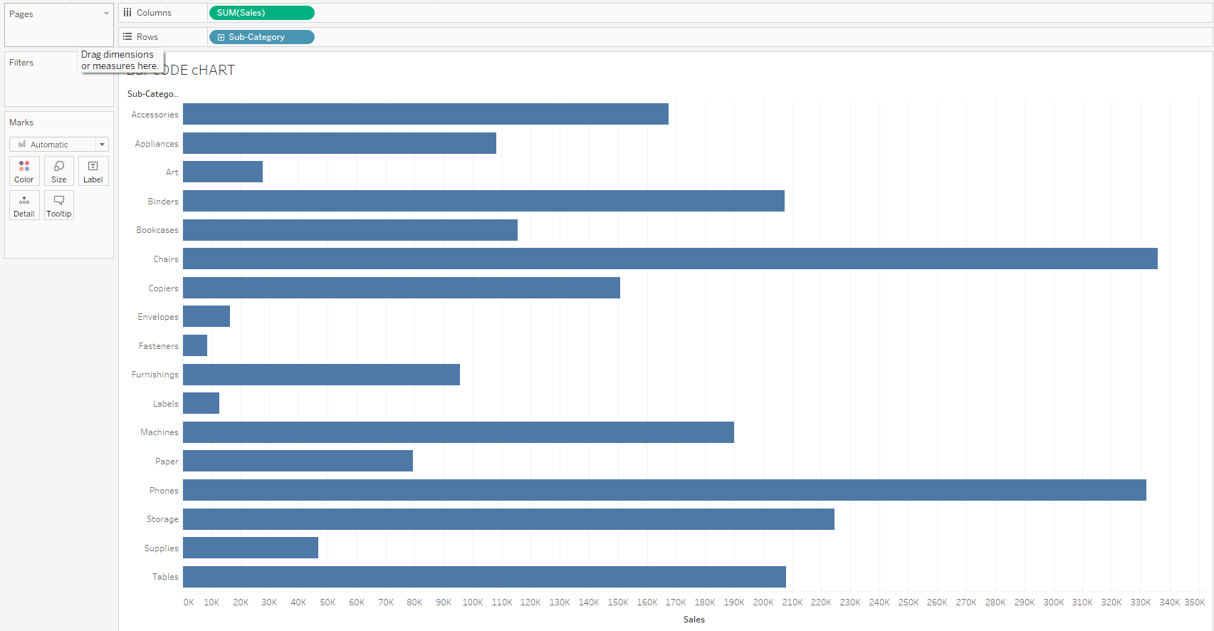
Bar code charts are great for showing values within a distribution. In this blog I shall show you how to create one to show how much sales we accrue from each customer on each product sub-category.
- Drag product sub-category to rows and sales to columns.
2. Change the marks to Gantt

3. Drag customer name to detail

4. Click on colour and reduce opacity reasonably

5. Show customer highlighter by clicking on the dropdown on the customer field and selecting show highlighter.
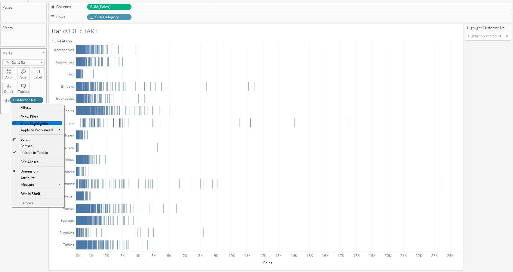
The bar code chart is done and we can flip through the highlights card to view the contributions of each customer by name.

I hope this tip helped and thanks for reading.