Histograms are great for understanding how your data is distributed. They give you a quick sense of the data’s overall “shape”—whether it’s normal, skewed, uniform, or multimodal—and make it easy to spot outliers. Because they group large datasets into simple, visual summaries, histograms are one of the most approachable tools for exploratory data analysis.
There are two main ways to build histograms in Tableau: using Tableau’s built-in bins feature or by defining your own bin sizes with a calculated field. Let’s walk through both approaches using this housing price dataset from Kaggle.
Using Tableau Bins
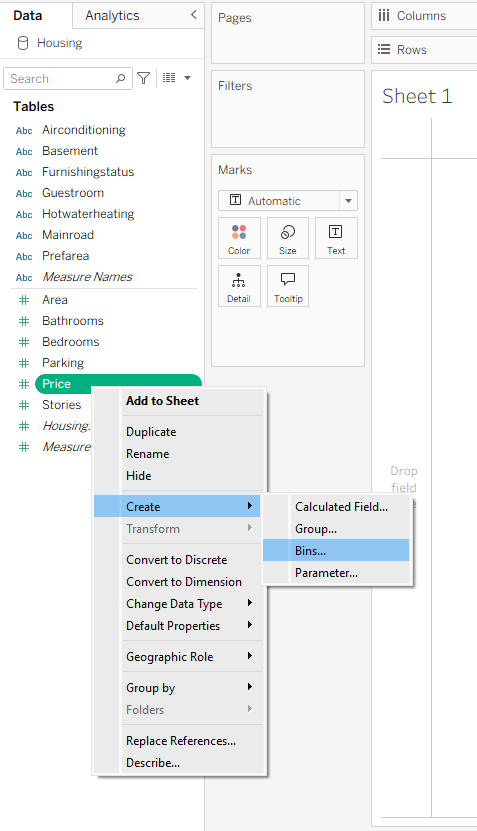
Let’s say you want to group houses into bins based on their price to get a clearer picture of the price distribution. To do this, right-click the Price pill, hover over Create, and then select Bins from the menu.
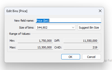
This opens the Bins dialog box, where you can set a name and choose the size of each bin. By default, Tableau suggests a bin size based on the data in your dataset. You can restore this default at any time by clicking Suggest Bin Size. You also have the option to define your own bin size. For this example, we’ll stick with Tableau’s default bin size of 544,902.
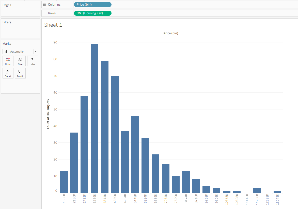
This creates a new blue pill in the Data pane called Price (bin), marked with a small blue histogram icon. Drag this pill to Columns to create your bins, then drag Housing.csv (Count) to Rows. This plots the number of houses within each price range.
Using Parameters to Create Dynamic Bins
If you want more flexibility in defining your bin size—or you want to experiment with different sizes depending on what you’re analyzing—you can use dynamic bins instead. To do this, right-click the blue Price (bins) pill and select Edit. In the Bins dialog box, click the arrow next to the Size of Bins field and choose Create a New Parameter.
This opens a Create Parameter window. Name your parameter Price Parameter, set a default value (here, we’ll use 500,000), and change Allowable Values from Range to All. This makes your parameter more flexible and future-proof, especially if your dataset later includes a wider range of prices.
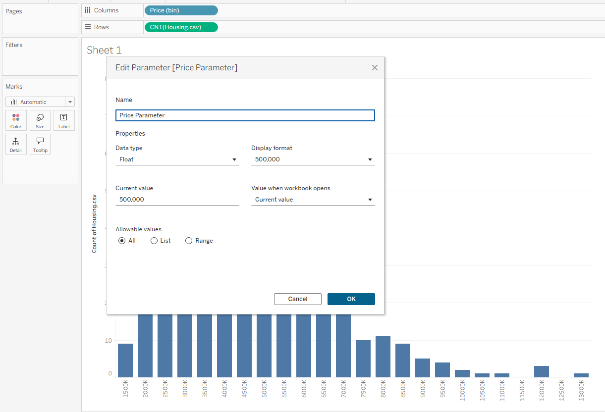
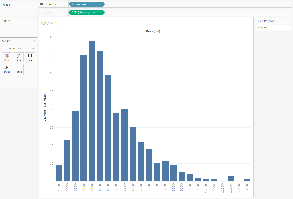
When you click OK, you’ll see the chart update to reflect your new bin size. To display your parameter, click the green Price Parameter pill at the bottom of the Data pane and select Show Parameter. This brings the parameter box onto your view. From there, you can type in any bin size you want, and the visualization will automatically adjust to match.
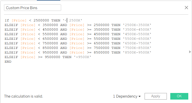
Using Calculated Fields to Create Custom Bins
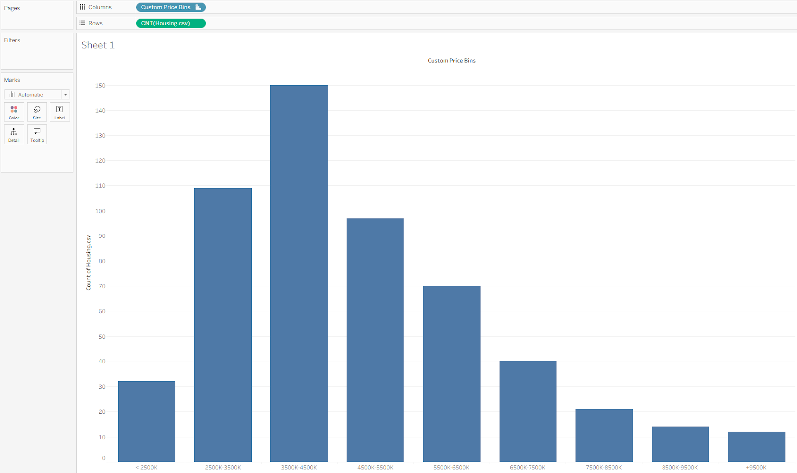
Even with dynamic bins, you might still want more control. Tableau’s default bins only display the lower end of each range, while custom bins let you display the full range. If your dataset is heavily skewed—or if you want to define specific price ranges—creating custom bins with a calculated field is the better approach. In this example, we’ll group housing prices into sets of 1,000,000, covering a range from 2,500,000 to 9,500,000.
Click Save, then drag your new Custom Price Bins field to replace Price (bins) on Columns. You should now see the updated view reflecting your custom bin ranges.
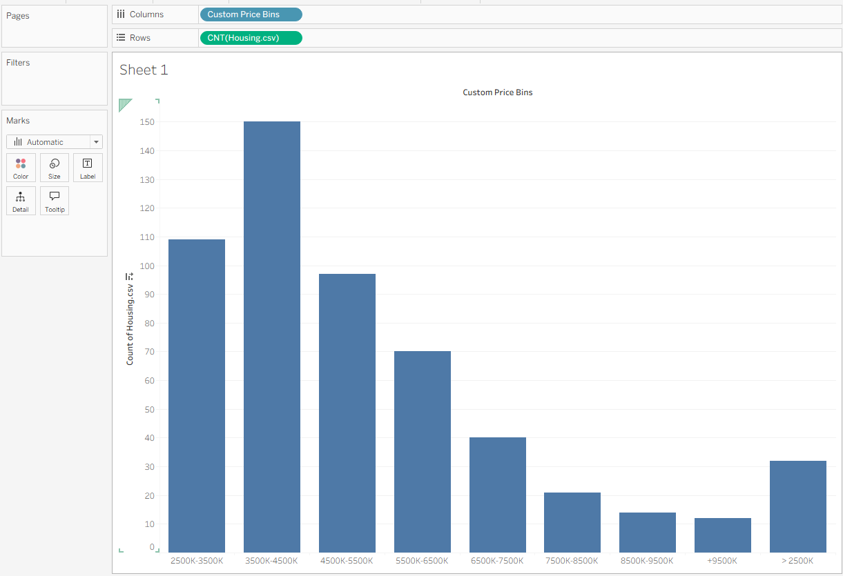
You might notice that the bars are a little out of order, with < 2,500,000 appearing on the right instead of the left. This happens because Tableau is sorting the bins by name. To fix it, simply click on the headers and drag the bar into the correct position so your chart looks like this.