


Waffle charts are commonly used as an alternative to pie charts, as they're really simple to comprehend, and also exhibit a clean aesthetic too, making them very easy on the eye. Below I'll show you how to make one, with the final chart displaying the average percentage discount (%) for orders within Superstore.
STEP 1 - Scaffolding
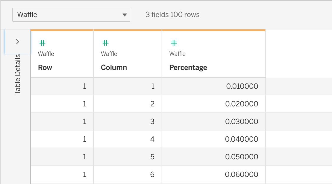
So a key pre-requisite to consider when creating a waffle chart, is scaffolding, which will allow us to create a framework off of which to plot the points for the chart. This comes in the form of a supplementary data source, which, in this case, contains a row and column number for each percent out of 100, with each percent then translating into a circle (or any shape of your choice) within the waffle chart, once finished. The image below shows you part of what the scaffolding dataset looks like, encompassing the first 6% of the chart.
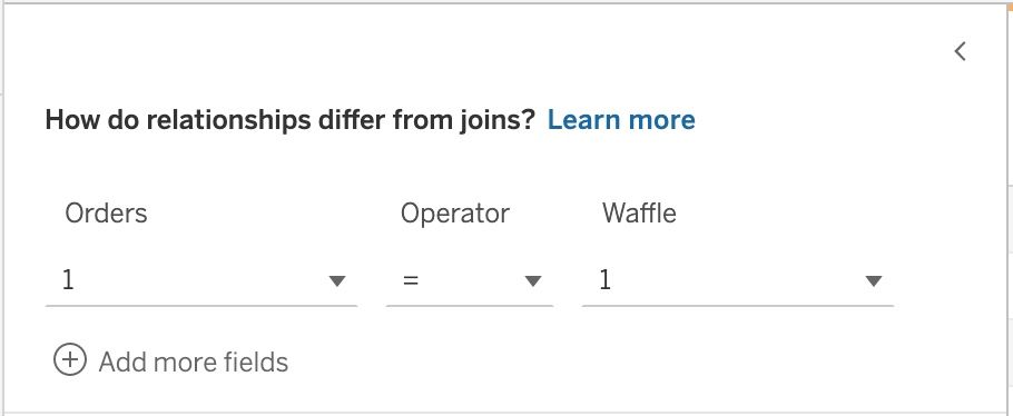
With your main data set already loaded into Tableau, you need to select add connection within the data source tab, and navigate to the the scaffolding dataset that you've saved. Then, drag this onto the canvas to create a relationship with the existing data set, setting the relationship calculation for both data sets to '1'.
STEP 2 - Chart Structure
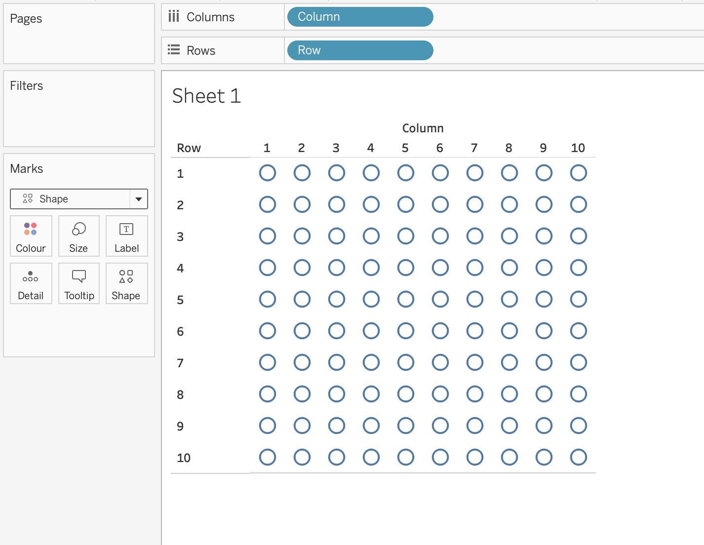
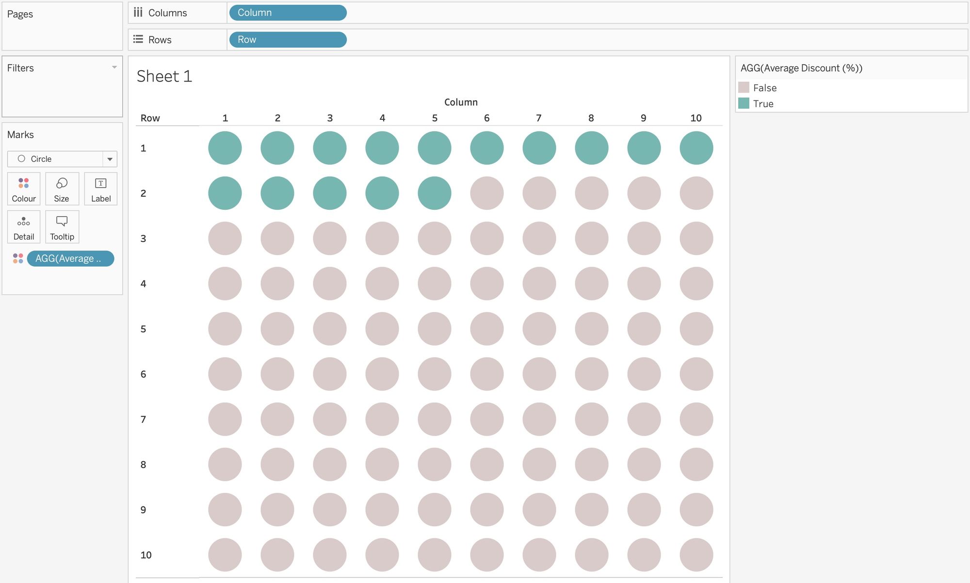
Now we've connected the two data sets, we can get started creating the structure for our waffle chart. First things first, we need to convert our Row and Column fields from our scaffolding data to dimensions, so just right click on them within the data pane and this option should be visible within the pop up box, or drag them up until the dimension/measure labels appear. After this, we then need to drag the Column field to the columns shelf, and the Rows field to the rows shelf (making sure that they aren't aggregated), with the view now hopefully looking something like this:
Step 3 - Chart Colouring
To actually visualise the average percentage discount within this chart, we now need to create a calculation, like the following:
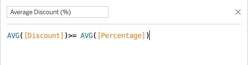
This calculation is essentially a boolean, telling Tableau to colour the boxes dependent on their value of either true or false, with true corresponding to the average percentage discount. After creating the calculation just drag it onto colour in the marks card, with the view now hopefully showing 15 of the circles as true, and the other 85 as false, denoting that the average percentage discount for orders within superstore, is 15%.
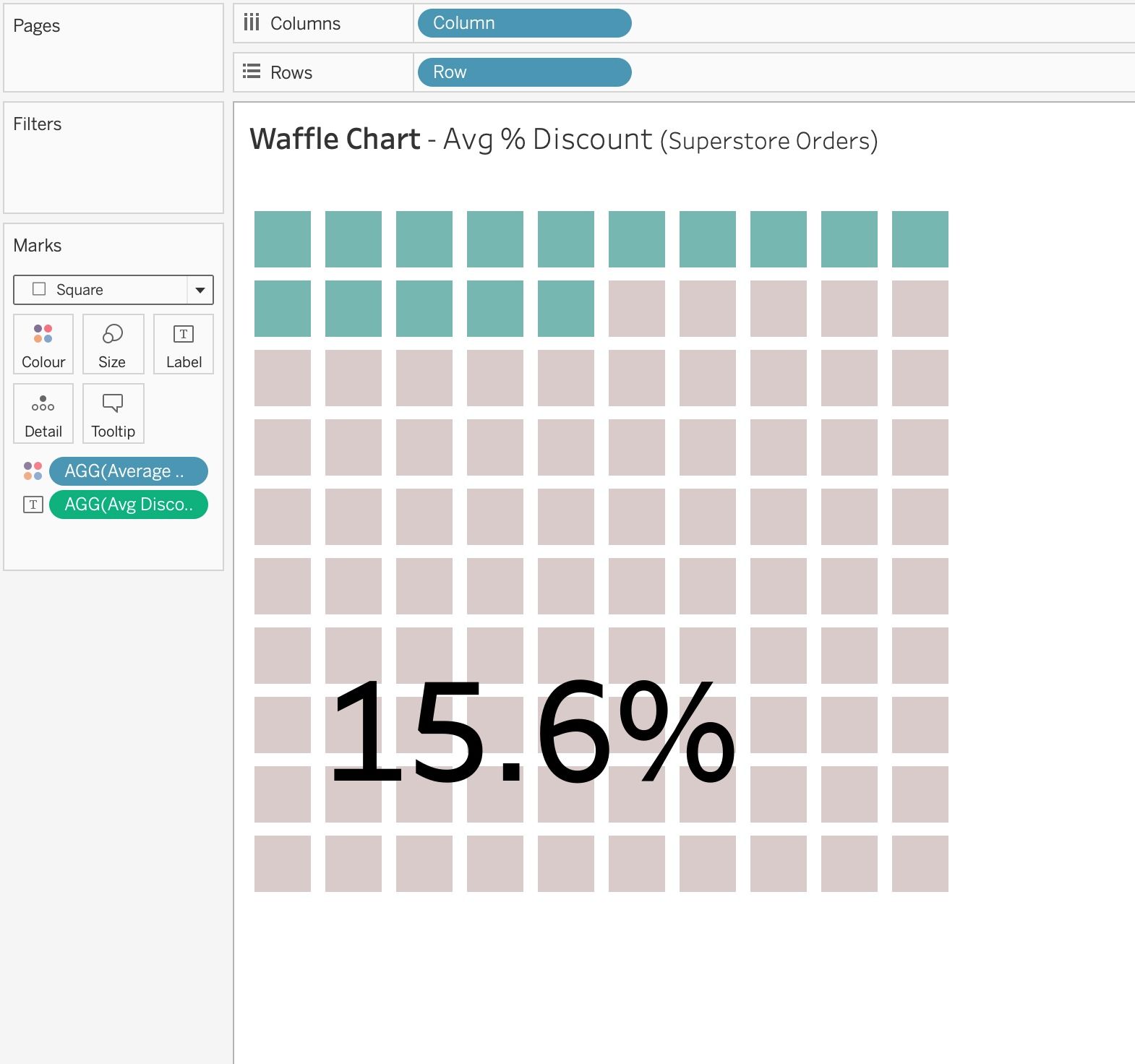
Step 4 - Formatting
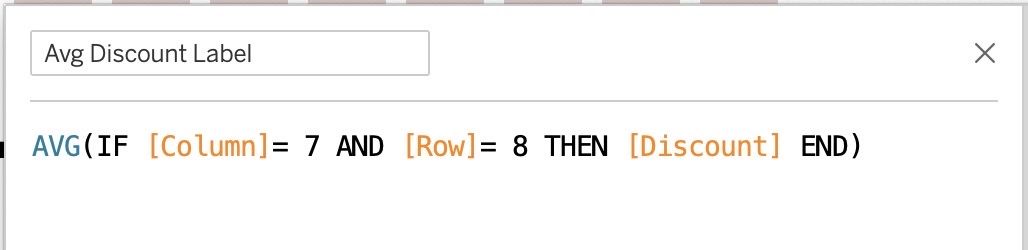
Now all that's left is to format the chart. This part is subjective and is completely up to you, however, I usually aim to hide all of the gridlines, headers, and axis, and then add a label to the chart, keeping the view clean, but informative. The label just requires one more calculation, visible in the image below, which basically just fixes the label to the point in the chart, where the column is '7' and the row is '8'.
After dragging this calculation onto label within the marks card, I also decided that I preferred the waffle chart with squares instead of circles, so I altered it, and ended up with this final view.
Hope this blog helped!