Hex tile maps are really useful if you don't want the size of a geographical region to be a key factor for analysis within your dashboard, with each region displayed as a hexbin of equivalent size. It is important to note that as this is a map, your data set must contain fields for both longitude and latitude, as this is what will be used to plot the hexbins in the view.
STEP 1 - Create Parameter
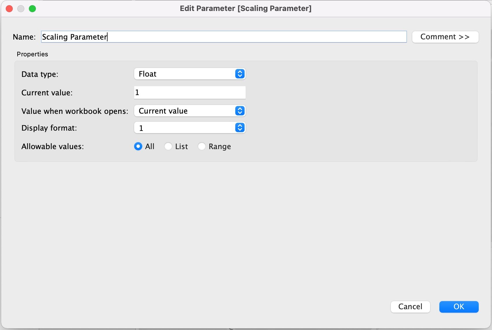
The first thing we need to do is to create a Scaling Parameter, which will allow us to specify the number of hexbins that make up the hex tile map overall; it should have the following set-up.
STEP 2 - Calculated Fields
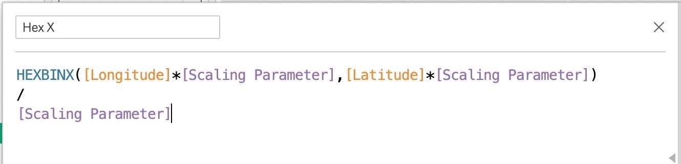
Next, we need to create two calculated fields that allow us to plot our hexbins on a map. The Hex X calculation is going to give us the hexbins in the x-direction.
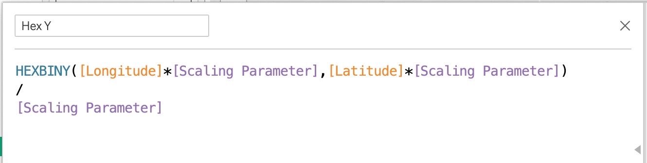
The Hex Y calculation gives us the hexbins in the y-direction.
STEP 3 - Creating the map
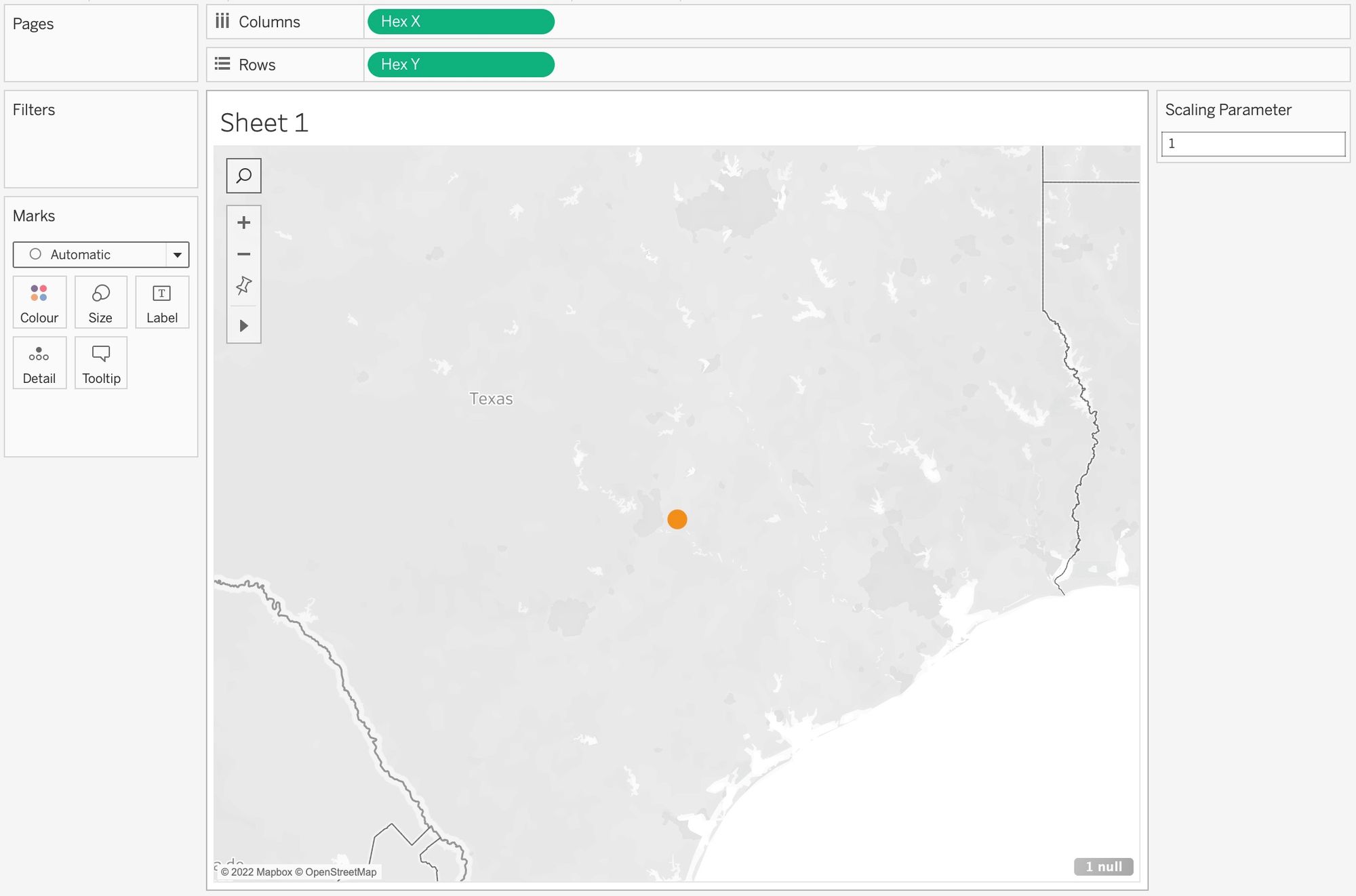
Now we've created those two calculated fields, we need to drag them onto the view, with Hex X on Columns and Hex Y on Rows. Once this is done, you should now be left with something that looks like this:
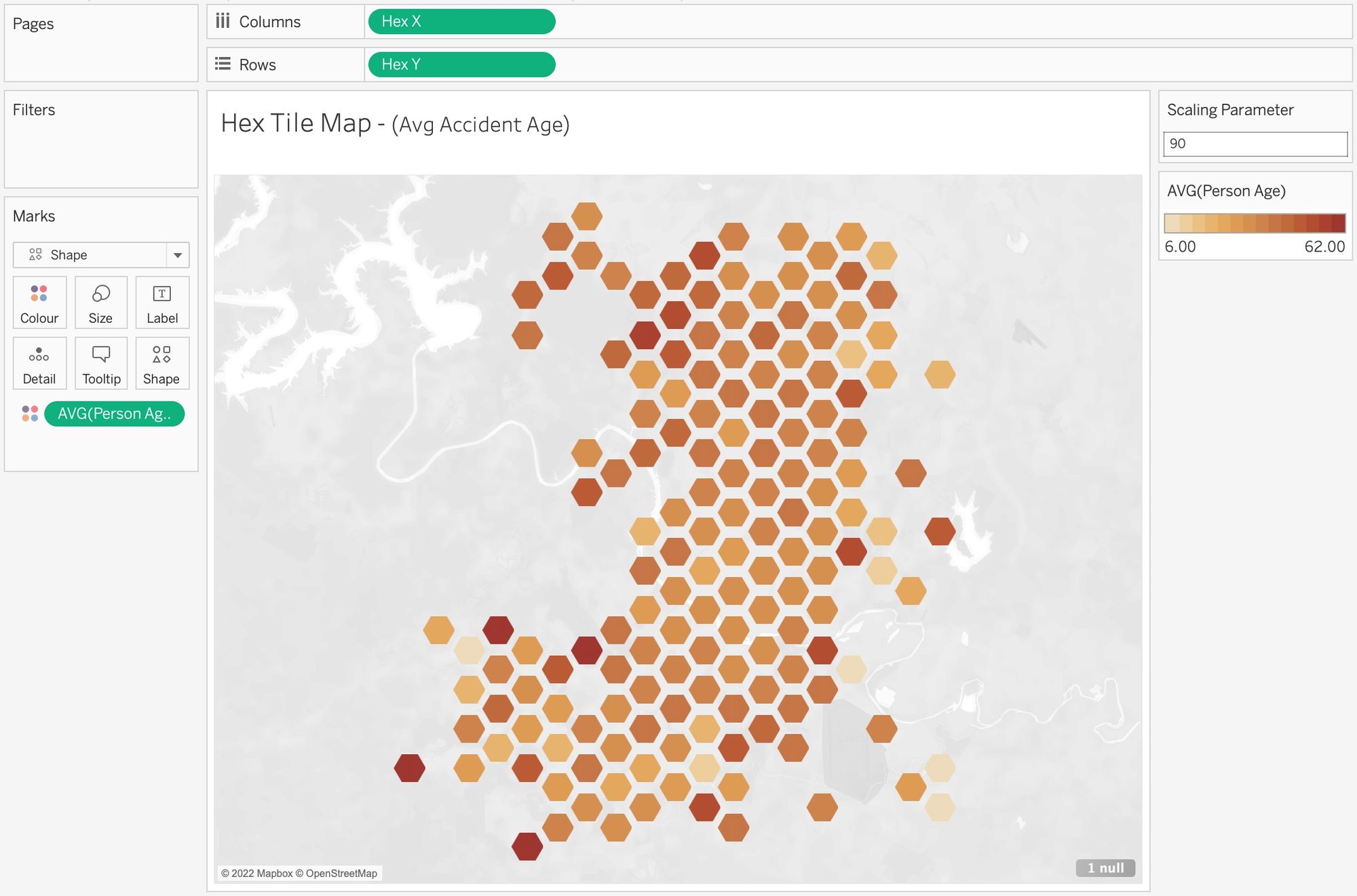
There's just a few more steps to finish it off. Add your chosen metric onto colour, in this case we're going to use Average Age as the data set pertains to bike accidents, and also remember to configure the scaling parameter to determine the number of hexbins in the view; I've chosen to use 90 for my map. Finally, choose Shape within the marks card, and edit the shape to be a hexagon (make sure it's loaded into your shapes folder in your tableau repository), then fit your hexbins on the map uniformly, using the size slider within the marks card. Once complete, it should look something like this.