


Today our task was to create 'an exceptionally designed KPI dashboard' using data from katepennington.org, pertaining to San Francisco property listings between 2000 and 2018 (on Craigslist). We had free range to choose the most pertinent KPI's from the data, so I decided that my use case was going to be:
Allowing property owners to determine a specific price point for their rental property.
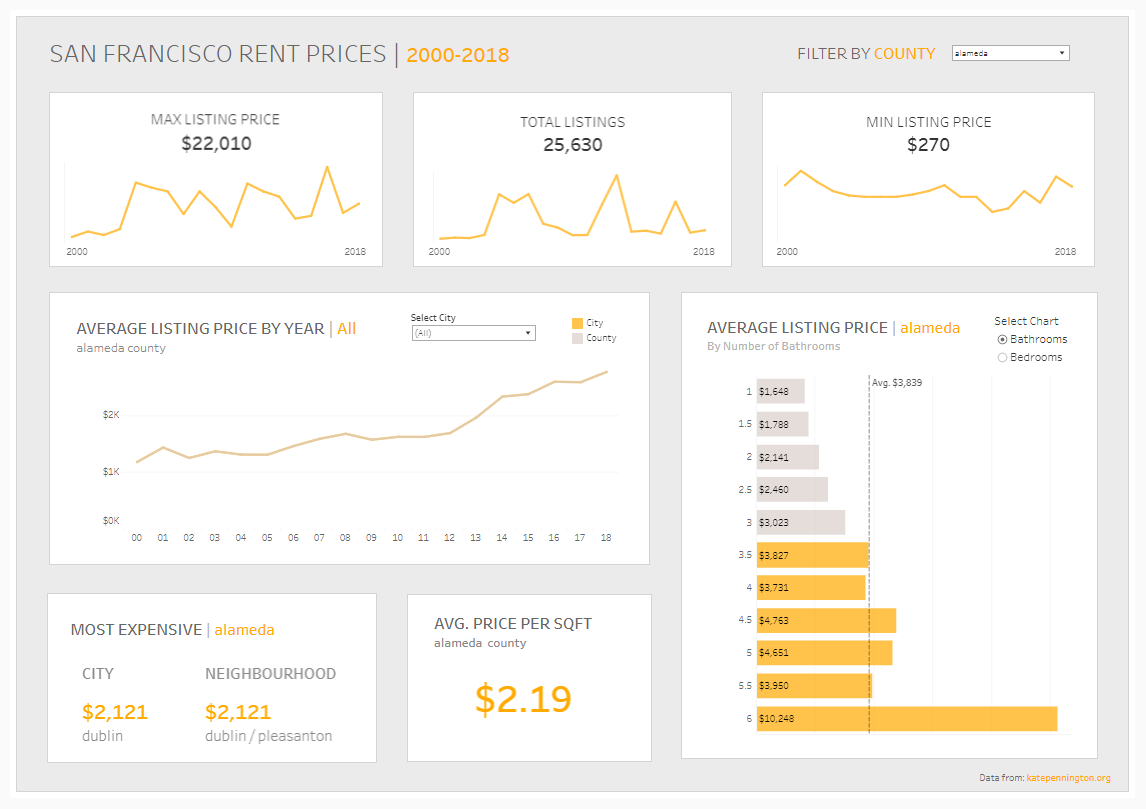
Here's the dashboard that I came up with:
Key Challenges:
Deciding the most relevant metrics to use
- There was a limited number of measures, so required further calculations to garner further insights.
- There was lots of null values in the metrics, so either had to choose whether they were relevant to keep or remove, or dismiss the metric entirely (e.g., longitude/ latitude).
Using LOD's to bring back the necessary values
- For my 'Average Listing Price by Year' chart to work properly, I had to include some LOD calculations, which I did not realise initially. This therefore resulted in some panic on my side, however after asking for some help, I was finally able to get the chart to work properly with both the filter and the parameter.
Formatting the dashboard in the most optimal way
- I like my dashboard's to look clean, therefore I spend a fair amount of time formatting them, which can sometimes impact the amount of time I spend on the content itself.
- KPI dashboard's can come in all shapes and sizes, so was a little bit of a struggle deciding what data to display as text, and what data to display as charts.