


This blog post will provide a step-by-step tutorial on how to create a bar-in-bar chart, so you can give it a go for yourself in Tableau! But first, let's look at why this chart type is useful:
- It is visually appealing for the user
- It allows for effortless comparison between two measures (e.g., 2019 Profit vs 2020 Profit).
- It is very easy to comprehend, so is suitable for use within a wide range of data visualisation contexts.
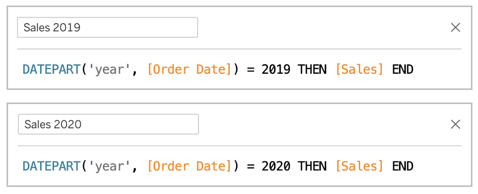
Calculations Used:
Step 1:
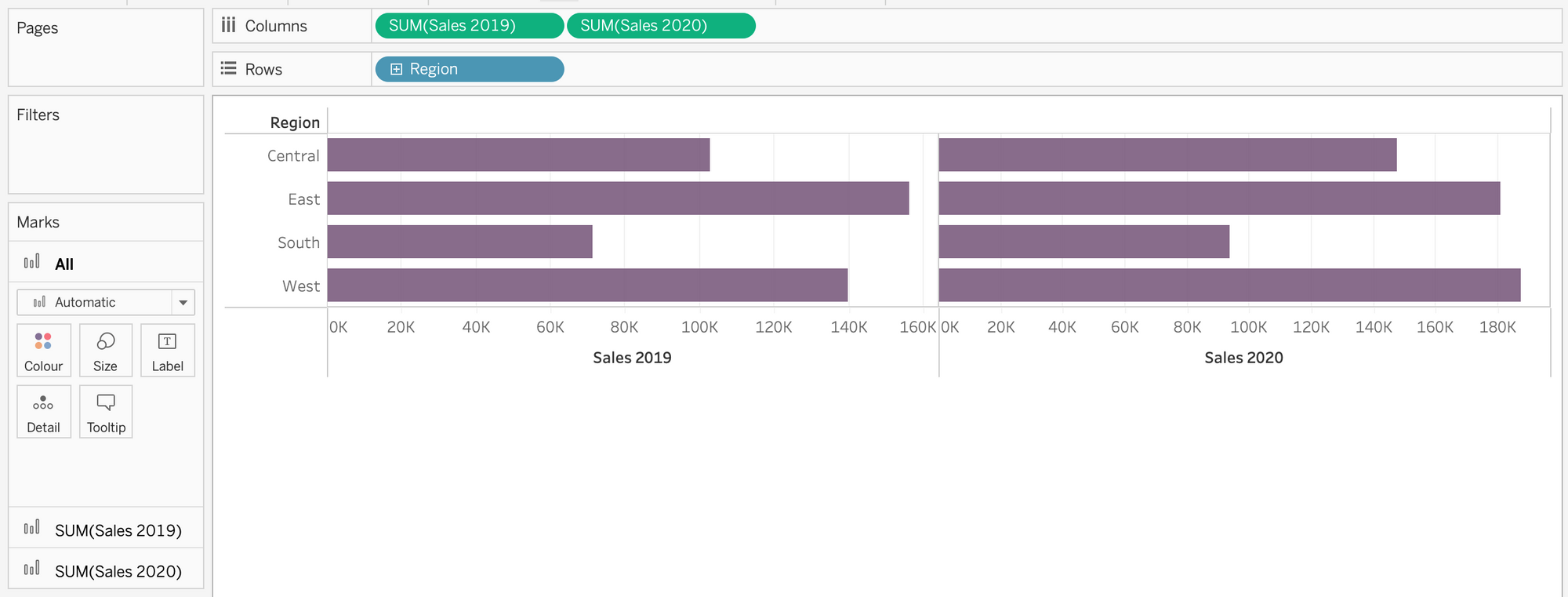
A bar-in-bar chart requires two measures, therefore drag the two metrics you would like to use onto columns, alongside a dimension of your choice on rows. I’m comparing Superstore Sales from 2019 and 2020, by Region. Your view should now have two separate bar charts, and they should look something like this:
Step 2:
Now we have two charts, we need to combine them onto one set of axes to create our bar-in-bar chart. To do this, click on the right side of the right green pill and choose the ‘Dual Axis’ drop down. Your view should now have one bar chart, with two measure names on the right, and a marks card with three tabs:

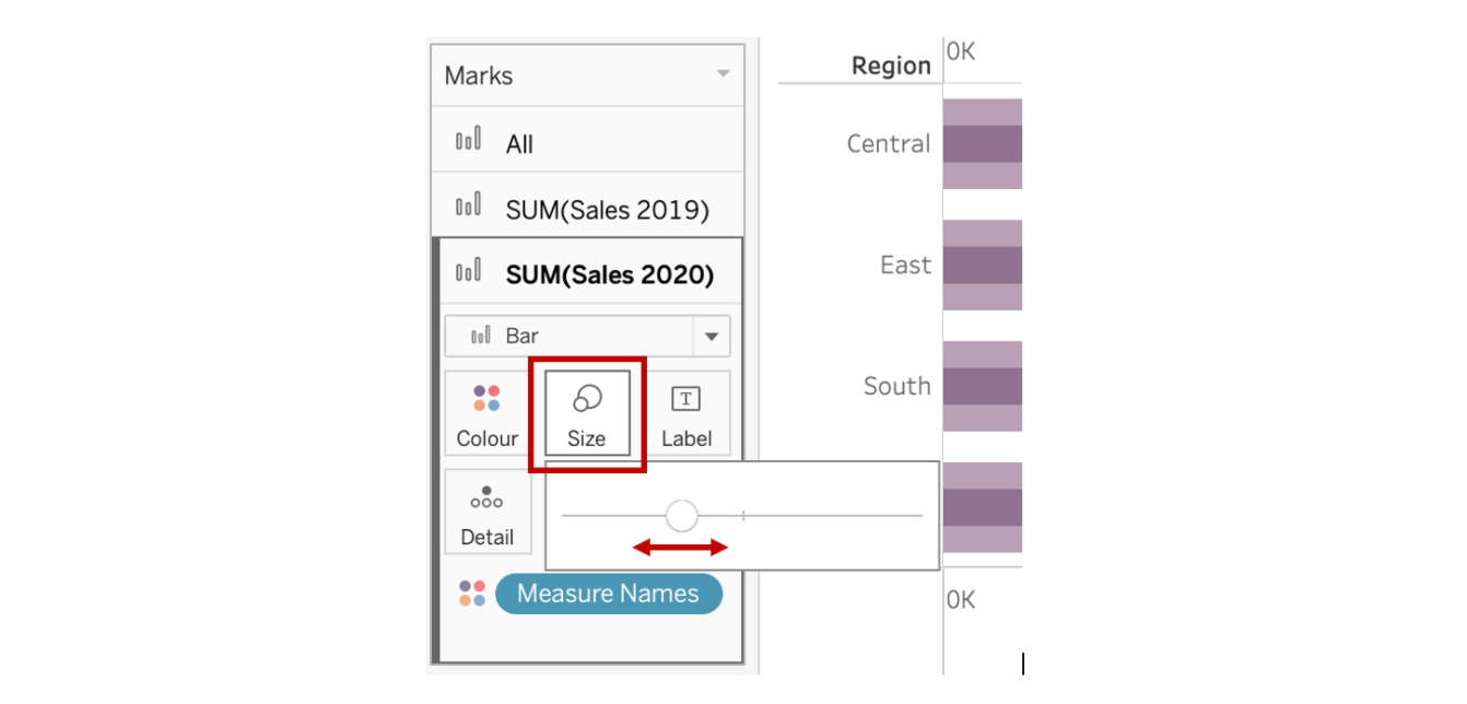
Step 3:
We obviously want to be able to differentiate between the two metrics, therefore the bar size of one of the measures must be reduced next. This can be done by clicking on the marks tab of the specific measure, and utilising the slider on the ‘size’ button; for this example, I will be reducing the bar size of Sales 2020.
Step 4:
Only the last little bits of formatting left now! First remove the second header by right clicking on it and unticking the ‘show header’ drop down; also rename the remaining header. Next you can configure the grid lines to your liking (right click on the chart and choose format), and change up the colours so they’re more appropriate. Finally, add a title if you haven’t already, and remember to synchronise the axis too (if necessary); just right click on one of the measure headers and click the ‘Synchronise Axis’ drop down.
Your completed chart should now look something like this:

Hope this helps!