


Everyone knows Tableau is a good choice for displaying geodata. I'm sure we've all seen some map of the world before, where each country is colored by some metric. A filled map just makes it very easy to compare different geographical entities with regards to a specific measure. But have you seen a map like this before?
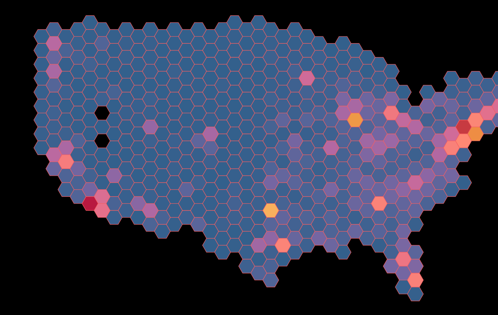
Or better yet, would you know how to build one off the top of your head? Why even bother, you say? Good question. What is the advantage of a map consisting of little discrete shapes of seemingly arbitrary size over the typical one divided by actual geographic boundaries, like country or state borders for example?
Some Advantages of a Hexbin Map
This might be somewhat subjective, but these are some advantages that come to my mind:
Visual appeal
There's just something to that clean look of well-chosen bin size and colors in a hex map that's lacking in a typical filled map.
Reduced bias
The typical geographical borders might elicit a positive or negative bias in the person viewing the visualization.
Flexibility
As you'll find out in the next section, you can use a parameter to smoothly change the aggregation level: The bigger the bin, the less granular the view.
Discrete space
Hexbins are a pretty straight-forward way to discretize 2D space into areas of equal surface area.
So how to build it?
The Adjusting Parameter
Obviously you need some geodata to display. So let's assume you have latitude and longitude fields. You'll create two calculated fields and one parameter in total. Let's start with the parameter. Right-click somewhere in the data pane, select 'Create' -> 'Parameter...'. Set it up as type integer, allow a range of values (e.g. 1-300), enter some default value at 'Current value', e.g. 100, and call the parameter 'Adjust Hexbins'.
The Calculated Fields for the Spatial Data
Now you need to integrate the parameter into the spatial data. Right-click somewhere in the data pane again and choose 'Create' -> 'Calculated Field...' this time. Enter 'hexbin_x' as name and enter this calculation below:
HEXBINY([Latitude] * [Adjust Hexbins], [Longitude] * [Adjust Hexbins]) / [Adjust Hexbins]
If your coordinate fields are named anything other than 'Latitude' and 'Longitude', change them accordingly. Duplicate the calculated field you just created, change the name to 'hexbin_y' and alter the code so that it matches this one:
HEXBINX([Latitude] * [Adjust Hexbins], [Longitude] * [Adjust Hexbins]) / [Adjust Hexbins]
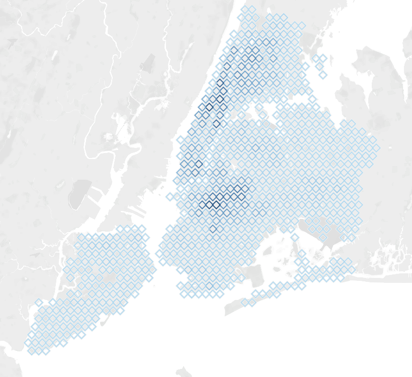
Right-click both fields and set their geographic roles to longitude and latitude. To make use of them, drag 'hexbin_x' onto columns and hexbin_y onto rows. Drag whichever measure you want to visualize onto color. Switch the marks type to 'Shape' and use any shape you like. No need to limit yourself to hexagons, as you see in the example below:
Finally, use the 'Size' slider on the marks card and your parameter to find the right size of your bins and enjoy the nice visualization you just created!