It’s day three of dashboard week and we’ve been tasked with Vizualising some more survey data, this time from a Harvard University survey of Electricity access in India. What makes this challenge slightly different from Monday’s is that for this one, we need to Parse the question headers from a PDF, not the easiest of challenges.
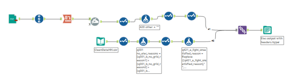
Immediately, my mind went to Tableau Prep because of its integrated PDF parsing, but when I had a look at the PDF itself, I thought I’d give it a go using Ollie Clarke’s PDF parsing Macro in Alteryx. This worked pretty well but there was a new challenge. Most of the headers didn’t match up to the response data from the CSV, meaning it wouldn’t be a simple case of Unioning the two together once I’d extracted the header. At this point was faced with two options: define my scope and only clean and extract the fields I needed, or do a more through job of extracting and cleaning leaving me more fields to explore. Given that I was also delivering my Webinar during lunch, I decided to do the former. As a result, my Alteryx workflow is too much to look at:
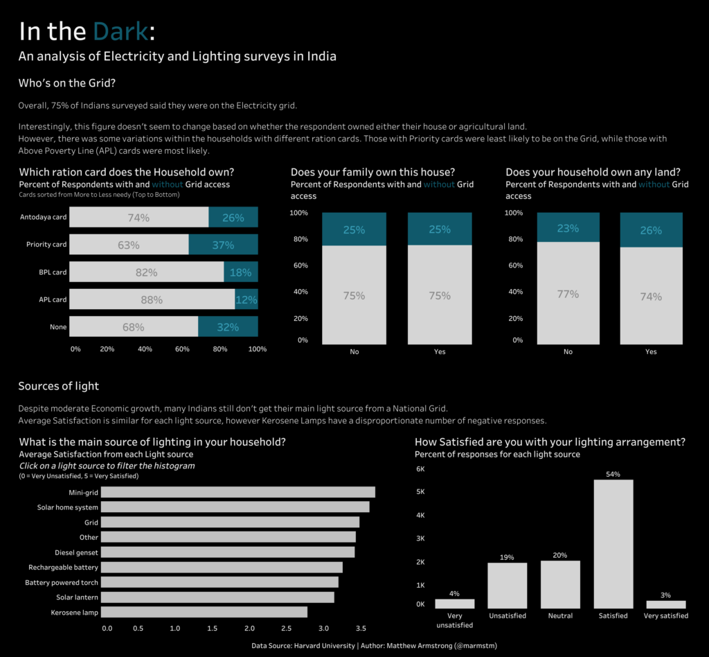
Once in Tableau, I was vastly limited in terms of what I could Vizualise since I had only extracted a small sub-set of the fields. However, either by luck or great judgement, the fields I had chosen developed into a fairly decent story. I decided to keep the analysis to a minimum, focusing on the different sources of light reported by the respondents and how each scored in terms of satisfaction.
In an apparent throwback to Monday, all my charts turned out to be bar-graphs (I swear I don’t do this consciously), with a couple of stacked bars thrown in for good measure:
Here’s the final product: