Sometimes we want to give our readers additional context to better understand what they are looking at or highlight areas we want them to focus their attention on. An example of that could be introducing averages and average lines. In a typical scenario, a simple average line throughout the graph could provide us with that benefit of additional context, but a thin line is usually hard to see and in certain cases, it makes it difficult to differentiate the values that are above the average from the ones that are below. To fix that, we can use the power of preventative processing and utilize colour in differentiating our values. In other words, we can colour bars that are above the average differently than the ones that are below.
But how could you do this on Tableau? The answer - by introducing a new calculated field that utilizes a function called WINDOW_AVG. This function allows us to look up the average within the window and use it within our calculations.
Let's see how it works!
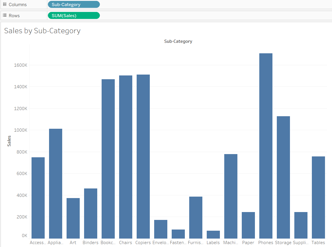
For this example, I used the Global Superstore dataset, you can download my workbook here in case you want to follow along. First, drag Sub-Category to the columns and Sales to the rows, as per the example below:
After that, bring in the average line. This can be done by navigating to the Analytics pane and dragging Average Line onto your canvas.
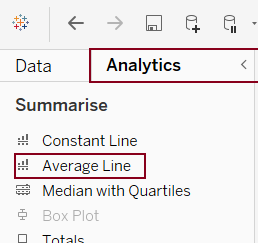
When you start dragging a small window should pop up with different options where reference/average line should be added. Choose the option for the whole table. This should bring in the average line into your chart display:

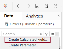
Now we need to create our new calculated field. Navigate back to the Data Pane (to the left of Analytics Pane) and click on the little down-pointing triangle next to the search bar. Select Create Calculated Field.
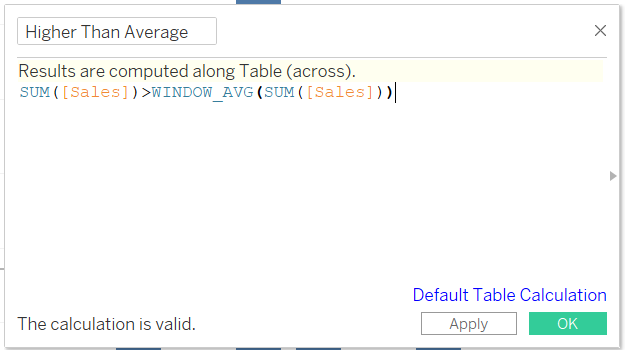
In the window that opens up, type:
SUM([Sales])>WINDOW_AVG(SUM([Sales]))
This calculated field queries each column and checks whether it is above the window average, if it is, the calculation returns True, if it is not, it returns False. We need to use WINDOW_AVG in this case, because it looks at the average value for all columns, while the AVG function would look for the average value for each of the columns.
After you finished typing the calculation, give it a name (I named it Higher Than Average) and hit OK.
You should now be able to see your newly created field on the Data Pane, next to your measures:
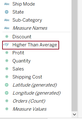
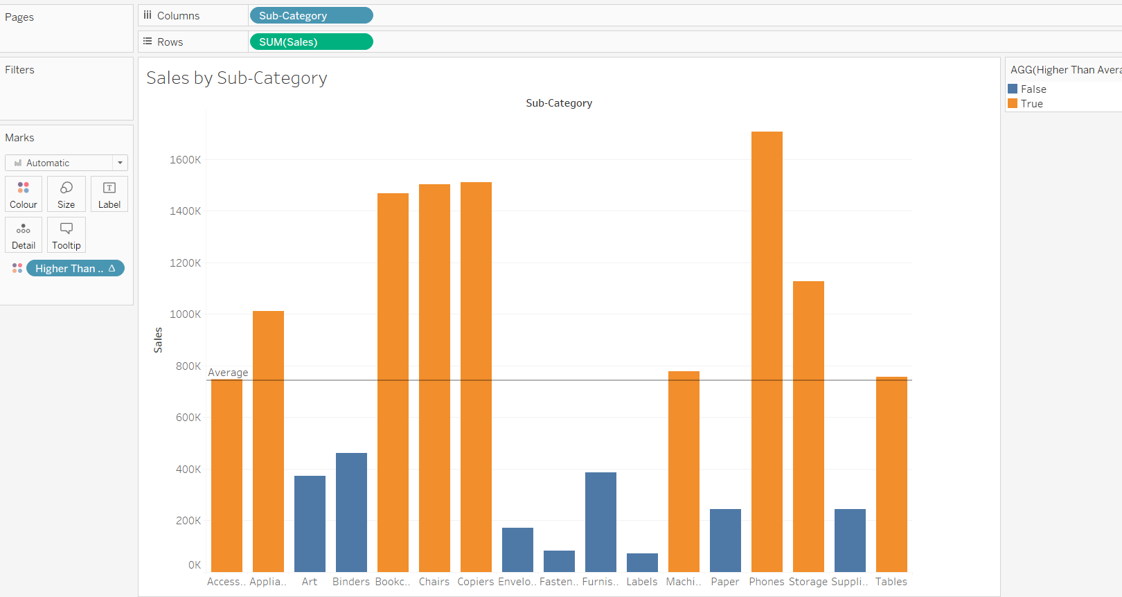
If you take this field and drag it onto colour in your Marks Card, you should see how your bars get coloured based on whether they are above or below the average.
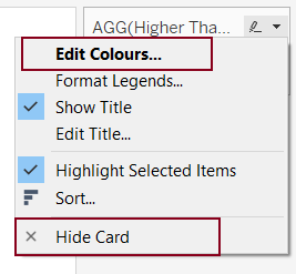
On your colour legend (to the right of your chart) you can also edit your colours, format your legend or choose to hide it. To access the selection menu, hover over your legend and select the downward-pointing triangle.
I decided to change bars colours, but your final result should look similar to this:
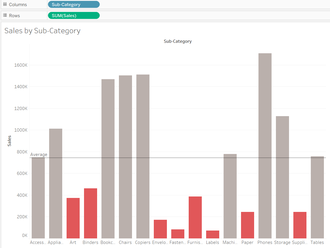
You can download this workbook from my Tableau Public profile.
