


Today I want to share with you how to insert a diagram into a tooltip in Power BI. It’s actually very easy to do.

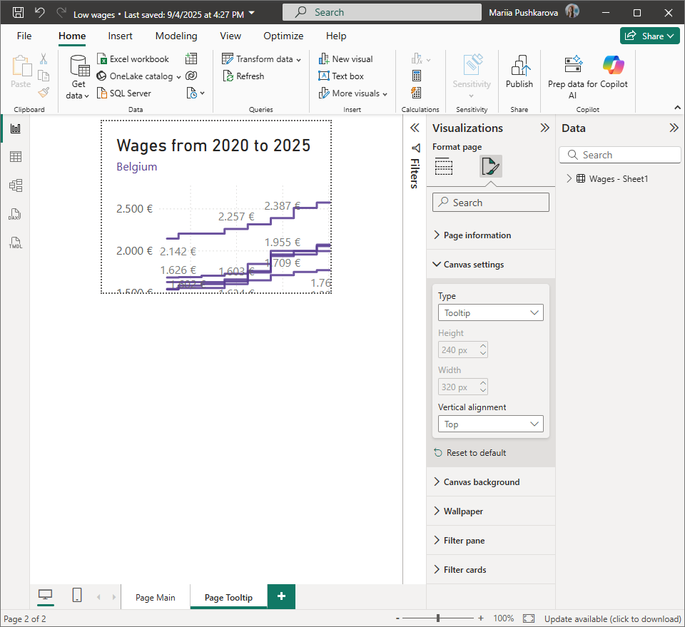
First, we create our main page with the dashboard, and then a second page that we want to use as a tooltip. After that, go to Settings → Visualization → Canvas settings, and set the page type to Tooltip. Don’t worry if the page size looks wrong at this point — we can adjust it later.
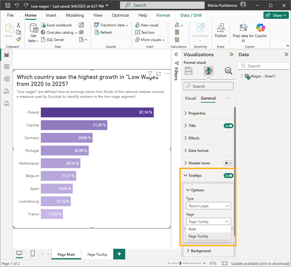
Next, go back to the main page, select your diagram (or the whole page, as in my case), then go to Visualization → General → Tooltips, switch it On, choose Report page, and select the page you created for the tooltip.
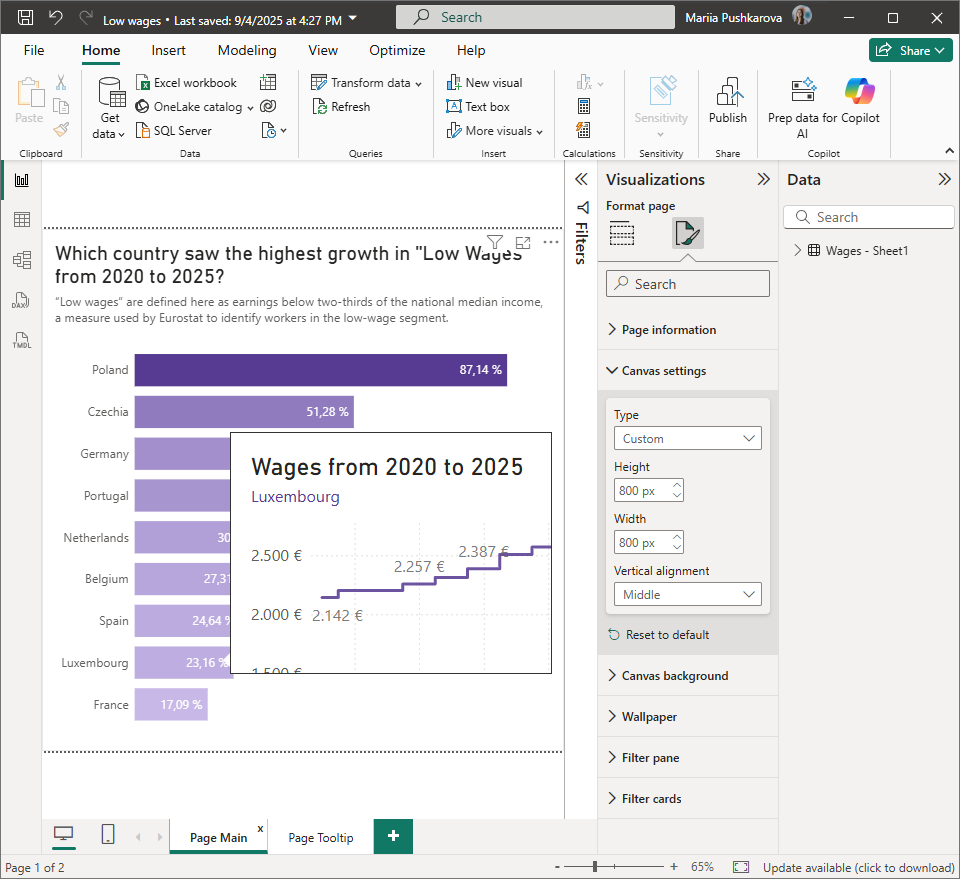
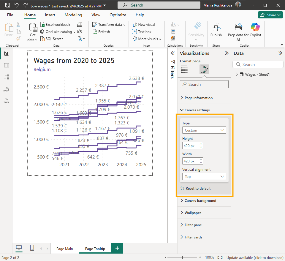
It already works, but we may need to adjust the size of the tooltip. If you want to make it bigger, go to the tooltip page, change the type to Custom, and set your preferred height and width. These changes will automatically apply to your tooltip.
That’s it — simple, but very effective for showing clients extra details when they need specific information.