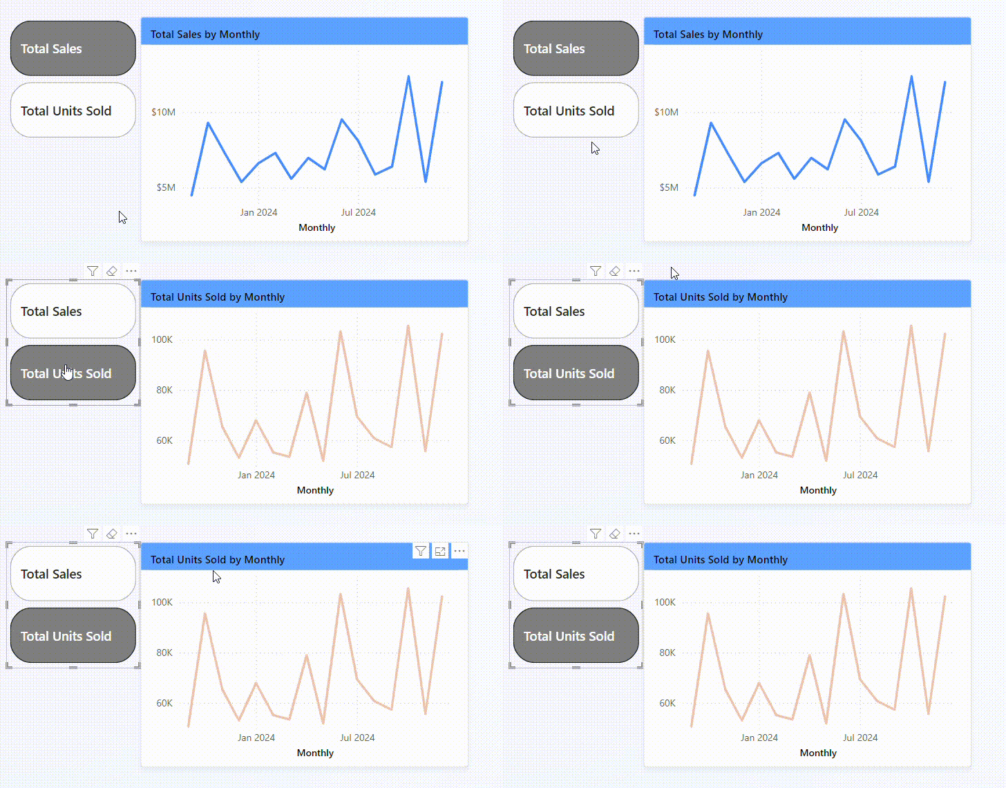
Power BI has many great functions. Some of them are even very similar to those of Tableau. One of these functions is the use of parameters, e.g. to dynamically swap a measure in a chart. I would like to share with you how this works in this blog post.
What do you need for this? A data set with two measures, such as Sales and Profit. In the demo I use a data set from a Workout Wednesday. You can find the link here: https://workout-wednesday.com/pbi-2024-w28/
The aim of this blog is to swap the measures Sales and Units sold dynamically with buttons in the chart. We are starting by building a line chart.
Step 1: Create a chart
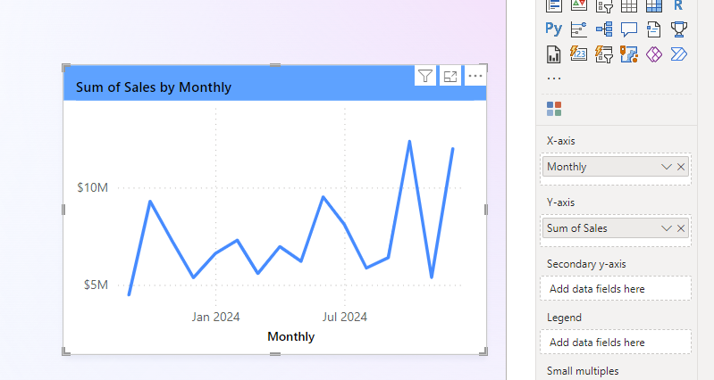
In the line chart the column Monthly (date) was placed on the X-axis and the column Sales on the Y-axis. The chart looks as followed:
Step 2: Create measures
In order to create the parameter new measures have to be generated. This new measures are aggregations of the original measures. In our case we use the Sum of Sales and the Sum of Units Sold.
To do this, you just have to right-click in the right-hand bar (Data) and select "New measure".
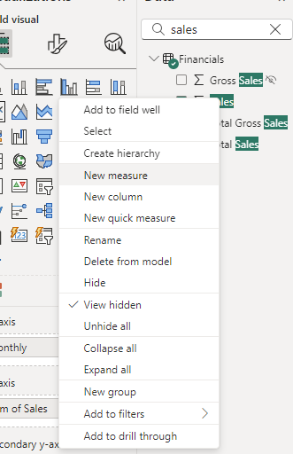
A bar will open up above the report canvas. Here you can change the name of the new measure and write the SUM calculation. It looks like this:

Step 3: Create the parameter
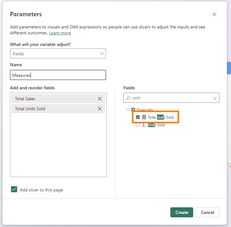
Now we can beginn to create the parameter by selecting Modeling in the menu bar, going to New Parameter and clicking on Fields. Select the corresponding measures in the new window on the right-hand side. The new measures have a calculator symbol before their name.

Step 4: Replace the original measure with the parameter in the Y-axis
Now you can drag the new parameter into the Y-axis and remove Sales. As soon as this is done, a slicer is automatically created. The chart should now change according to the selected measure.
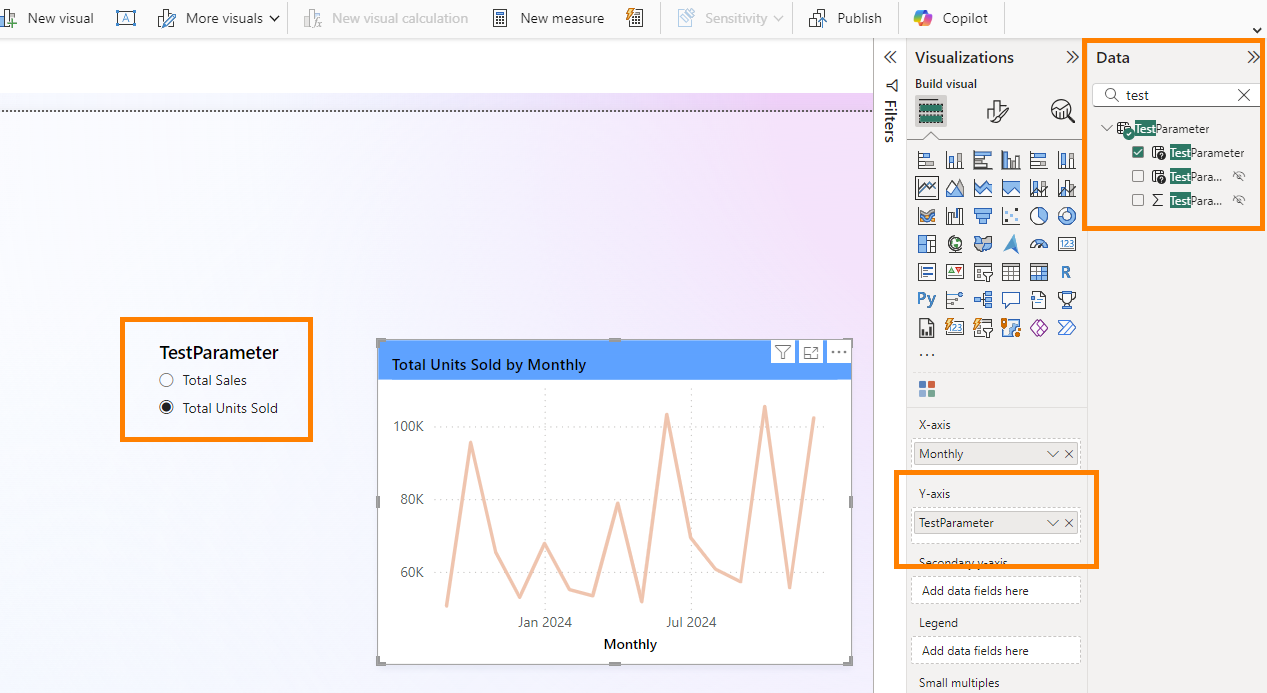
Step 5: Customise slicer
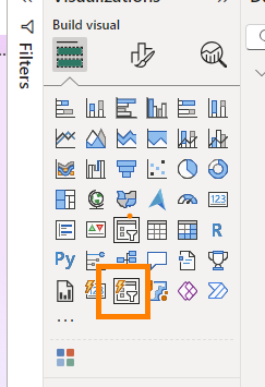
Of course, we don't have any buttons yet. To create these, we only need to select the Slicer (new) in the visualisation selection.
Afterwards the slicer can be customised in terms of shape, colors and layout in general.
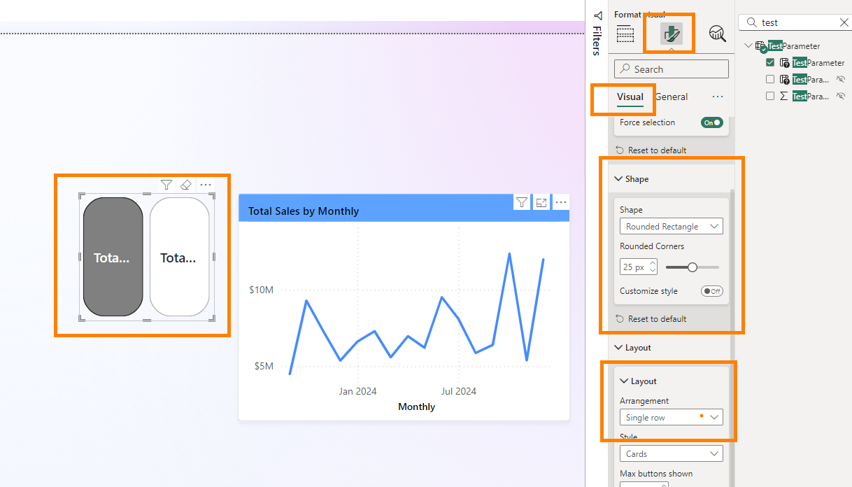
Result:
Now we are finished and the result should look something like this:
