Have you ever wondered how you can actually visualise a KPI in Power BI in which you can also display the percentage comparison to the previous month?
I asked myself this question last week in the Dashboard week and would like to share my solution with you in this post. I am using the Superstore data set for the exemplary visualisation. Our goal is to display a sales KPI.
Step 1 Create Previous Month & MoM (Month over Month) column
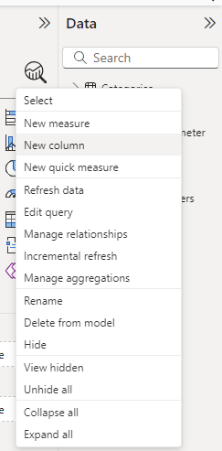
To display the percentage change compared to the previous month, we can follow three steps. In the first step we need to calculate the previous month. This requires a New Column. Make a right click within the data selection on the left side.

An input field opens directly below the top menu bar in which you can enter the following formula.

Step 2 MoM (Month over Month) column
Based on the Previous Month calculation, we can now create the desired Month ofer Month calculation. To do this, create a new column and enter the following formula:

As soon as this is done, you should make sure that you switch the calculation to percentage. You can do this above the calculation with the percentage symbol, as you can see here:

To test whether your DAX formulas work, you can create a table in which you enter the date, the ‘normal’ sales, the previous month and the MOM calculation. This can look like this

Step 3 Visualise
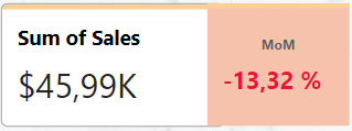
Based on these new calculations, you can now design a KPI according to your wishes. Although there are already KPI visualisation options in Power BI, in my example I have decided to work with two card representations that I have positioned so that it looks like one card visualisation. You also have the option of working with conditional formatting so that the user can quickly recognise whether there is a minus or a plus compared to the last month. Here is an example of a negative development compared to the previous month:

I hope you enjoy building your KPI!
