On the last day of our Dashboard Week, we had the opportunity to work on a personal data project and design a Tableau dashboard accordingly.
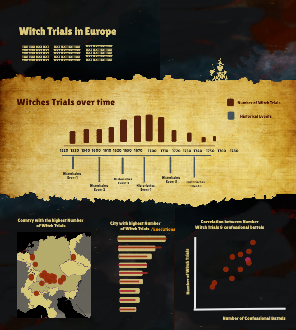
I have chosen the topic of Witch Trials in Europe because I came across a great data set by chance and wanted to try my hand at visualising historical data. The central element was to be the timeline, which not only shows the number of witch trials, but also which historical events took place at that time in order to better understand why, for example, there was an increase in witch trials at a specific time. In addition, I wanted to analyse geographically where most of the witch trials took place and how the number might also correlate with the number of confessional battels between protestants and catholics. My first sketch looks like this:

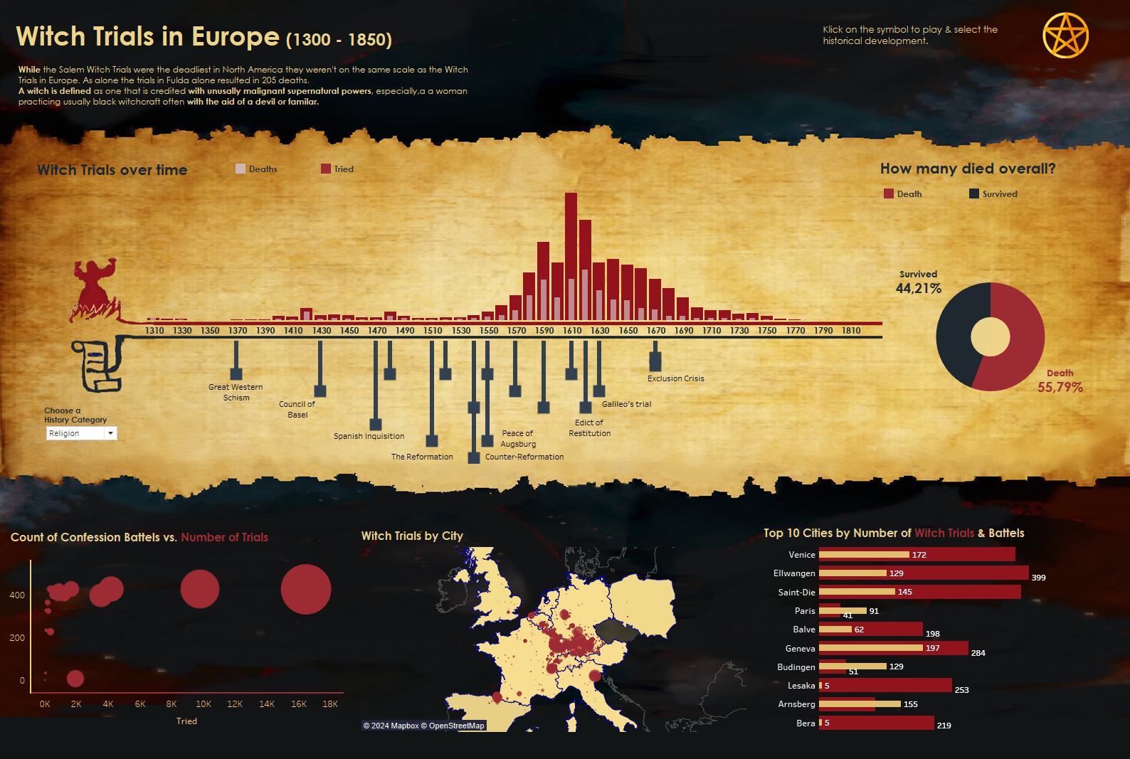
Overall, I am very happy with the first version of my dashboard, even though there is still a lot of room for improvement. I was able to realise my ideas and even expand them, for example I added a filter to the timeline so that the historical data can be selected by category, such as religion or witch craft related historical events. I have also added a donut chart that shows how many of the people accused of being witches were executed. The first version of my dashboard looks like this:

Feedback & next steps
As this is of course only the first version, there are still a few points that I would like to adapt further. For example, I have the idea of providing the entire dashboard with a standardised animation so that the user can really see how the story develops before their eyes. In addition, I have received valuable feedback that I could do without the donut chart to give the timeline more space.
