


Slicers are one of the most powerful tools in Power BI for creating interactive and dynamic reports. They allow users to filter data in real time and focus on the insights they need. In this blog, I’ll show you how to use slicers effectively and share tips to make your reports more user-friendly.
What is a Slicer and Why Is It Important?
A slicer is essentially a filter element placed on a report page. It allows users to filter data based on specific criteria, such as date, region, or product category. Unlike traditional filtering options, slicers are visually appealing and easily accessible, making them highly user-friendly.
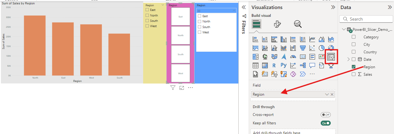
How to Add a Slicer
- Open your report in Power BI Desktop.
- Select the Slicer visual from the Visualizations pane.
- Drag the desired field (e.g., "Region" or "Product Category") into the slicer’s field area.
- Adjust the size and position of the slicer on your report page.
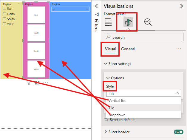
Tip: Experiment with different slicer formats, such as dropdowns or lists, to find the best fit for your report.
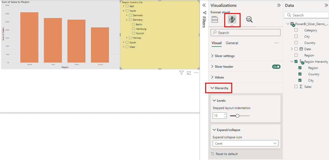
Creating Hierarchical Slicers
Hierarchical slicers allow users to filter data across multiple levels. For example, you may want users to first select a region and then narrow it down to countries or cities.
Here’s how to set it up:
- Add a field with a hierarchy (e.g., "Region > Country > City") to the slicer.
- Enable the “Show hierarchy” option in the formatting pane.
- Users can now navigate through the levels using the arrows within the slicer.
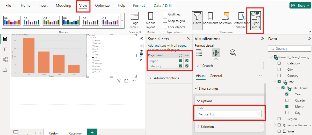
Sync Slicers Across Multiple Pages
With synced slicers, filters applied on one page are automatically applied to other pages in the report.
Here’s how to enable synced slicers:
- Open the Sync Slicers Pane (View > Sync Slicers).
- Place slicers on the desired pages.
- Use the sync pane to specify which pages the slicer should affect.
Tip: This is particularly useful for multi-page reports with consistent filter options.
Slicer Design and Usability Tips
A well-designed slicer improves the user experience:
- Use clear labels to ensure users know what they are filtering.
- Limit the options to avoid overwhelming users. For instance, a date slicer should be constrained to a meaningful range.
- Highlight active filters with visual cues like colors to make selections more noticeable.
Conclusion
Slicers enhance the interactivity and usability of your Power BI reports. They’re simple to implement but can have a significant impact with a bit of refinement. Experiment with different slicer types and options to create the perfect report for your needs.