Ease of use and data visualization
The two leading platforms in the field of data visualization and analysis are Tableau from Salesforce and Power BI from Microsoft. We have now had our introductory training in both. I had already worked with Tableau for my application dashboard. Now I have worked with both programs and would like to show you some advantages and disadvantages of both programs in the areas of ease of use and data visualization.
Tableau
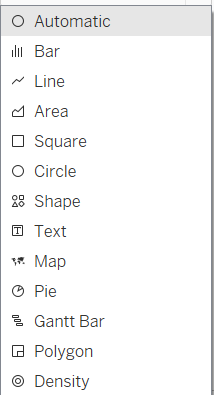
Ease of use: Tableau has a very user-friendly and uncluttered interface. Beginners will quickly find their way around to create simple charts. But more complex charts are also easy to create. Tableau suggests the most suitable chart type based on the data to be displayed.

There are many setting options to display the data optimally. There are many ways to get to the formatting menu of the individual elements, and some are not so easy to find.
Data visualization: Each chart is created on a sheet and compiled into a dashboard. Containers are used to position the individual charts. Filters and interactions can be created between the charts.
Dashboards can be published on Tableau Public and everyone has the opportunity to view my work.

Power BI
User-friendliness: Power BI is a Microsoft Office product. Anyone who has already worked with Excel, for example, will quickly get used to the interface and operation.
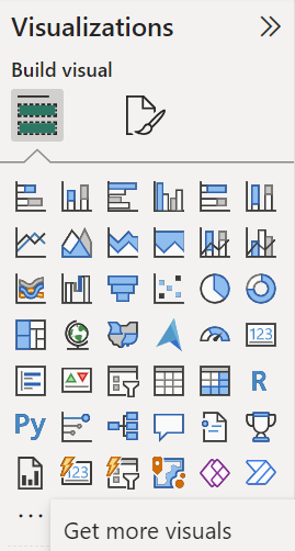
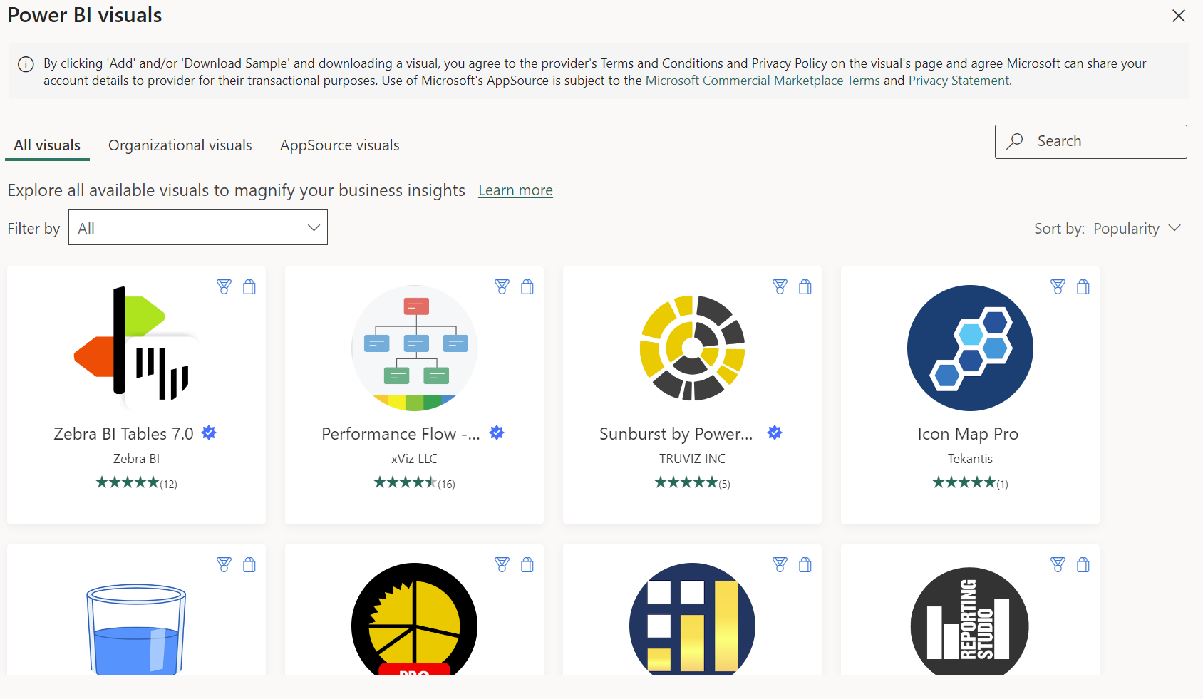
Data Visualization: Visualizations can also be created very quickly here. However, you must first select the visualization type and then insert the data. There is a large selection of visualizations , e.g. a ready-made donut chart. Additional visualizations can be downloaded from the Power BI Marketplace or custom visualizations can be created.


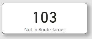
There is also the option of using round corners and shadows in the individual elements.

However, the formatting is more limited than with Tableau.
One drawback I have experienced is that Power BI breaks a date directly into its hierarchy, i.e. day, month and year. To get the date as a whole, you need an additional table and a function to be able to use it again. Working with a map is also not as convenient as in Tableau. When preparing data in Power BI Query, the individual steps are listed automatically. For better documentation, the steps can be renamed and a more detailed description can be added. However, there is NO UNDO function!
Individual steps can be moved and deleted, but you have to be very careful to ensure that the data flow still works. The charts are compiled on a sheet to form a report. All charts are floating and can be moved freely. Positioning lines are helpful here. The individual charts are automatically linked to filters and highlights that can be edited. It is not possible to publish the report in the free version.
Conclusion
Both programs have their strengths and weaknesses. Tableau impresses with its user-friendly interface and advanced visualization options, while Power BI scores with its integration in Microsoft Office and ease of use. The choice between the two tools ultimately depends on the specific requirements and, of course, which product the customer is working with.
