


Scatter plots are a great tool to visualize the relationship between two measures. They become even more powerful when you make them interactive. With Tableau, you can enhance scatter plots to allow users to filter, explore, and analyze data points in greater detail.
In this blog, I’ll guide you step-by-step to create an interactive scatter plot that includes drilldowns and tooltips.
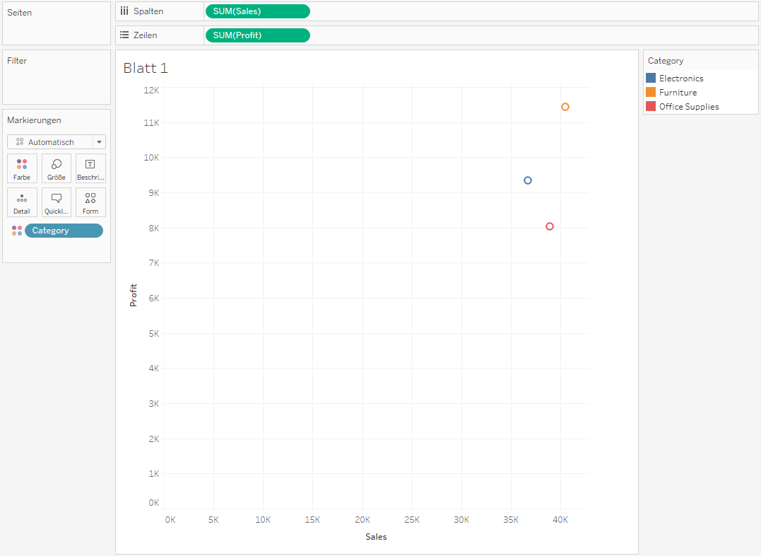
Step 1: Create Your Scatter Plot
- Open Tableau and select your data source.
- Drag one measure (e.g., "Sales") onto the Columns shelf and another measure (e.g., "Profit") onto the Rows shelf.
- Tableau will automatically create a scatter plot.
- Drag a dimension (e.g., "Product Category") onto the Color mark to differentiate data points by group.
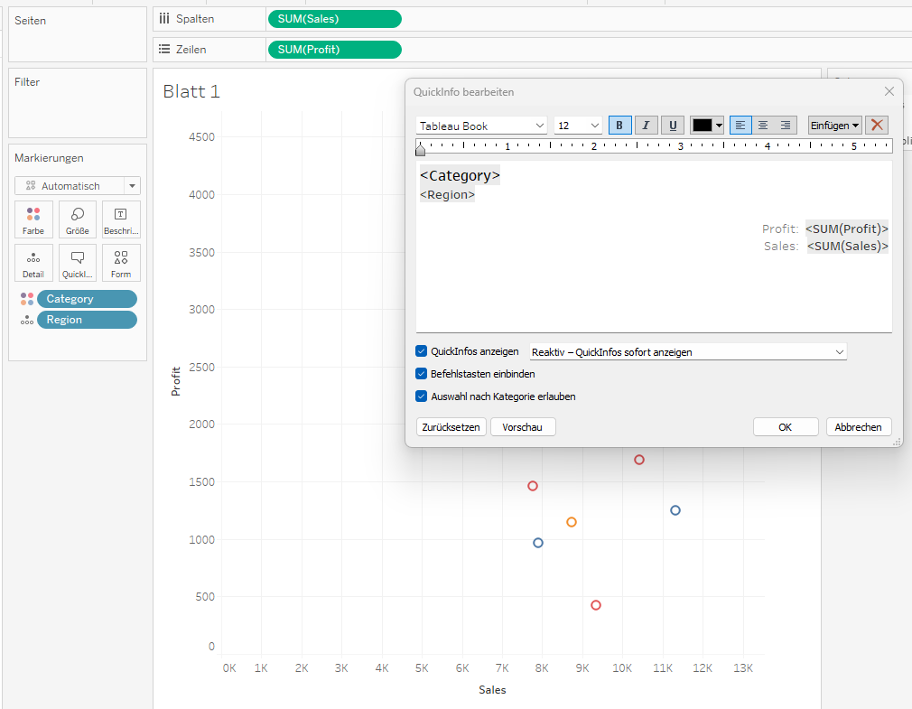
Step 2: Add Tooltips
Tooltips are a simple way to provide more information about a data point:
- Click the Tooltip button in the Marks card.
- Edit the tooltip text by adding dynamic fields such as
Product Name,Region, orDate. - You can also format the tooltip (e.g., bold, colored text).
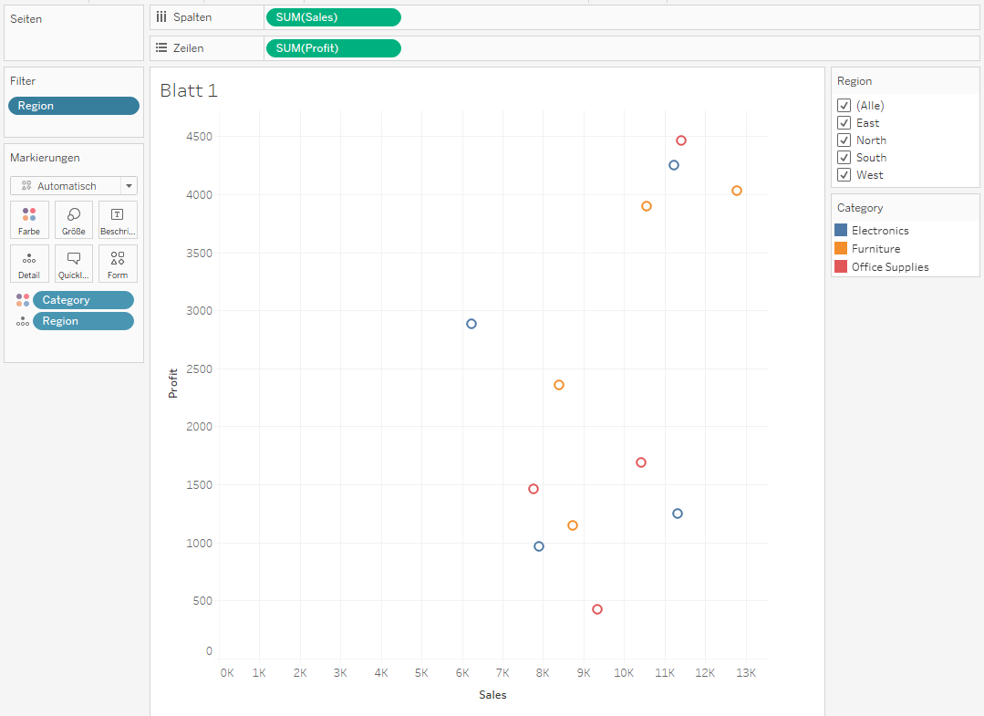
Step 3: Add Interactive Filters
Allow users to filter the scatter plot points by dimensions or measures:
- Drag a dimension (e.g., "Region") onto the Filters shelf.
- Right-click the filter and select Show Filter to display an interactive checkbox on the dashboard.
- Repeat for additional dimensions or parameters as needed.
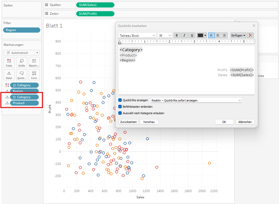
Step 4: Set Up Drilldowns
For detailed analysis, you can add drilldowns to explore hierarchical data:
- Create a hierarchy by dragging dimensions (e.g., "Category," "Sub-Category," "Product Name") on top of each other in the Data Pane.
- Drag the hierarchy onto the Detail mark in the Marks card.
- Click on a data point to explore the lower levels of the hierarchy.
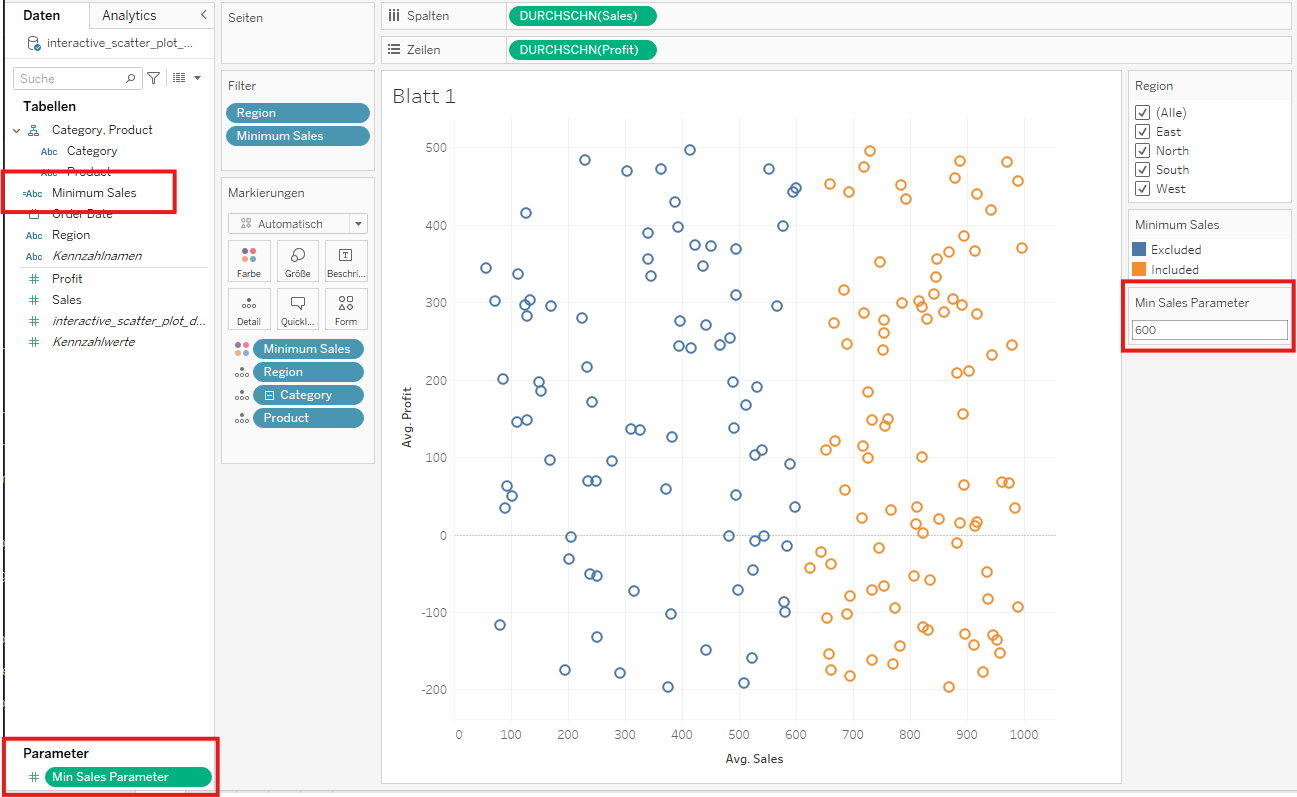
Step 5: Use Parameters for Extra Interactivity
Parameters let users set custom thresholds or select categories:
- Go to Data → Create Parameter, and create a parameter for something like "Min Sales Parameter". Show parameter.
- Use the parameter in a calculated field (e.g.,
IF [Sales] > [Min Sales Parameter] THEN 'Included' ELSE 'Excluded' END). - Drag the calculated field onto the color or size mark to visually encode the parameter.
Step 6: Build a Dashboard for Full Interactivity
- Add your scatter plot to a dashboard.
- Enhance the dashboard with interactive elements like dropdowns, sliders, or highlight actions.
- Test the interactivity to ensure tooltips and filters work seamlessly.
Conclusion
An interactive scatter plot in Tableau provides a powerful way to present data in a visually appealing and actionable format. Users can explore data points, filter them, and uncover deeper insights through drilldowns.