


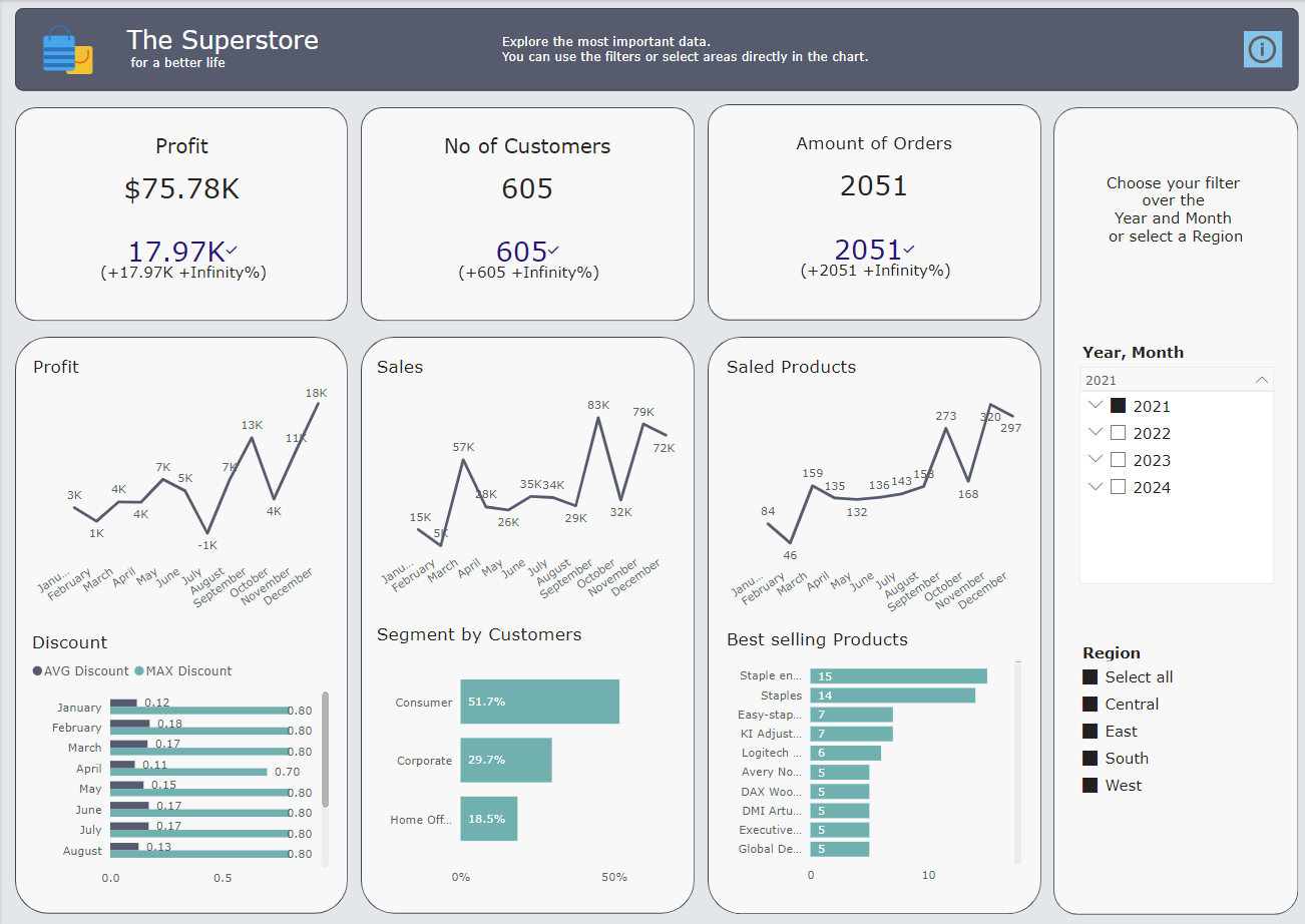
The Superstore with PowerBI
We have already done a lot of exercises with the Superstore. And the last time we worked with PowerBi was over 2 months ago. The task for this challenge was to create a business dashboard for the Superstore, at least 3 KPIs, one of which was profit, and of course a user story.
Firstly, I thought about what user story I was writing; ‘As a Sales Supervisor I need quick overview about the Sales, Customers and Products over the Regions, Years and Month.’ I researched on Tableau public and other sites what types of charts are common in the industry. I then chose 2 that I wanted to combine.
I also thought about which colour and font I would like to use and which rules should be observed for the font size.
Then it was time to find my way around PowerBI again. I imported the Superstore data, adjusted the size of the dashboard, selected the background colour and then started with the individual elements.
First a text title display with content and matching colour. Now the first card chart for the profit. As it could not be taken directly from the tables, it had to be calculated.
First of all the costs:
Cost = Orders[Quantity]*RELATED(‘Product Costs’[Unit Cost])
Then the profit:
Profit = Orders[Sales]-Orders[Cost]
Below this should be a KPI display, with a comparison to the previous month. Unfortunately, this was not so easy. I then wrote a help post on Convo. Only one reaction. Was then also no longer realisable in terms of time.
I then concentrated on other charts.
I have created line charts for profit, sales and products sold over the months. The values are displayed.
There is a filter on the right-hand side that allows you to filter by year, month and region.
The discount is displayed over the months as an average and maximum value.
The sigments of the costumers are displayed as a bar chart by percentage.
The last chart shows the best-selling products in a bar chart.
Finally, I have standardised the design.
And this is my finished dashboard:
Points that still need to be changed:
- the KPIs for the previous month must be calculated correctly
- in the line charts only the minimum and maximum should be displayed as labels
- the discount value must be taken * 10 so that it is displayed correctly in %