Hello and good day!
Week 5 at the Data School has kicked off to a flying start with learning lots of table calculations and LODs and also consisted of tests from Andy to see if we can build what he has up on the screen using the skills taught to us over the past few days.
As part of the ‘Rebuild what I made’ tests, Andy got us to rebuild his Week 27 MakeoverMonday which consisted of a nice highlight table with marginal histograms that detailed the number of guests visiting Berlin. This consisted of a highlight table representing the busiest months over the years and 2 bar charts that represented the number of guests that visited Berlin (one for the months and one for the years). Andy’s version can be found here, and my version can be found here.
I found it quite easy to build this once I got over the realisation that this was NOT created all in one sheet and so thought it would make an interesting blog to cement my understanding of the build process of the highlight table with marginal histograms.
I have created this visualisation using the EU Superstore data and will guide you through how to build one of these.
***Note: This can also be built using the normal Superstore dataset or your own dataset***
Step 1: Highlight Table
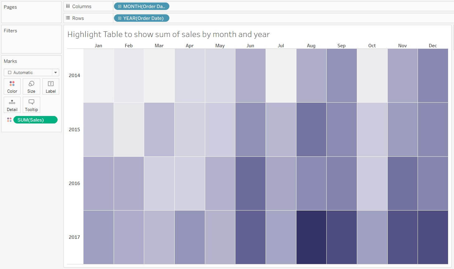
We want to right-click + drag Order Date into the columns shelf and select Month then drag Order Date into the rows shelf (it will automatically set to YEAR(Order Date)).
You can see that we now have the skeleton of our highlight table and all you need to do is drag the Sales measure onto the colour shelf within the Marks card which will then give us the below view showing highest sales by year and month.
Step 2: Monthly Sales Bar Chart
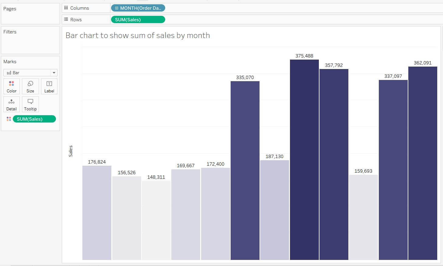
Next, we want to move on to a new sheet to start building the first of our 2 bar charts – A bar chart to represent the monthly sum of sales that will go on the top of the heat map.
This is very easy to build as it is just a simple bar chart and only requires us to drag Sales onto the rows shelf and right-click + drag Order Date onto the columns shelf and set to Month. Drag Sales onto the colour shelf and voila! You now have the monthly representation of sales for EU Superstore data.
Step 3: Yearly Sales Bar Chart
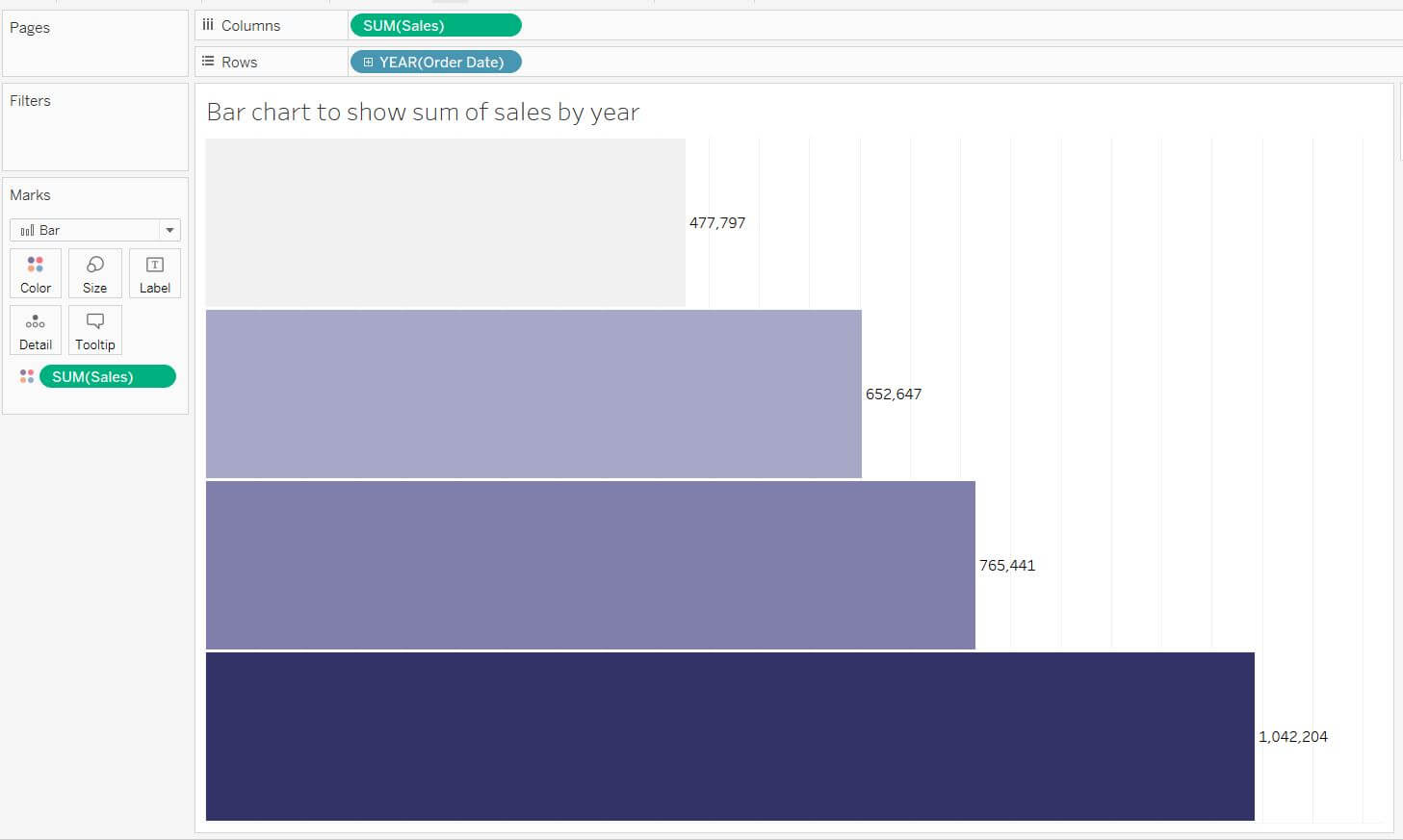
Lastly, we want to create the last bar chart which represents the sum of Sales on a year level which will be placed to the right of the histogram once it goes onto the dashboard.
A quick way to do this would be to duplicate the sheet of your first bar chart, in the duplicated worksheet you will then want to swap the rows and columns by either using the short key (Ctrl + W) or by pressing the Swap Rows and Columns Icon. ![]()
Right click on the MONTH(Order Date) pill in the rows shelf and change it to Year and hey presto! You now have your yearly view of Sales.
Step 4: Building Your Dashboard
Now we can bring all the pieces of the puzzle together on a new Dashboard.
To get your bars to align with the heat map you will need to adjust the sizing of the bars within their worksheets and (optional) remove the headers, labels and titles that you don’t want to keep which will hopefully leave you with a similar view to the below.
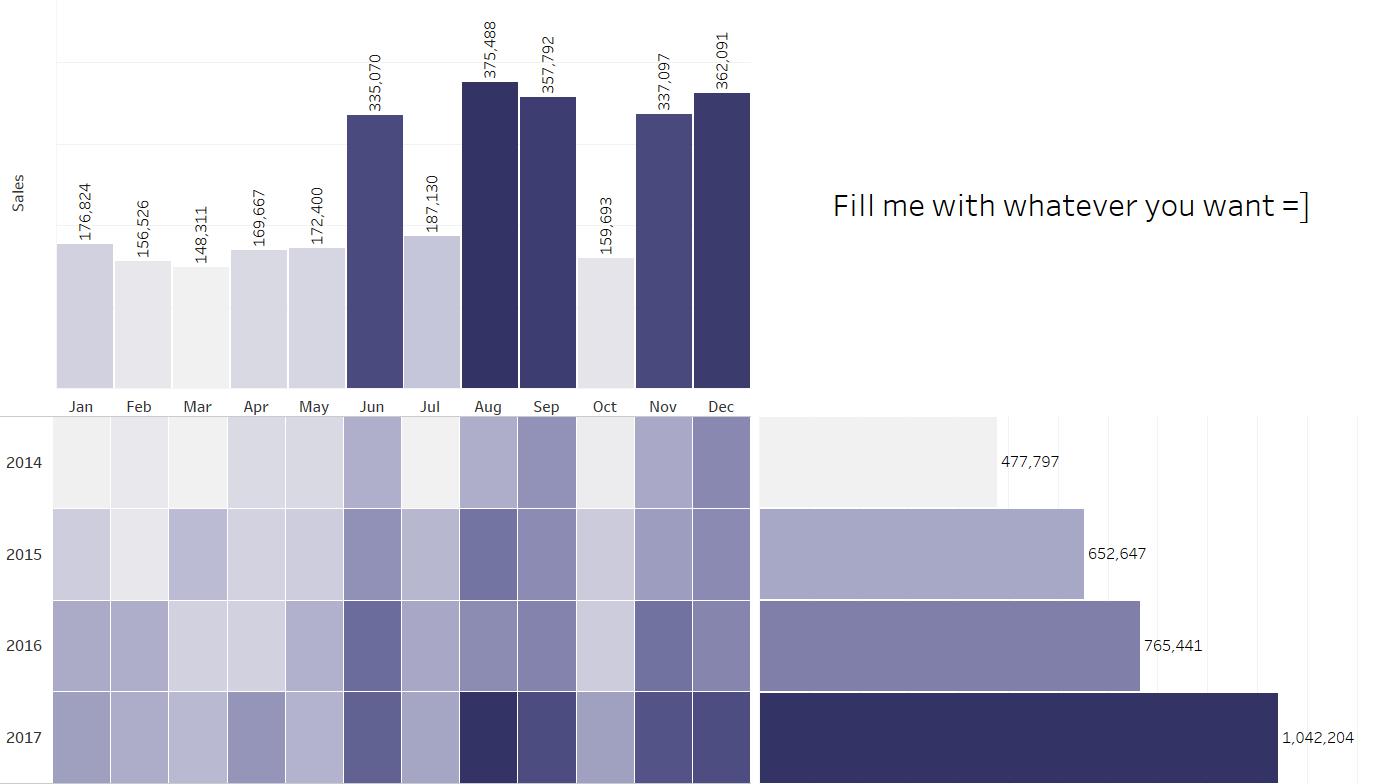
And there you have it, you have successfully made a highlight table with marginal histograms “Huzzah”.
What now?
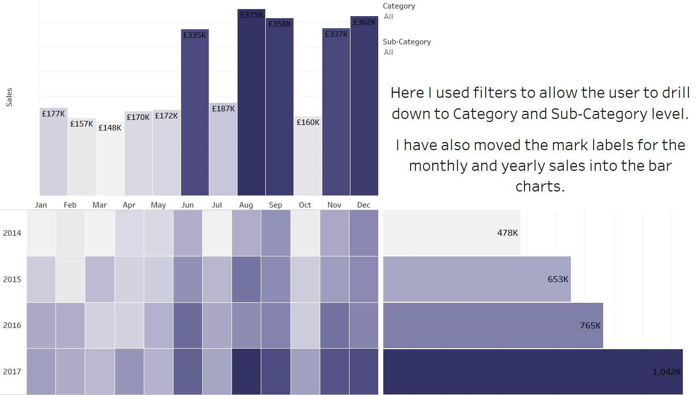
If you want you can continue to build on this visualisation by using the space in the top right corner of your dashboard to either fill with some text, add a map to use as an active filter, throw in a line chart or even add an image. You can also edit the labels like I have done below… There are many choices on what to fill this space with but I will let you decide on this.
Hope you enjoyed this blog.
