


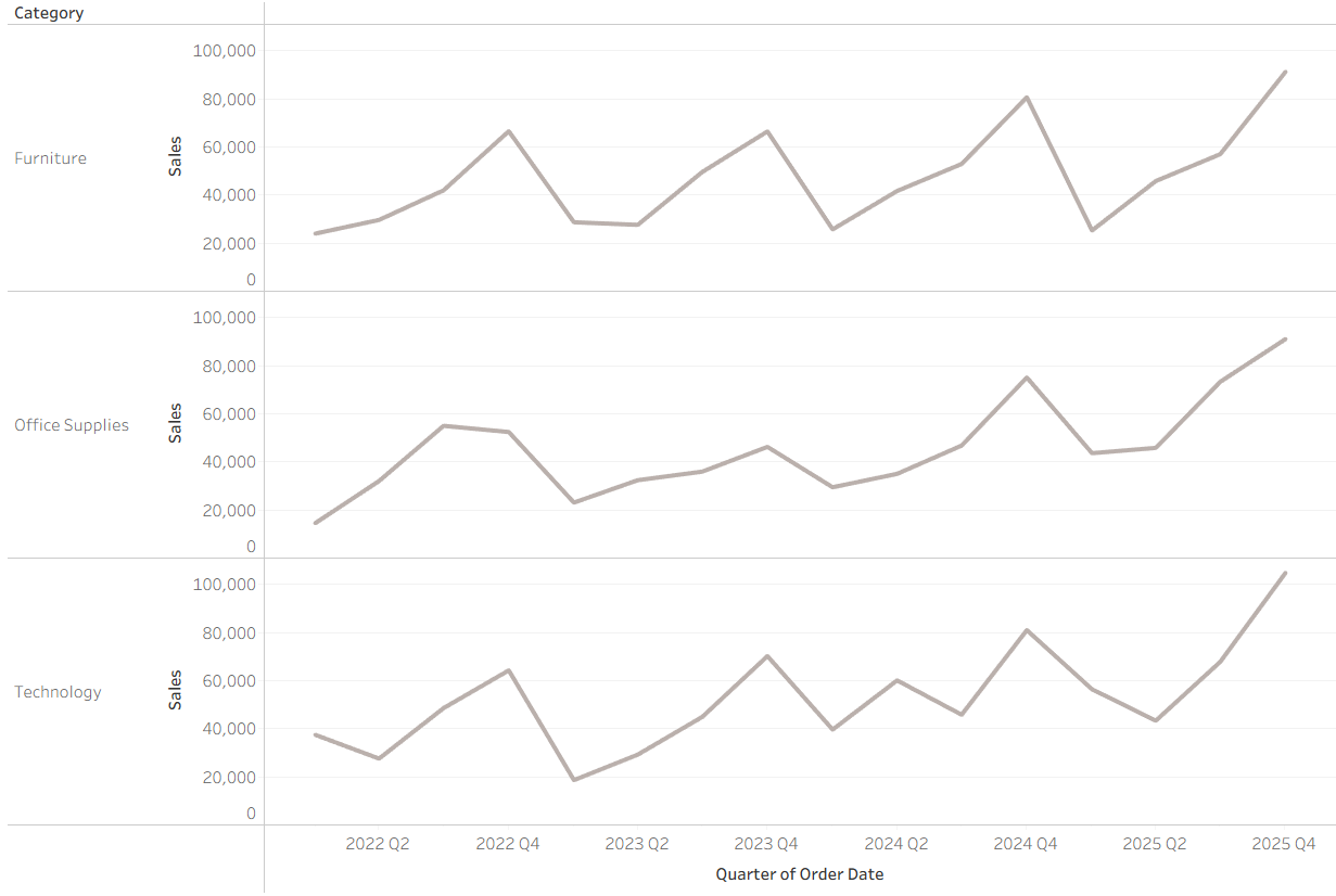
Imagine that you are the CEO of a leading supermarket chain. At a glance, total sales tell you how the business is performing overall. But when you dig deeper, you’d want to know: Which quarter was the strongest performer for each category and which one dragged results down?
Identifying the best and worst quarter per category helps decision-makers allocate marketing spend, manage inventory better, and focus on areas that need improvement.
In Tableau, we can uncover these insights in two main ways:
- Using Level of Detail (LOD) expressions which let us define exactly how data is aggregated regardless of the view.
- Or using Table Calculations which operate over the data already in the visualization.
In this post, I’ll walk through how to calculate quarterly min and max sales per category using both methods and then how to highlight this clearly on a simple but effective line chart.
Here is preview of the data that we will be working with:
The LOD Way
Step 1: Finding the Base Sales Values
First, we need to aggregate sales at the Category + Quarter level. To do this, we can use a FIXED LOD:
Sales per Category/Quarter = { FIXED [Category], DATETRUNC('quarter', [Order Date]) : SUM([Sales]) }
This gives us total quarterly sales for each category.
Step 2: Find the Minimum and Maximum for Each Category
Now, from those quarterly values, we want to identify:
- The minimum sales per category
- The maximum sales per category
We can calculate them as:
Min Sales per Category: { FIXED [Category] : MIN([Sales per Category/Quarter]) }
Max Sales per Category: { FIXED [Category] : MAX([Sales per Category/Quarter]) }
Step 3: Return the Quarter Matching the Min or Max
The last step is to highlight only the specific quarter that match the min or max value. That way you not only know the number but also when it happened.
We can do this using:
LOD Min Only: IF [Min Sales per Category] = [Sales per Category/Quarter] THEN [Min Sales per Category] END
LOD Max Only: IF [Max Sales per Category] = [Sales per Category/Quarter] THEN [Max Sales per Category] END
The Table Calc Way
Step 1: Find the Maximum and Minimum for Each Category
Since we already have Sales broken down by Category and Quarter, we can use:
Window Min of Sales: WINDOW_MIN(SUM([Sales]))
Window Max of Sales: WINDOW_MAX(SUM([Sales]))
Step 2: Return the Quarter Matching the Min or Max
To highlight the actual quarter where these minimum and maximum sales happened, we can calculate this as:
Window Min Only: IF [Window Min Sales] = SUM([Sales]) THEN [Window Min Sales] END
Window Max Only: IF [Window Max Sales] = SUM([Sales]) THEN [Window Max Sales] END
Visualising the Min and Max Sales of Each Category by Quarter
Now that we’ve got fields isolating the min and max quarters per category, the next step is to make them stand out visually!
We can do this by dragging the max quarter (LOD Max Sales or Window Max Sales) onto the Rows to add it to the chart.
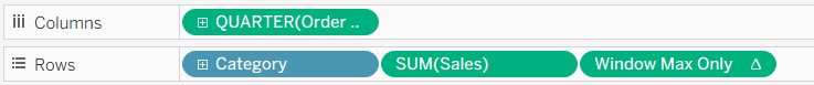
To get the min quarter (LOD Min Sales or Window Min Sales) on the chart too, we can simply drag the field onto the max quarter axis until you see the 2 green bars to blend them together.
We can now see that both the minimum and maximum sales values are shown on the same axis.
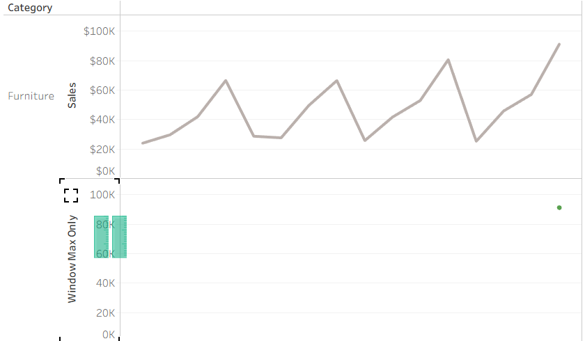
We can now right-click on the Measure Values pill in Rows and select Dual Axis to have plot these points onto the line chart.
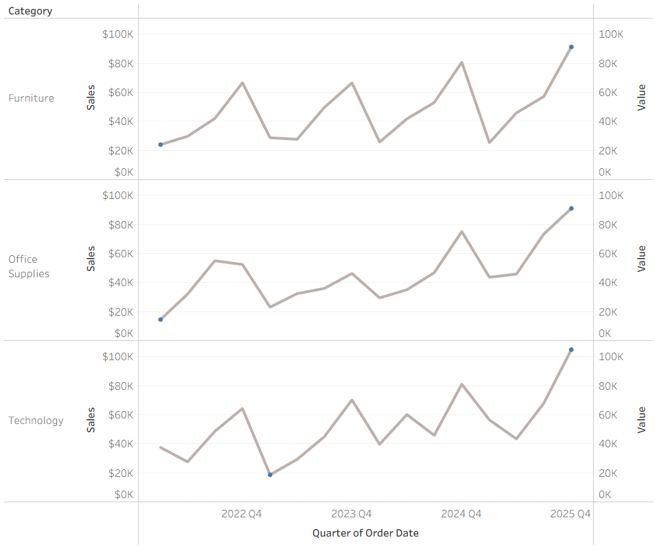
To make these stand out even more, we can change their colours and adjust their sizing. We can also hide the additional axis (after synchronising them!) for a cleaner look.
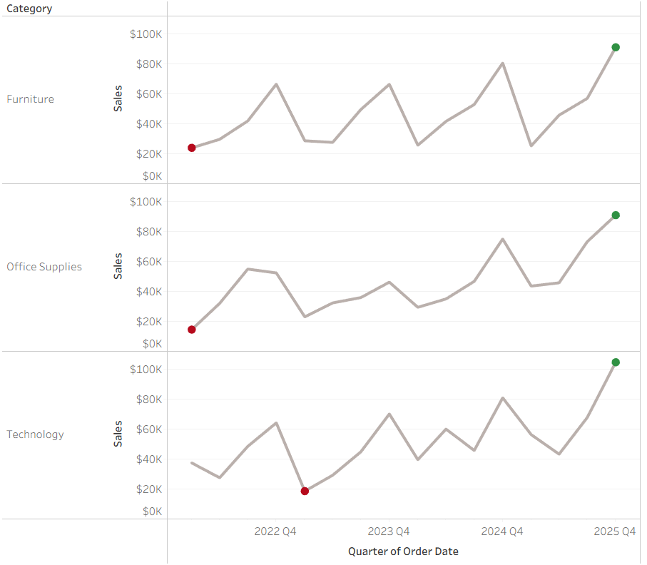
And there you go! That’s how you quickly identify the minimum and maximum sales within specific time periods - like quarters - for each category using both LOD expressions and table calculations in Tableau.