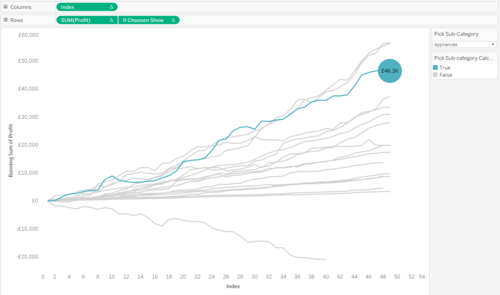
A common baseline chart will allow you to create a view which will show each dimension starting at the same time to compare their overall trend. From each product’s beginning to end. For example, you could use this chart if you wanted to see how much each product has made over time since they started being sold.
For this example, I will use the EU superstore data.
Let’s start by making an index calculation:
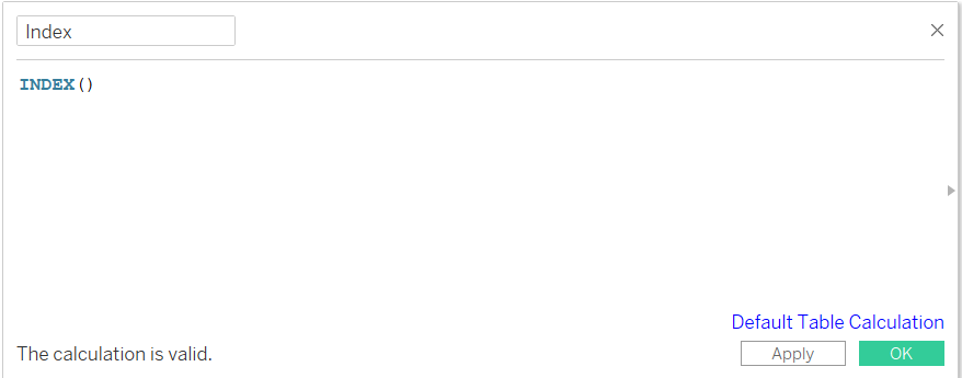
This calculation will allow us to order our time sequence.
Now drag your date field on to your row axis. I like to see my calculations as a table first before I build my graph.
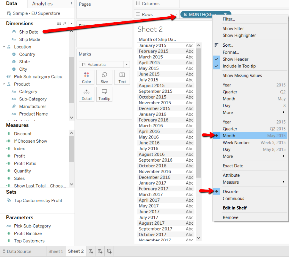
I have turned my date field into continuous months and a discrete variable.
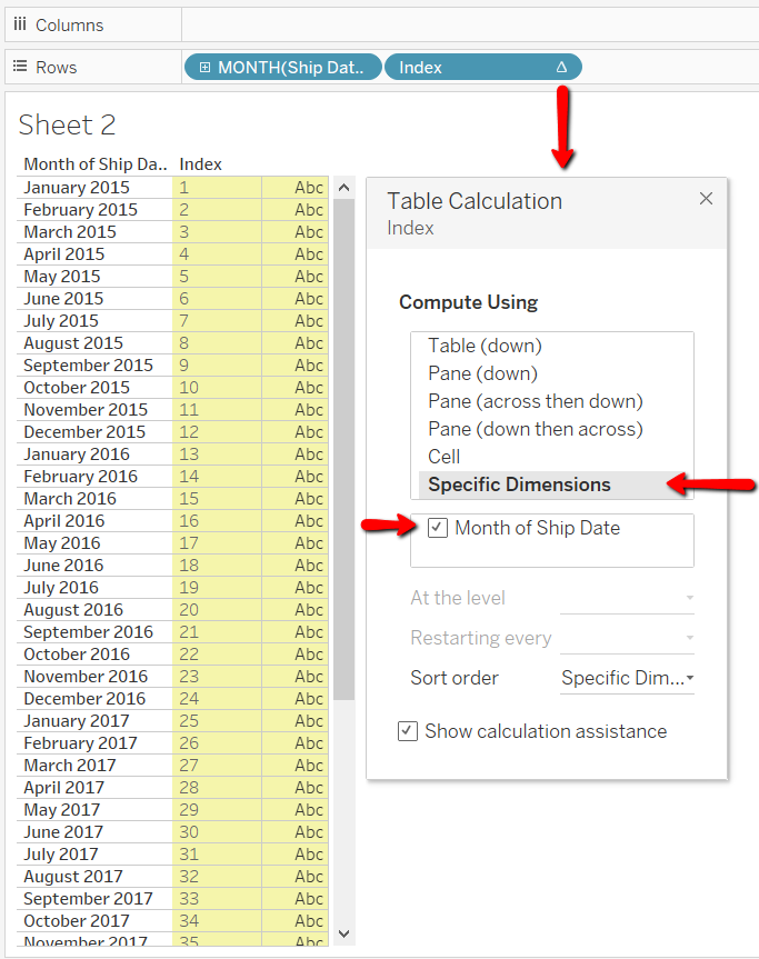
Now add in your index calculation on to your rows and change it to a discrete variable.
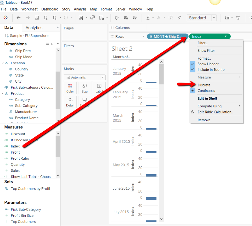
Now we need to configure our index calculation. Right click on your index calculation and choose to edit table calculation. The calculation configuration window will appear. We will always choose to compute using “specific dimensions” and you will tick the date field.
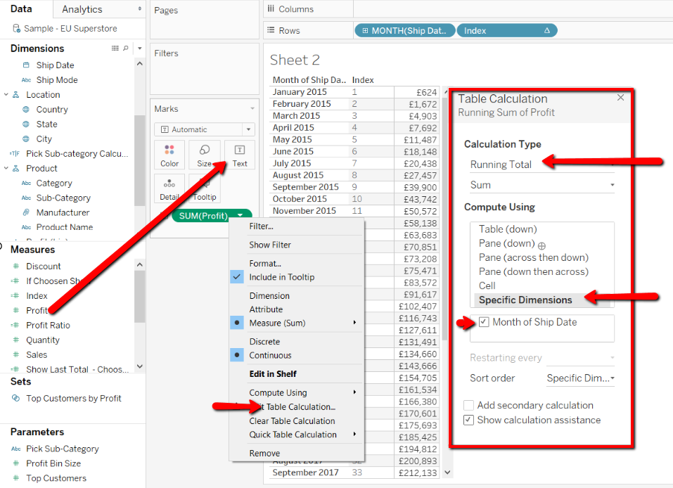
Now we will add in our measure Profit to this table. We will place Profit on to the text shelf.
Right click and add table calculation.
A table calculation configuration box will appear and here we will create a running total sum. Choose specific dimensions and use the month of ship date again.
Once you can see that the calculation is working the way you want it to, we can build our graph.
Place your index on to your Columns shelf.
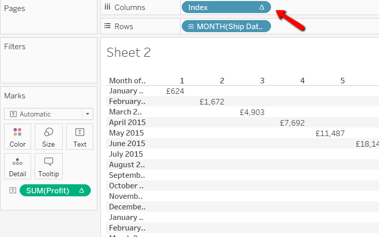
Now swap your date and profit positions.
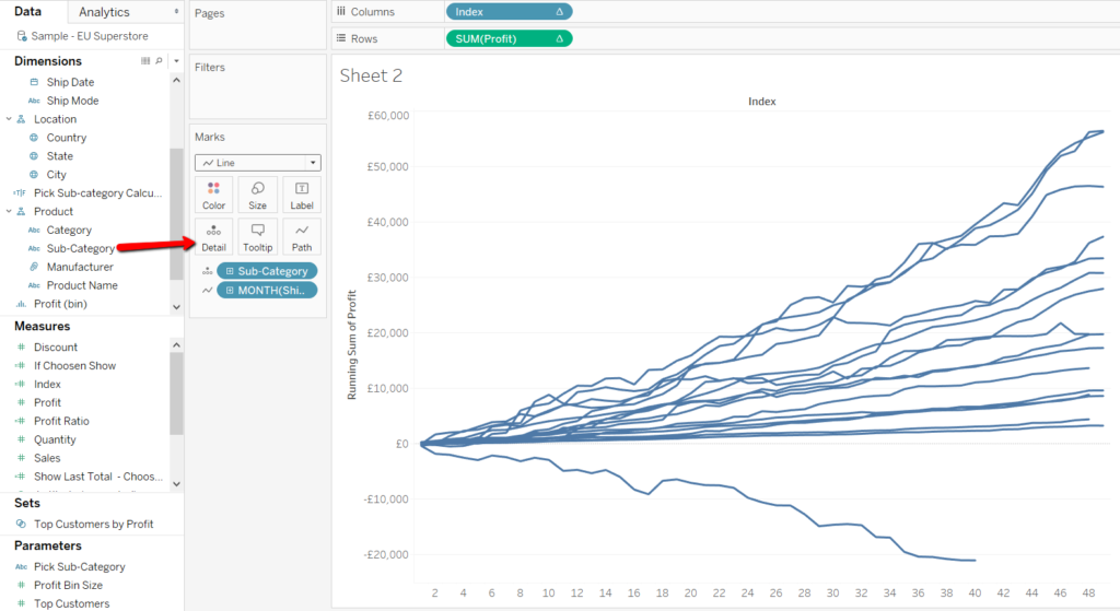
Turn the graph into a line graph and make your date field the path.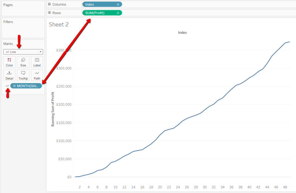
Now you can add Sub-Category to detail.
Now add your dimension to colour and you can use your colour legend on the right as a highlighter.
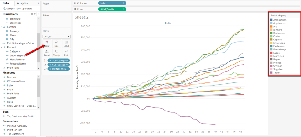
Now you have your basic Common Baseline chart.
Go on to Part 2 to make this graph more dynamic and allow your user to pick which subcategory they would like to view and compare it to the rest, using parameters.
To create something like this:
