Colour is an incredibly powerful tool in data visualization. I'm constantly making the wrong choice when it comes to my vizzes, but people around me at the Data School are teaching me how not to get it wrong.
Visualizations often involve presenting a continuous range of values. A key decision to make is what kind of colour palette to use.
Case 1 - using colour on categories
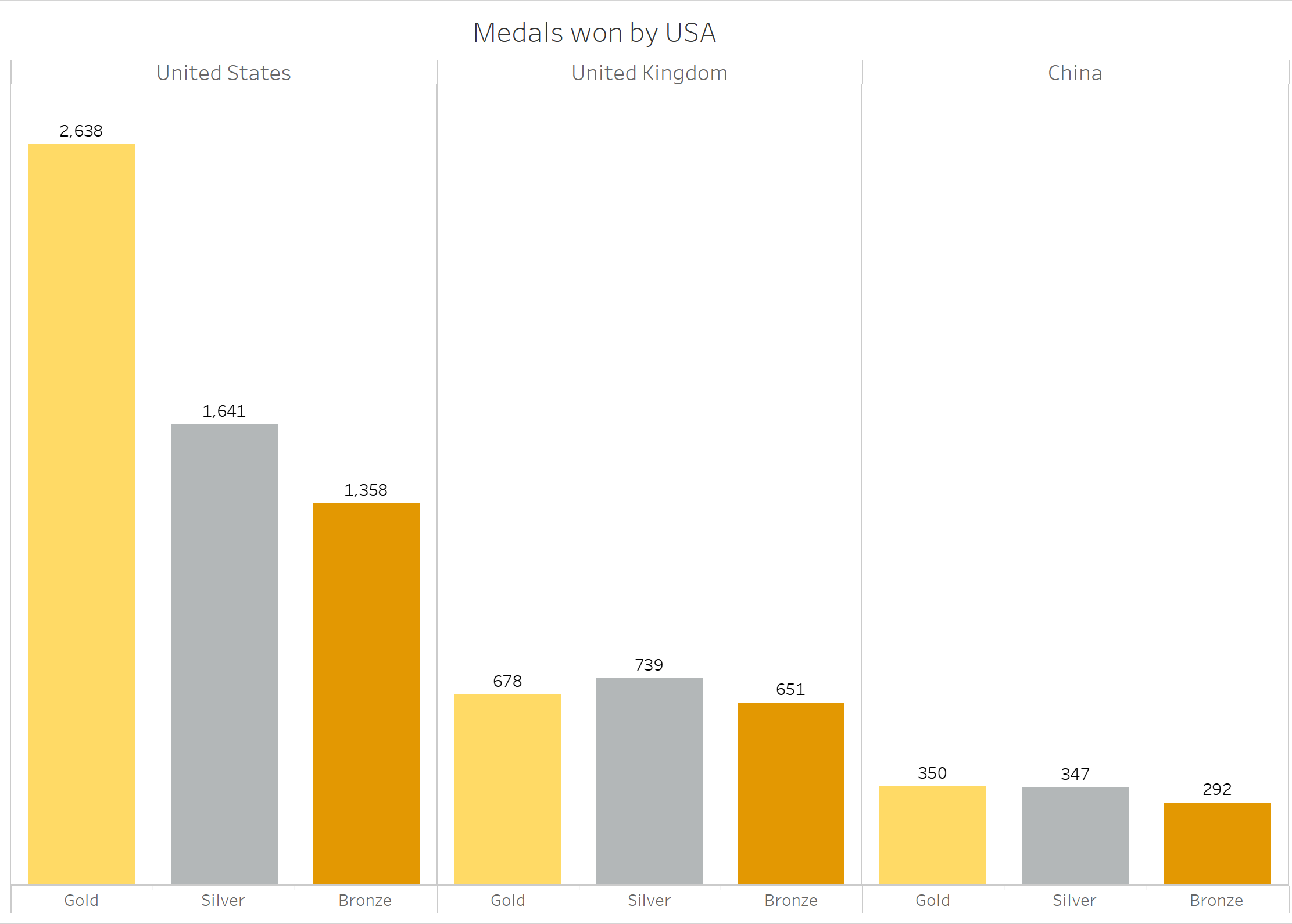
One of the most common way colour is used on a viz is to group items of the same category together. Below is a bar chart representing the number of medals won by three countries in the Olympic games. Colouring the bars gold, silver and bronze is a way to make it easy for most people to identify the meaning of each bar.

Another example of colouring categories is to colour marks the same when they are in the same group. Below is a chart of the top 10 countries in terms of how many Olympic games they have competed in. Each bar is coloured based on the country's continent. The colour makes it easy for us to determine that most of these countries are in Europe.

Case 2 - colour by magnitude
Colour can be used to show the magnitude of values. The choice of sequetial or diverging colour palettes is really important. A sequential palette contains different shades of the same colour; for example shades of blue from light to dark. A diverging colour palette has two colours which transition; for example, orange to blue.
Diverging palettes should only be used when comparing the values to a neutral midpoint. The classic example of this is if we have a range of values from, say, -200 to +200. You may want to colour the positive values in blue with the largest values in the darkest shades. Then the negative values would be orange, with the values closest to -200 in the darkest shades. Here, the middle transition shade represents 0. In other examples, the white transition shade may represent an average value or a target value. The key question to ask here is:
What does the central transition shade represent?
If you don't have a good answer for this, you may want to reconsider your diverging palette.
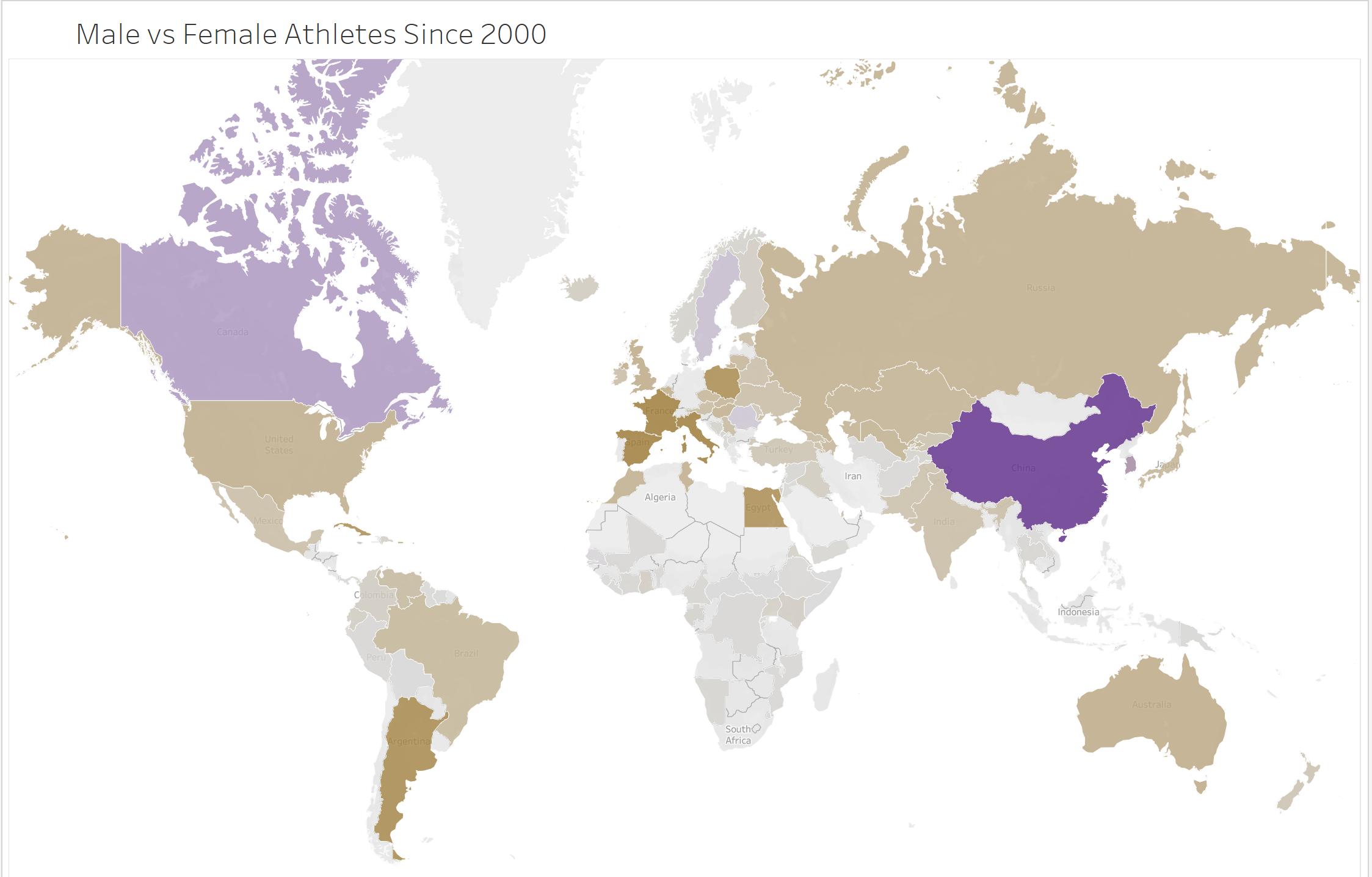
In the below example, countries who had more female athletes than male since 2000 are shaded in purple and countries who had more male athletes than female in brown. The strength of the colour shows the disparity between the number of male and female athletes. The central transition here represents countries who have had the same number of male and female athletes.

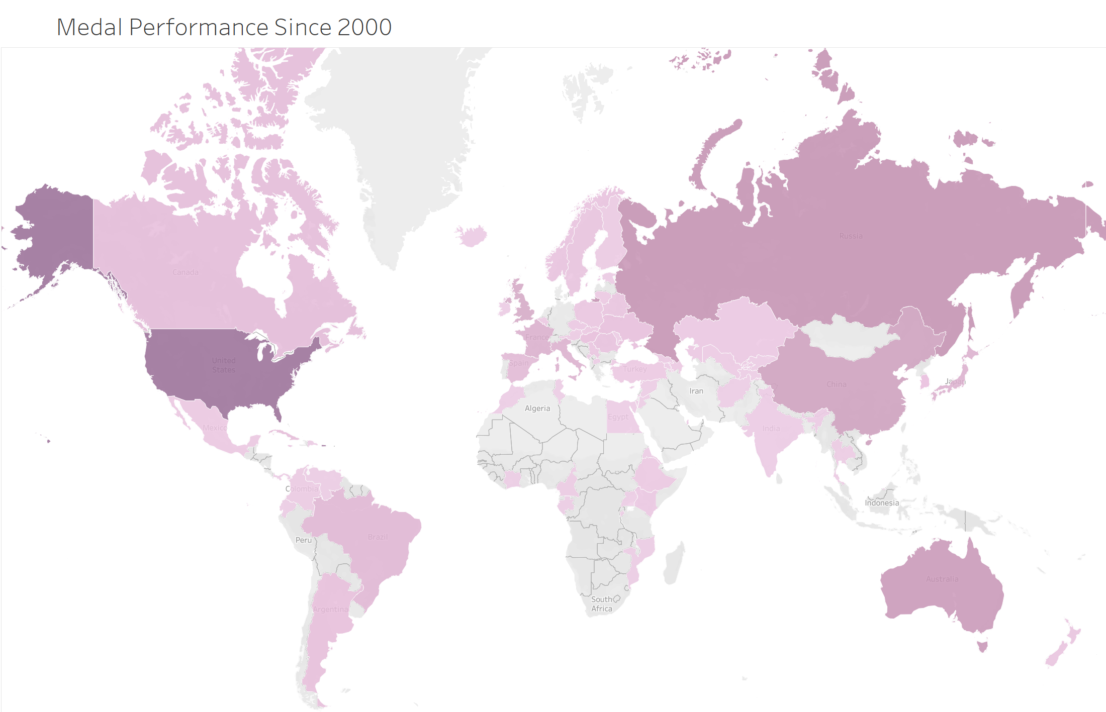
Sequential palettes are used to show a progression from low to high values. Generally this is when all of the values are positive. In the below example, countries who have won the most number of Olympic medals are shaded the darkest.

