


There have been multiple instances in my Data School journey when I have tried to push the boat out and build a weird and wonderful chart but I don’t exactly know how to build it. The question is, how do you get help to build a chart (from Google, Tableau forums, Twitter etc) if you have no idea what it is called? During a Makeover Monday I was trying to build a unit chart (Figure 2) but at the time had no idea what it was called so I’ll share with you my actual Google search:
“Tableau chart where each point is a person that represents a percentage” – Luke Donovan, 2020
So the aim of this blog is to expose new Tableau users to popular charts that you’ve definitely seen, but may not know the name of to then allow you to go on and build it.
Butterfly Chart
A butterfly chart (also known as a diverging bar chart) is a great way to visualise the difference between two groups with the same parameters. A typical example is when comparing the difference of male and female populations of a certain species of animal or human populations in different countries. Below is an example of a butterfly chart looking at the difference in male and female populations of different age groups in 2019 in the UK.
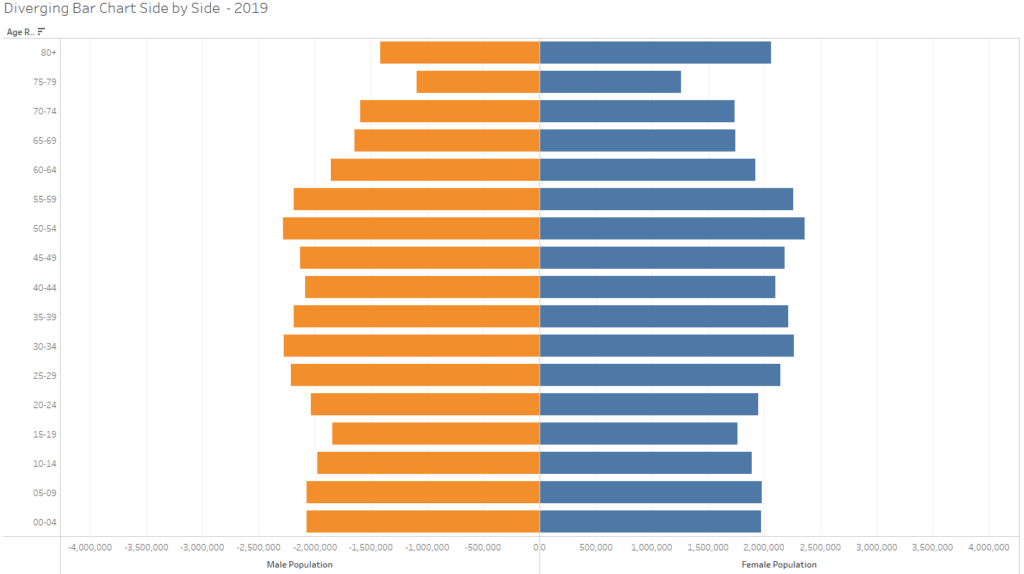
My fellow DS20 colleague, Gordon, has a great blog on how to build a butterfly chart with dynamic axis.
Unit Chart
A unit chart is another great visual chart which uses symbols to communicate specific quantities of a certain metric. A common use case of a unit chart is polling data, I.E. If 47% of people voted for Labour, on the view you would have 100 people symbols, with 47 of them coloured red as 1 symbol would represent 1%. It doesn’t have to be that though, you could have a symbol represent 5% or 10%. The key thing about unit charts is to make sure you stipulate what metric your symbols represent. Here’s a Makeover Monday I created on mental health data.
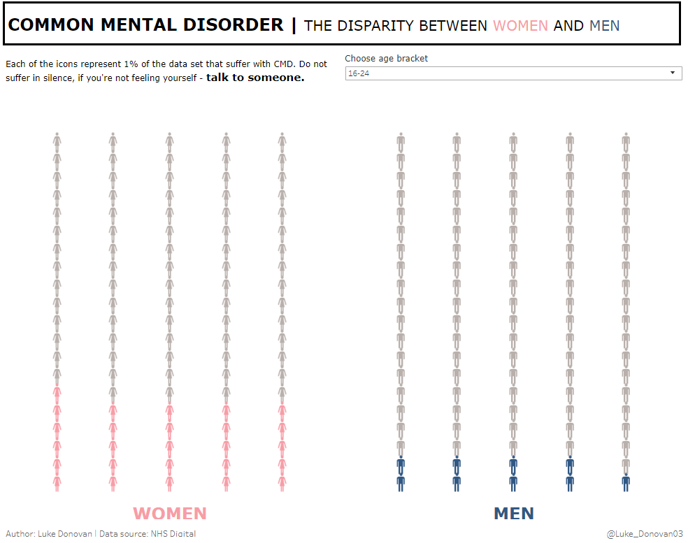
DS19’s Tim has a great blog on how to make a unit chart – it’s where I found the inspiration to build mine.
Bump Chart
Bump Charts are extremely popular, and relatively easy to build in Tableau once you know what they are. I had seen a lot of these charts before I started the DS and never knew what they were called (sometimes called rank charts). As bump charts use ranking, they’re a great way of showing visually how certain dimensions change over time. A good example would be premier league teams’ league position over the different match weeks. I built a bump chart using Sample – Superstore which shows the rank of each Region in relation to Sales over each quarter.
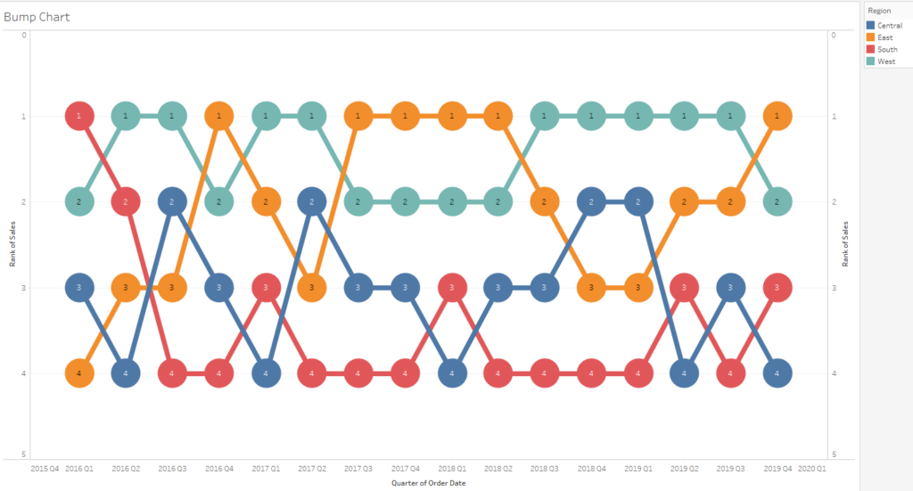
Check out Gauthier’s blog on how to create a bump chart.
Dumbbell Chart
This chart type is another example of visualising differences between two groups in relation to the same field I.E. Male and Female participation in a certain sports. Dumbbell charts (also referred to as a barbell chart) stand out visually and offer a minimalist view whilst offering great analysis. My fellow DS20 colleague Micol created a great dumbbell chart in a Makeover Monday which can be seen below.
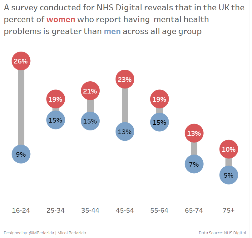
Paul from DS13 has a great blog on how to make one of these.
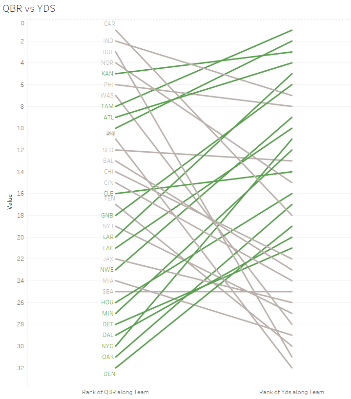
Slope Graph
Similar to the bump chart, this also uses rank to visualise data, however, a slope graph is used to compare rank between two different measures as opposed to the same measure over time. Slope graphs are commonly used in sport scenarios, for example comparing Premier League team ranks in terms of metrics like total shots on target and goals. I created a slope graph on a NFL data set comparing teams rank in relation to their QB rating and Yards in a certain season.
Shameless plug here but I wrote a blog on how to make a slope graph and also introduce dynamic colouring within it.
Thanks for reading this blog! Whilst these chart types aren’t the most complex, they’re a step above your conventional bar and line charts and can add that extra dimension missing from your analysis. Again, the aim is just to make you aware of what these charts are actually called to add them to your Tableau arsenal!
Happy chart building, check out my Tableau public and follow me on twitter: @Luke_Donovan03