


I was determined to do something a little different today and venture away from my usual design and really push the boat out on some other design and chart type ideas I had. I really wanted to try and impress with this dashboard so I set the bar really high for myself.
The Data
The data was extremely topical for today, it was looking at the paycheck protection programme loan COVID finance relief system in the US and holding the US accountable for the loans they’ve been giving out to businesses. Luckily, the data prep was a lot less of a headache than day 2, to be precise there was virtually no data prep at all (thanks Andy!). The data was split between large and small loans, with small loans being identified as the value of a single loan being below $150k. It also had the bank which loaned the money and how many jobs that loan had saved as well as the industry of the claimant. Looking at the data, I wanted to solely focus on loans below $150k as I thought this would be a more interesting stance as the loans above $150k data set had ranges and not specific values.
My approach
As stated earlier, I knew exactly what I wanted to focus on and the story I wanted to tell, the design however, I had to rethink. Instead of my usual style, I chose to go with something a little different, and have the left of the dashboard not only include the filters, but the logo and the title as well as some introductory text. As we read from left to right, I wanted focus to be on the left first to introduce the dashboard and then look into the charts.
I knew I wanted to look at a state view for the various metrics, as well as show a change in loan amount over the months in the data set. I saw a really cool dashboard made by Tom Prowse that included a bar chart showing change over time, but also % change bars next to those bars illustrating visually the change over time. It stood out and looked super cool so I wanted to try it out. I also wanted to drive home the importance of these loans to the non-profit sector. COVID hit every single industry hard, but it was interesting to see the reliance of these loans on saving jobs within the non-profit sector.
With all that in mind, here’s what I came up with
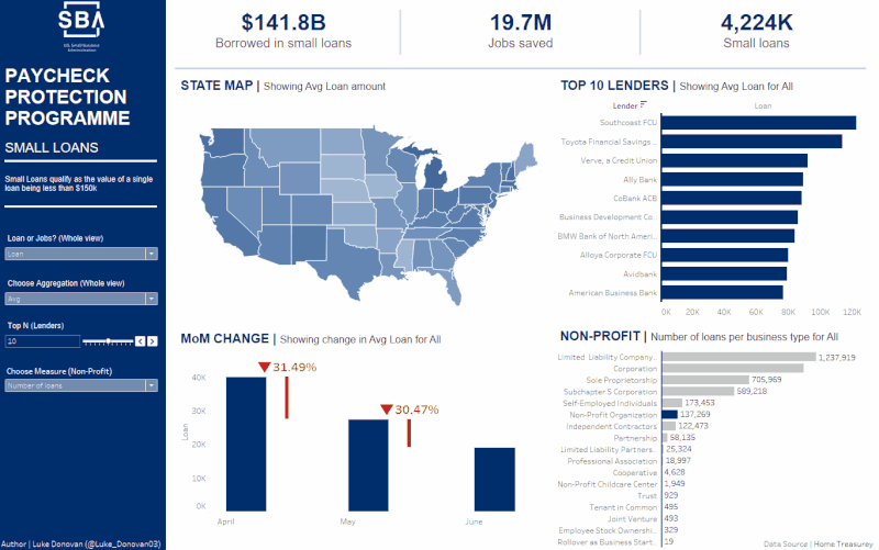
I was very happy with the outcome of this dashboard, I managed to get the exact image I had in my head onto a dashboard which is something I struggled a lot with, especially in the earlier parts of training.
As always thanks for taking the time to read this blog and you can check out the viz on tableau public here 😊