


In the early 20th century, the rapidly advancing pace of data visualization hit a slight halt, as many statisticians viewed images to be inaccurate and preferred showing exact numbers. However, charts and graphs were still becoming more prevalent in textbooks and businesses.
The mid-to-late 20th century saw a growth in statistical theory, such as American writer Darrell Huff’s 1955 book How to Lie With Statistics which critically analyzed deceptive practices in statistics. French theorist Jacques Bertin’s 1967 work the Semiology of Graphics also contributed massively to data visualization specifically, as Bertin defined different types of marks (points, lines, and areas) and properties (such as color, position, size, shape, orientation) of statistical graphics and offered guidance on how to effectively design data visualizations.
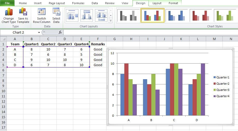
The emergence and exponential improvement of computer technology in the late 20th century greatly advanced the ability to store large quantities of data and visualize it quickly. The use of spreadsheets, such as through Microsoft Excel which debuted in 1985, streamlined data collection and had built in visualization capabilities. The 1980s also saw the emergence of Edward Tufte, whose work The Visual Display of Quantitative Information still influences the study of data visualization and statistics today. Tufte is also credited with inventing the sparkline, which provides a quick overview of trends. Other key figures of the modern era who have written important pieces on data visualization include Stephen Few, Albert Cairo, and Colin Ware.
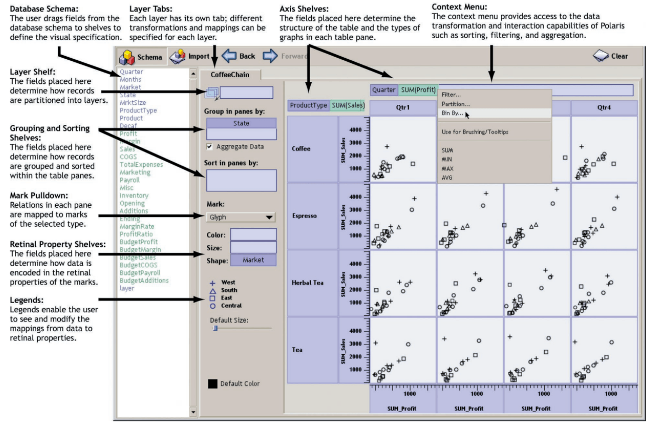
Various software tools have greatly enhanced what can be created with data, such as dashboards that make data more interactive and understandable to different kinds of users. Tableau’s founding in 2003, as well as the emergence of dozens of other data visualization tools, analytics suites, and data prep tools, have allowed data to be displayed more efficiently and more creatively. Data visualization has also increasingly been employed in journalism and storytelling, as quantitative and qualitative information intermingle.

Data analysis and visualization not only governs the decisions of countless businesses, non-profits, and government organizations, but it increasingly pervades our everyday lives. The products we buy, the media we consume—the things we interact with on a daily basis are informed by data analysis and our interaction with them is collected as data. It remains to be seen what the future holds for data visualization, especially with the advent of sophisticated artificial intelligence, but it is clear that its use will only continue to expand. And as long as humans remain on this planet, our predisposition to curiosity and analysis will only drive further data exploration.
Sources:
https://www.yellowfinbi.com/blog/the-history-of-data-visualization
https://www.tableau.com/whitepapers/designing-great-visualizations
https://www.incrementaleconomics.com/a-summary-of-how-to-lie-with-statistics-by-darrell-huff/
https://www.tableau.com/blog/analyzing-history-tableau-innovation
Further Reading: