


The 19th century saw huge strides in the development of data visualization, such as British doctor John Snow (not the Game of Thrones character unfortunately), who plotted instances of cholera during an 1854 outbreak in London. Snow mapped the residence of each person who died of cholera, with each bar representing one death. The concentration of bars was densest near the water pump at Broad Street that supplied much of the area. After further interviews and statistical analysis, Snow concluded that the outbreak of cholera was caused by contamination in Broad Street’s water, disproving the prevailing miasma theory which speculated that bad air had been the culprit.

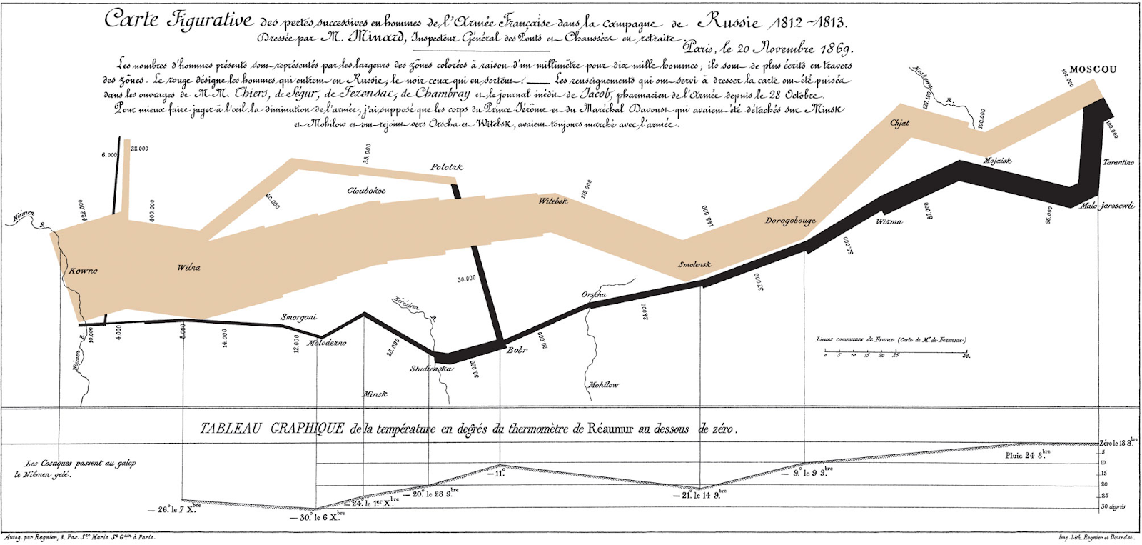
Other prominent data pioneers of the time include French civil engineer Charles Minard, who in 1869 plotted the number of men in Napoleon’s army against extreme cold temperatures to visualize the soldiers’ death from war and frostbite during the failed French invasion of Russia in 1812. The chart is ripe with information, referencing several different sources of data that include the locations of rivers, cities, and battles, temperature on the x-axis, and the path and size of Napoleon’s army. The tan color represents the army’s path into Russia while the black area represents their retreat, and the progressive thinning of these tan and black areas (1 mm of thickness = 10,000 soldiers) demonstrates the massive death toll of the campaign.
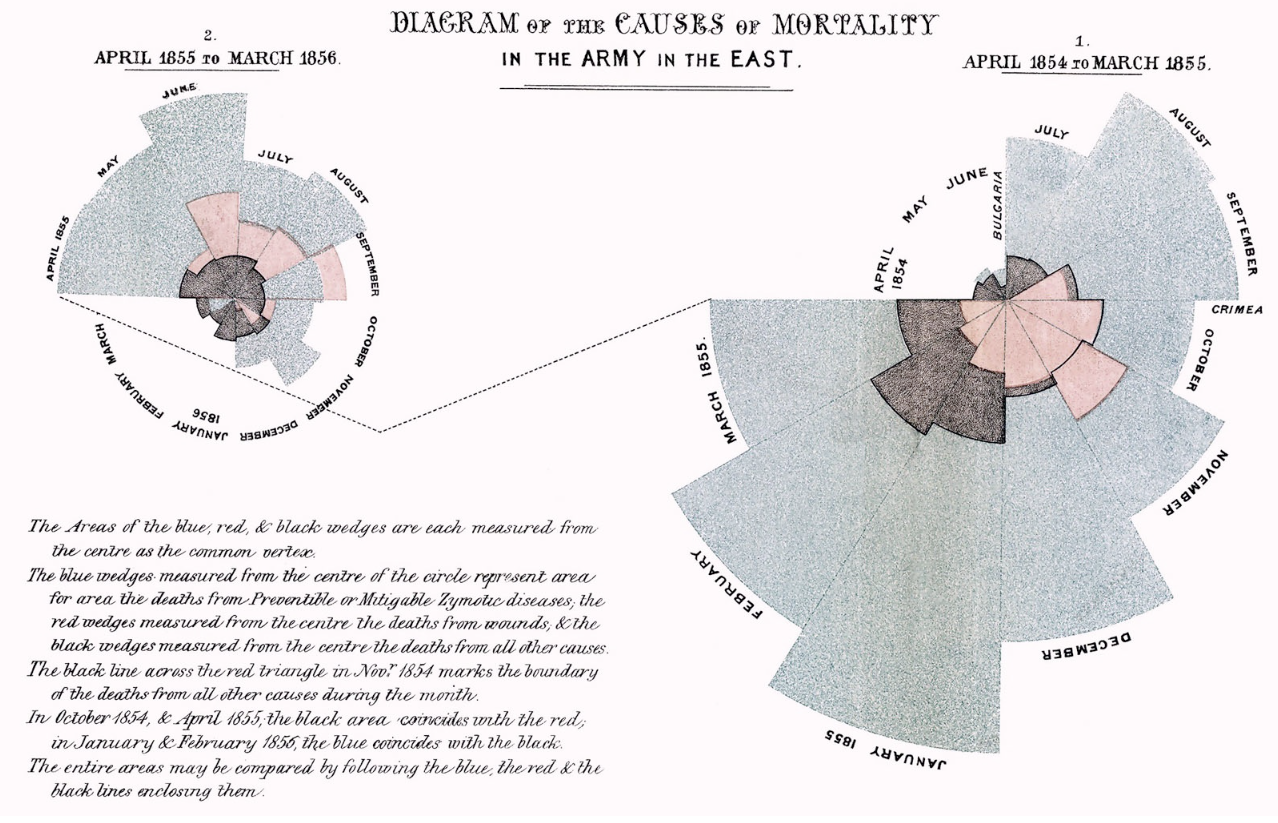
Florence Nightingale, an English nurse, statistician, and reformer, also contributed greatly to statistics and data visualization with her rose chart that depicted causes of death in the British army during the Crimean War of the 1850s. Similarly to Minard, Nightingale analyzed the death causes of a military force, with the deaths sliced up by month and the different causes determining the colors. The predominance of the gray areas in the charts below show that disease was overwhelmingly responsible for the demise of British soldiers. Her work further showed how the effect of disease could be mitigated with proper nutrition and sanitation.
The 17-19th centuries saw massive advances in data visualization and statistics thanks to the innovation of the aforementioned analysts. More broadly, this “Golden Age” of statistical visualization can be attributed to the industrial revolution, the rise of modern businesses, and an increased reliance on data in informing government policy, medicine, transportation, and military affairs.
It should also be noted that all of the data pioneers mentioned in this and the previous blog post have been European, with most being English. It is certainly true that England and other countries in Western Europe made massive contributions to statistics and other forms of quantitative analysis during this period. However, further research should be done to compile data analysis and visualization advances elsewhere across the globe, as most of what I came across for this period was focused on Europe. In the final post of this series, I will explore some of how our modern data-driven world came to be.
Sources:
https://www.yellowfinbi.com/blog/the-history-of-data-visualization
https://www.tableau.com/whitepapers/designing-great-visualizations
https://insightsoftware.com/blog/a-brief-history-of-data-visualization/
https://www.theguardian.com/news/datablog/2013/mar/15/john-snow-cholera-map
https://bigthink.com/strange-maps/229-vital-statistics-of-a-deadly-campaign-the-minard-map/
https://www.historyofinformation.com/detail.php?entryid=3815
Further Reading:
A History of Data Visualization and Graphic Communication by Michael Friendly and Howard Wainer