


Michael Florent Van Langren, a Flemish astronomer, is thought to have created the first statistical chart in 1644 when he plotted estimates of the distance between Toledo and Rome according to different astronomers. He could have simply written down the different values or put them in a table, but his visual line graph makes the variance and order of the different estimates much more clear.

The 17th century witnessed the birth of quantitative social science, as more demographic and monetary information became recorded and statistically analyzed. One figure central in this era was John Graunt, who in 1662 created large data tables to break down causes of death in London, and is often regarded as the father of demography. Another Englishman, William Petty, surveyed Irish land for Oliver Cromwell’s brutal conquest, and championed precise quantitative measurement of taxes, trade, and expenditure. An excerpt from his 1682 work “Another essay in Political Arithmetick” below includes a data table measuring births and deaths in the different parishes of London.

Joseph Priestly, an English chemist, also experimented with different charts and methods of displaying information. Priestly was particularly interested in visualizing history, including his 1769 chart below titled “A New Chart of History.” The graphic came up with creative ways to display ruling regimes, as it plots time along vertical space and country or region along horizontal space. Thus, by looking at the areas of the different colored shapes, we can see how widespread each reign was across the globe by its width and how long it lasted by its length. Priestly created other charts with the names of historical figures plotted along a time axis and categories of their achievement (a subjective measurement determined by Priestly) breaking down the length of the chart.

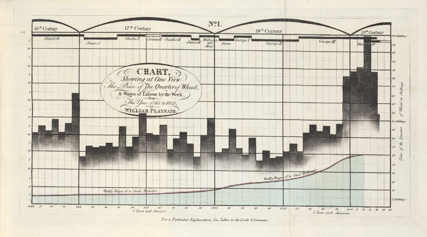
Starting in the 18th century, maps became more sophisticated, documenting things like geologic and economic data, while graphs began to depict more complicated functions and detail measurement error. William Playfair was perhaps the most prominent data analyst during this period, and his innovations gave us some of the most popular chart types we use today, such as line, bar, circle, and pie charts. Playfair created the below chart in 1821, and it depicts the price of wheat, weekly wages, and the current monarch between 1565 and 1820. This chart plots multiple variables and how they change over time, and uses multiple chart types to do so; wages are depicted using an area chart (blue area at bottom), wheat prices are shown with a bar chart, and a timeline of rulers is shown at the top. If you look closely at the axes, the years are plotted on the x-axis and are mirrored by the timeline of rulers at top, while wages and wheat prices are dual-axised with both of the y axes synchronized.
In the next post, part 3 of my history series, we'll continue looking at the so-called "golden age" of statistical graphing by examining figures of the 19th century.
Sources:
https://www.yellowfinbi.com/blog/the-history-of-data-visualization
https://www.tableau.com/whitepapers/designing-great-visualizations
https://insightsoftware.com/blog/a-brief-history-of-data-visualization/
https://www.datavis.ca/papers/langren-TAS09154.pdf
https://worksinprogress.co/issue/how-mathematics-built-the-modern-world/
https://pjodonnel.wordpress.com/2015/11/02/design-history-joseph-priestley/
https://collections.library.yale.edu/catalog/2066757
Further Reading:
A History of Data Visualization and Graphic Communication by Michael Friendly and Howard Wainer