


Makeover Monday Blog Post
The latest challenge we were assigned here at the Data School involved completing a #MakeoverMonday, which focused on the gender pay gap amongst teachers at state-funded schools across the UK. In this blog post, I will highlight what I liked and disliked about the original Viz, as well as elaborating on my own version of this week’s #MakeoverMonday. Here is the original Viz:
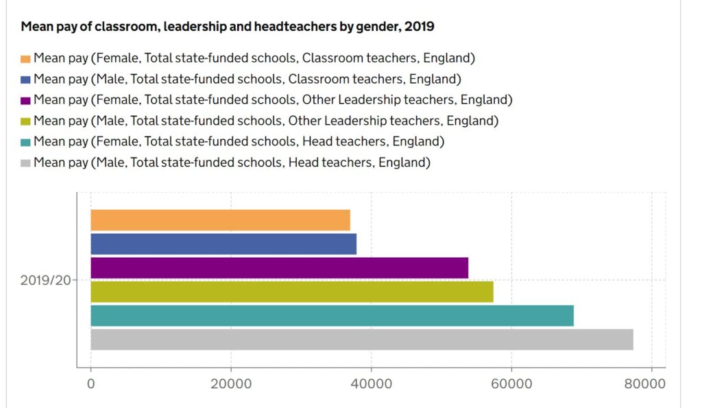
What I liked:
- The use of bar chart works particularly well here. By sorting the bars into ascending order, it allows the viewer to efficiently see the differences in pay across the various categories
- The colour legend above the chart is immediately clear and provides all relevant information for each category
What I didn’t like:
- Despite the colour legend being immediately clear, the use of several colours itself results in the viewer constantly gazing back and forth between chart and legend. Labels would work better here as well as only using two colours; one for male and one for female.
- The legend also repeats the categories of ‘Total State-funded Schools’ and ‘England’ across every category. This is unnecessary and creates clutter across the Viz.
- Again, without having labels for average mean pay, we can only roughly estimate the pay for each category by glancing down to the X axis.
- Focusing on one academic year (2019/20) does certainly provide insight into the current situation of a gendered pay gap across UK state-funded schools, but a comparison across time would provide far greater context into how this situation has developed over the last few years. Has the gender pay gap here widened or narrowed? In this instance, we are unable to know.
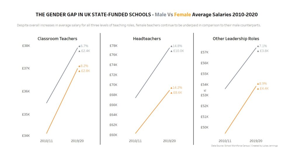
My approach:
- Since we have three different categories of teacher roles in this data set, I thought it’d make sense to have three separate graphs to allow for a more narrowed focus in the gendered pay difference between each teaching role rather than overloading one bar chart with too many variables.
- In addition, I utilised the data from back in 2010 to create a time series slope graph to see how the gender pay gap in UK school had developed over time between 2010 and 2020. I could have used a line graph to show the average pay for both males and females every year between 2010 and 2020, but for me personally, I am only interested in the 10-year change for this data set. The years in between would not necessarily add much insight for this data story.
- In terms of colour, I used just two colours: grey for male, and orange for female. I believe that using just two colours is far easier for the viewer to comprehend than using several colours for multiple categories. Instead of using a colour legend, I simply changed the font colour of ‘male’ and ‘female’ in the title.
- As well as using a simple two-coloured slope graph to compare male and female average mean pay, I opted to add some key performance indicators (KPIs) next to each slope. One KPI shows the percentage change since 2010, and the other shows change in pay since 2010. These two KPIs provide greater context into how each unique category has developed over time. Eg female headteachers have seen a 14.2% increase in average mean pay, which has risen by £8.6k since 2010.
Link to Viz on Tableau Public can be found here: