You might be thinking, “What’s the point of making a CV on Tableau? Companies only want CVs written in PDF format anyway”. But if you’re looking for a role in the data analytics sphere, what better way to show off your data visualisation skills than by firing off an interactive CV on Tableau! Not only will it make you stand out as a candidate, but you’re also providing the employer with a much more engaging experience compared to simply scanning through a bland document filled with text.
At this year’s Tableau Conference-ish, I watched a talk by Melody Cheung, an Academic Programs Coordinator at Tableau. She provided a step-by-step guide on how to build an interactive CV on Tableau and naturally, I was inspired to create my own.
As most data analysts will tell you, 80% of your time will be spent making sure that the data is prepared in the correct format so that it is ready to be interpreted and visualised in Tableau or any other data visualisation software. Thankfully, Melody provided a template exemplifying how an Excel sheet can be formatted to contain data from anyone’s CV so that is ready to be used in Tableau. A screenshot of said template can be seen below:

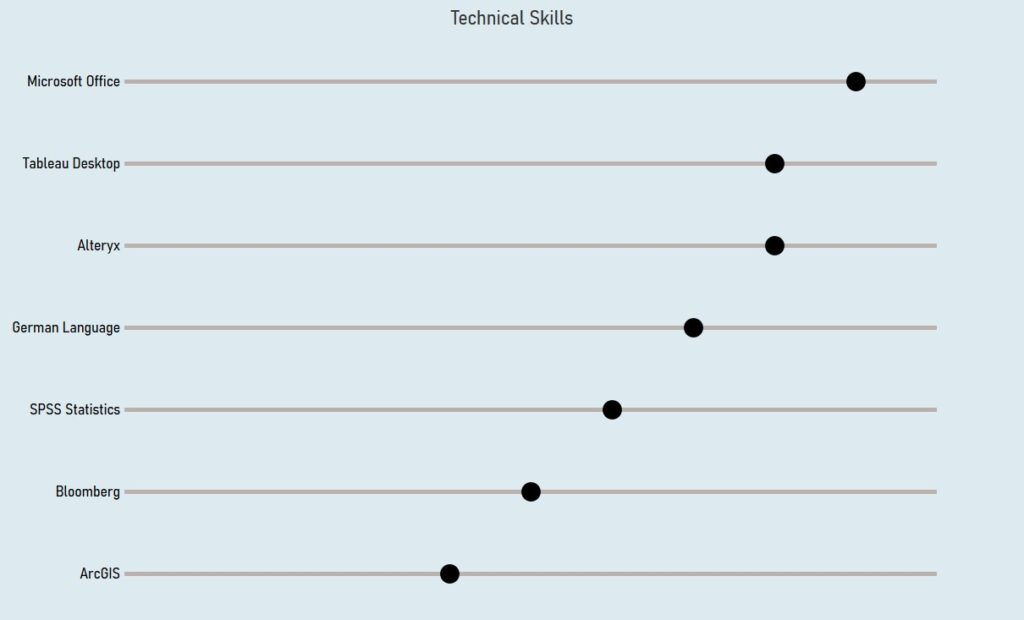
Now that the Excel sheet is complete, the real fun can begin! I started by charting my technical skills from my CV. To do this, I created an abacus chart by first filtering ‘Category’ onto ‘Skill’ only, dragging ‘Activity’ to rows and a dual axis of sum(totals) and sum(level) on columns. The ‘totals’ column will create the maximum line length of up to rank 10, and the ‘level’ will form the circle that lies anywhere between 1-10, depending on the proficiency I possess in that skill. This chart can be seen below:

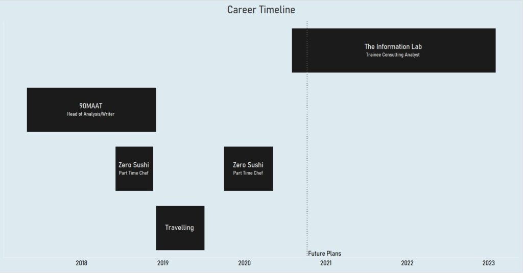
Next, I decided to make a career timeline of my previous and current roles using a Gantt chart. I dragged Month(Start Date) to columns and ‘Activity’ to columns, whilst again filtering the ‘Category to show only ‘work experience’ and ‘travelling’. But in order to get each Gantt to show the correct duration of each work experience, I created a simple calculated field:
DATEDIFF(‘day’, (Start Date), (End Date))
This will provide me with duration of days that were undertaken at each role, and by dragging this calculated field onto size, each Gantt will now accurately depict how long I worked at each company. Additionally, I added the ‘description’ dimension to the tooltip, thus providing the viewer with greater insight into what I did at each role. The Gannt chart should now look something like this:

To add my awards/certifications to my interactive CV, I simply selected a shape graph, dragged ‘Activity’ onto shape and yet again filtered the category to ‘certificate’. I then edited the shapes to have custom images of the two certifications I had achieved, increased the size of the images and added mark labels on each award.
For this particular example of CV, the three worksheets, which I have talked about above are actually all that is needed. The rest of the process now is simply adding various text boxes with information about yourself where you see fit, as well as adding various images with target URLs to certain social media platforms or emails. Here is the finalised version of my CV dashboard:

In terms of the actual content on Tableau, this really isn’t that difficult. The challenge here is in creating an input data file, which is structured in such a manner that it can provide the maximum output in Tableau. Once this process has been complete, it is very much plain sailing!
If you’re interested in applying to the Data School, click here!
