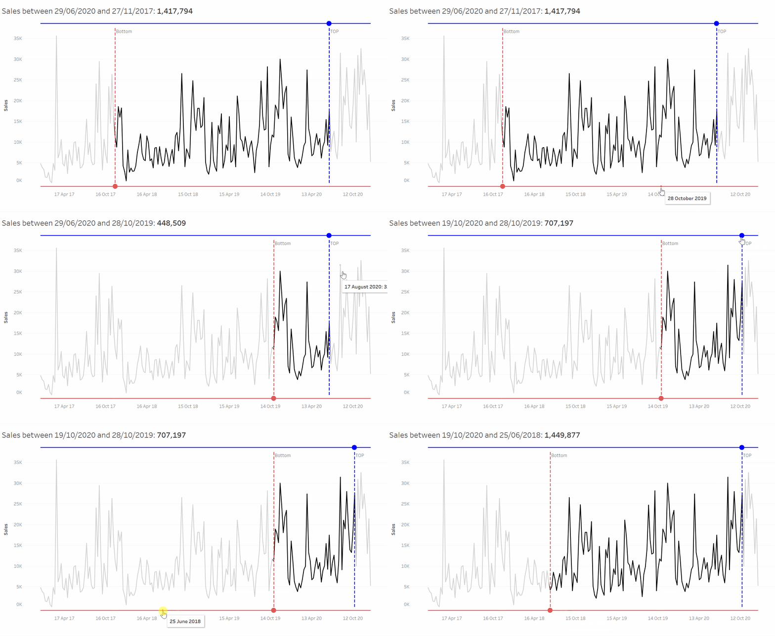
This week at the Data School, Head Coach Andy taught us a plethora of new Tableau skills and chart types, but something that really stood out for me was a dynamically shifting date slider. This graph essentially uses a top and bottom date parameter to dynamically return the value of a measure that resides between the two shifting parameters. Not only is this graph really cool to use but it is also incredibly practical within a business context. So, let’s find out how it was done using everyone’s favourite data set: Sample Superstore…

Firstly, we’ll drag ‘Order Date’ to Columns and set it to continuous weeks, whilst adding sum(Sales) to rows. This will give us a sample line chart. We will then create two parameters, one called ‘Bottom Date Parameter’ and one called ‘Top Date Parameter’. Both of these parameters will be Date values and have allowable values set to ‘All’.
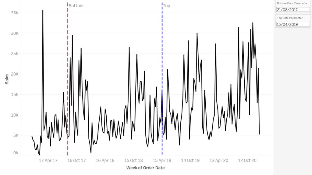
Once we have created both these date parameters, we can create two reference lines, which are both placed on ‘Week’ on the Table level. Set one of the reference lines values to ‘Bottom Date Parameter’ and the other one to ‘Top Date Parameter’. You can format these however you wish, but for the purpose of this example, I made them both thick, dotted lines with the top date parameter blue and the bottom date parameter red. I also labelled them as ‘Top’ and ‘Bottom’ to avoid any confusion. Your line chart should look something like this:
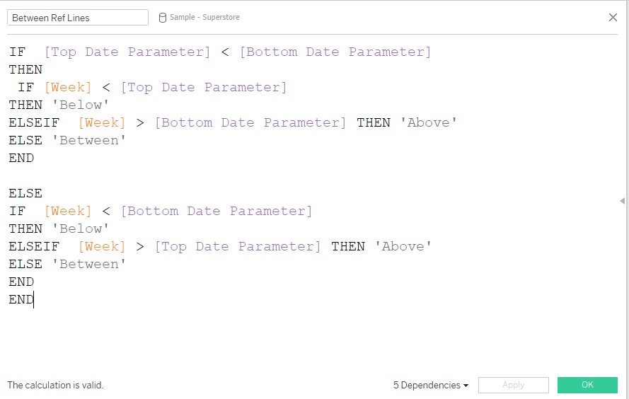
We will then add the following calculated field and drag it onto colours:
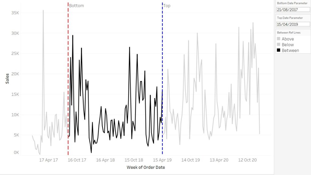
By setting ‘Above’ and ‘Below’ to the same light grey colour, and giving ‘Between’ a much darker colour, we can create the effect of highlighting the values between the two parameter reference lines. The final step of this sheet is to create a ‘Dummy’ calculated field with any quoted text inside and drag it onto detail. This help with the sliding functionality for the dashboard. Now your line chart should look like this:
Next, we need to create the sliders on two separate sheets. First, we will create the Upper Line sheet by creating a dual, synchronized axis of ‘Week’ and ‘Top Date Parameter’ on columns, alongside a dummy field of AVG(0) in rows. Make the ‘Week’ mark a line chart and the ‘Top Date Parameter’ mark a circle chart. Again, add the same dummy calculated field with any text from the previous sheet onto detail on the ‘All marks’ card. Untick ‘show header’ on all the pills in the columns shelf but format the header of AVG(0) to a white font. Change the colour on the ‘All marks’ card to match the ‘Top Date Parameter’ reference line in the previous sheet.
To create a dynamic title for this chart, I first needed to use the following LOD to return the value of sum(Sales) between the two date parameters:

Now I can type out a title which looks like this:
Sales between <Parameters.Top Date Parameter> and <Parameters.Bottom Date Parameter>: <SUM(Value Between)>
The Upper Line sheet should now look like this:
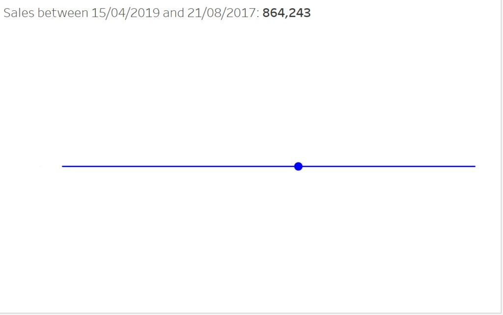
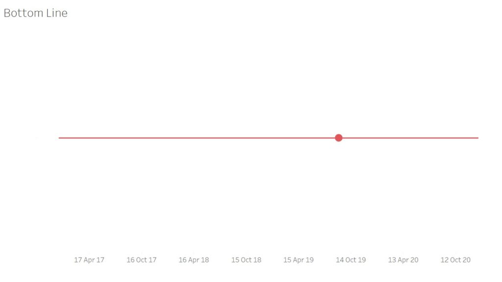
For the Bottom Line sheet, simply duplicate the Upper Line sheet, replace ‘Top Date Parameter’ with ‘Bottom Date Parameter’ in the columns section. Then remove the title but tick ‘show header’ on the ‘Week’ pill. Next, change the colour on the ‘All marks’ card to match the ‘Bottom Date Parameter’ reference line in the initial line chart sheet. Your Bottom Line sheet should now look something like this:
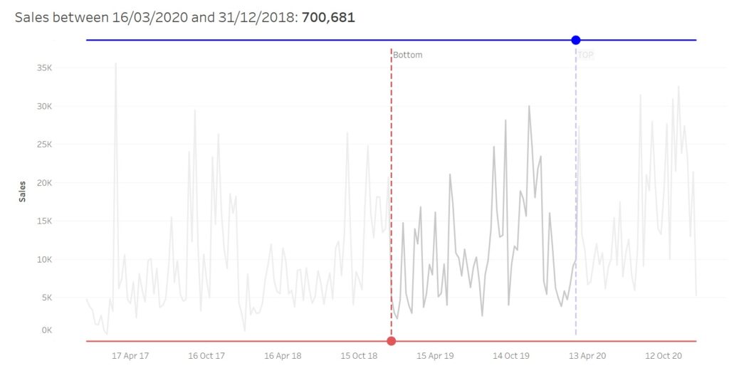
Now that we have created our three worksheets, we can start designing our dashboard. Firstly, add a vertical container to the dashboard and add the Upper Line sheet to the top, the main line chart in the middle and the Bottom Line sheet at the bottom. Format the sizes of the sheet until it resembles a dashboard that looks something like this:
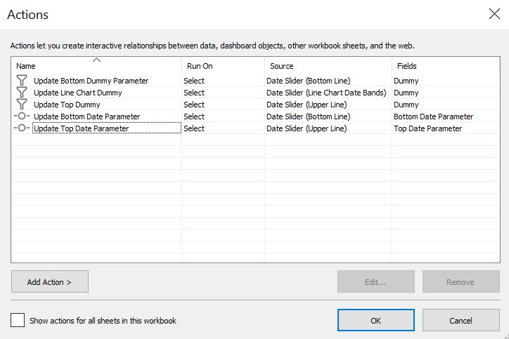
Finally, we need to make the dashboard actions, which is the most crucial part of the functionality of the date sliders. Remember that ‘Dummy’ field that was placed into the detail shelf of each of the three sheets? We need to use that to create a filter action for each sheet, with the source sheet the same as the target sheet. Each of these filter actions needs to run on ‘Select’, with the source field as ‘Dummy’ and the target field as any other field of your choosing. This allows the parameters to smoothly shift left and right after clicking anywhere along the slider.
We also need to add two change parameter actions. One using the source sheet of Bottom Line Chart, which targets the ‘Bottom Date Parameter’ using the ‘Week’ field, and the other using the source sheet of Upper Line Chart, which targets the ‘Top Date Parameter’ again, using the ‘Week’ field. Here is an overview of how the dashboard actions should look:
All that is left is minor formatting changes to ensure all the sliders and charts line up with each other. Once this is complete, you will have a fully functioning top and bottom date slider!
