


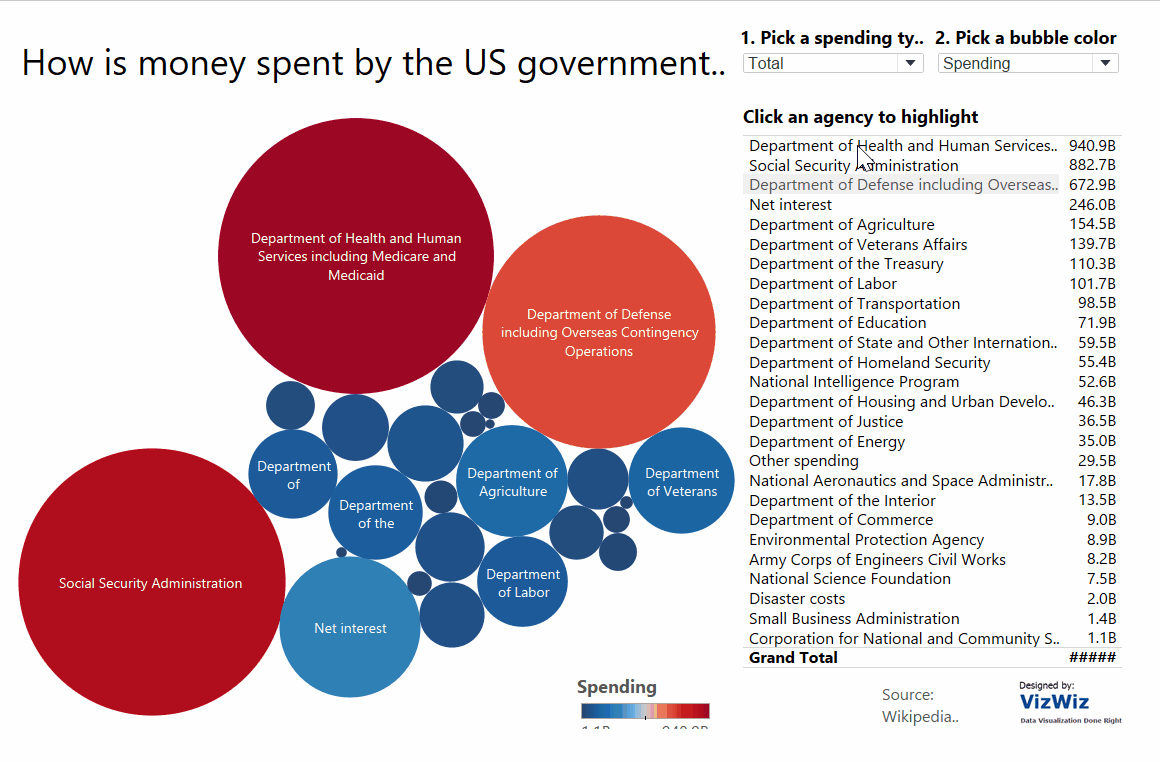
For this blog post, I will be dissecting and suggesting improvements for an old viz created by Head Coach Andy, as well as attempting to create an alternative Viz based on the fundamental principles of data visualization that we have been taught thus far. This Viz highlights the US government’s spending across different federal agencies from the 2013 budget. The link for Andy’s original Viz can be found here. So, here goes…
What works well?
Title: The use of a question for this title clearly shows the audience what to expect from this data visualization. We instantly know that this viz will be about spending patterns of the US government and that the data is from the 2013 federal budget.
Potential improvement: The question title could be made more specific to the individual agencies rather than a vague overview of government spending. EG “Which government agencies spent the most in the 2013 federal budget?”. This provides context as the audience will then know the viz is highlighting comparisons between the individual agencies.
Interactivity (Parameter): The first parameter regarding type of spending is a strong feature. It allows the user to switch between the type of spending from government agencies, which not only gives the viz more dimension but also provides scope for comparisons (context).
Potential Improvement: Remove the second parameter. This has no impact on the data story telling shows far too many colours on different bubbles. This also renders the spending measure legend obsolete.
Interactivity (Highlighter Function): With a data set that shows multiple dimensions like this one (government agencies), a highlighter function can be most useful to the user. It provides them with the ability to narrow their focus onto an agency of their interest.
Potential Improvement: Instead of using a long list of all the agencies, the highlighter function could be made into a simple drop-down menu. The long list not only takes up a lot of space on the viz but it also detracts the user’s attention away from the main graph.
Tooltips: In this instance, the tooltips are very informative and contain all the relevant information from this data set. Particularly as many of the labels on the bubble charts aren’t actually visible, the need for a tooltip to provide the user with the full agency name and spending cost is essential.
Potential Improvements: With better labelling (perhaps with a different chart type), a tooltip wouldn’t be necessary.
What doesn’t work well?
Chart type: With a bubble chart, it is incredibly difficult to compare the values across the different government agencies. With the large contrasts in the size of the bubbles, some labels are unable to fit inside their bubbles and therefore it is impossible to tell which of the smaller bubbles belongs to which government agency without hovering over it using the tooltip.
Potential Improvement: An alternative chart type would be a bar chart, which is sorted in descending order to allow for far easier comparisons of spending across different agencies.
Colour: When changing the parameter for spending type, the colour gradients seem to switch from blue-red diverging to grey-red diverging. This can be confusing for the user, particularly when they are both showing the same measure legend (spending).
Potential Improvement: Stick to the same colour gradient or use colour differently to show more context. EG top 5 or 10 agencies in a separate colour.
Context: The data here is all well and good but it is not overly insightful. We should always ask ourselves ‘So what?’ or ‘Compared to what?’. Currently, we are just seeing an overview of government spending, nothing more.
Potential Improvement: A comparison with agency spending from a previous or future federal budget would allow for far greater analysis and insight. Alternatively, a top 5 or 10 agencies for spending using a set and parameter would again provide more context and a greater scope for comparisons to be made. This would also drive home a key message as the audience would be able to see how the government prioritises their agency spending.
Alternative Viz
Having evaluated this viz, suggesting what works well and what perhaps doesn’t work so well, I have created an alternative on Tableau, which attempt to align with the key principles of data visualisation:
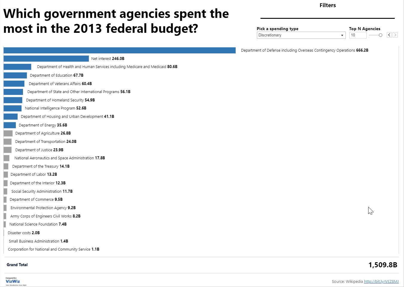
This alternative Viz can be found on Tableau Public here.