


For our first day of dashboard week, we learnt a significant amount about accessibility. We covered a plethora of different potential needs and how they can be accommodated. One quote in the presentation I felt surmised the session well is:
“Participation doesn’t require a particular design. But a particular design can prohibit participation.”
Kat Holmes
Prev Principal Designer of Inclusive Design at Microsoft
Our brief for our dashboard was to create something using covid data that prescribes to universal design. This requires principles that essentially make the dashboard as accessible to as many people as possible.
This required a different approach to our usual dashboard building, as in every aspect of design we needed to ensure no one was excluded from participating. Our idea was to make a simple dashboard that could be viewed and ingested by a wide variety of people.
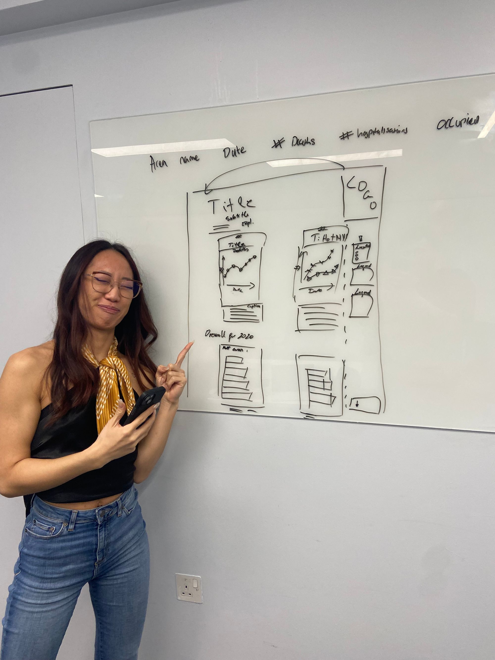
In the planning stage we really focused on ensuring that anything we incorporated into our design wasn’t prohibitive for as many potential users as possible. Our initial plan can be seen here along with my dashboarding partner:
The main features we tried to incorporate into our dashboard were as follows:
- Using High contrast colours: this will make the dashboard as clear as possible.
- Colour blindness; using colour blind friendly colour palette.
- Not using filters/parameters: making the dashboard as clear and concise as we can.
- Adding captions to the graphs: for those who use voice narration or find it easier to read descriptions.
- Large font sizes (>=12)
- Consistency of colours/sizes.
- Be able to use the voice narrator on all values: Limiting the number of sheets helps users who use the voice narrator read all the information as easily as possible. We spent a lot of time writing really detailed captions to enable anyone with visual impairments to fully understand what is happening in our charts
- Clear axis labels
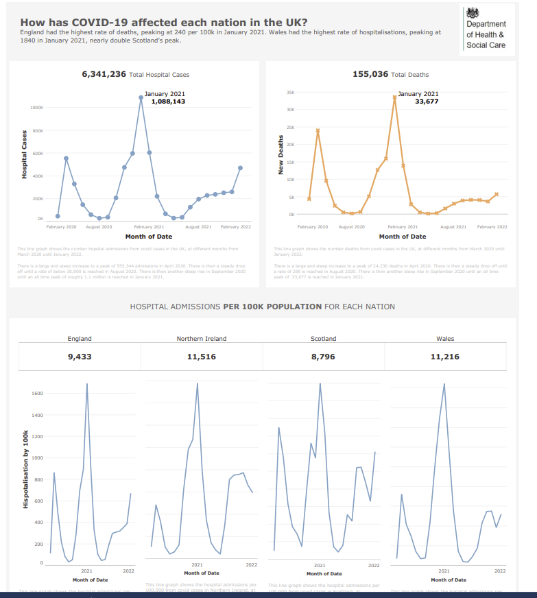
You can see the completed section of our dashboard below:
I really enjoyed this challenge despite some difficulties as it required a very different approach and different considerations to the norm.
One major issue we faced was the laptop blue screening 5 minutes before we were supposed to present, losing all of our formatting and captions. In the end, we only had half of our dashboard finished as a result of this issue.
A strong lesson here was to REGULARLY SAVE YOUR WORK!!!!!!!!
What went well:
Clear labels and titles
Consistent colours
Detailed captions
Things to improve:
Captions were a light gray which were not contrasted enough so could have been clearer
Some KPIs were not rounded which drew attention where it didn't need to be drawn
This was a really valuable session and exercise as it required a shift in perspective to consider the difficulties many others face on a regular basis, something I will bare in mind creating dashboards going forward.