Today’s task was extracting Traffic Data for areas of the UK and chucking it throw a ye olde analysis in Tableau 8 (by Friday we’re hoping to be on pasta shapes, glitter and crayon). I had the region of Yorkshire and the Humber, and decided to do an analysis of the % change in traffic volumes over the life of the dataset (since 2000), with a subsection on cycling.
Data Preparation

Full Alteryx Workflow to process the traffic data,
Although politely requested to do a macro, DS10 took the consultative expert decision to do a wildcard import of the data after realising it was just two lists of files. This is potentially done in a macro but it is quite a long one, and we only have a day to get everything done! The first two import tools extract and union all information from two file sets, one on traffic data and one on average flow data, for roads in each local authority in the Yorkshire and Humber region. The middle section uses a find and replace tool to map in the road category types, before extracting the type of area (rural or urban) from a regex parse and then converting Eastings and Northings into latitude and longitude. Finally, I converted the year field to a date as Tableau 8 is not as robust at switching between data types as later versions.
Tableau Visualisation
As mentioned above this is in Tableau v8, stepping backwards from v9 yesterday and 2018.* which DS10 have trained on. Working with v9 yesterday was mildly frustrating but it feels that the jump was more severe to version 8, as amongst other things;
- Groups can’t be used as variables in their own right.
- Calculations cannot be edited in the pill/shelf.
- There’s no analytics pane, though the functionality is hidden.
- You can’t drag pills from rows or columns into calculations.
- You can’t drag calculated fields into the data pane to create new variables.
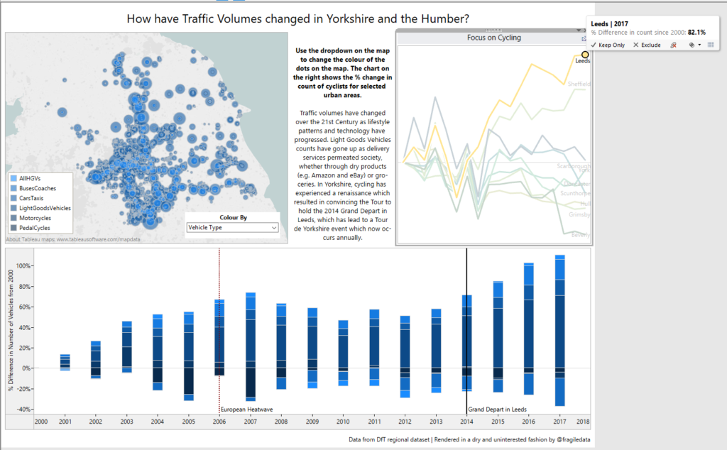
Therefore, the data analysis and visualisation often felt like working with oven gloves, as none of us felt particularly able to reach into the data and find insight very easily. Relying on the year that I lived in Leeds, I remembered that Yorkshire was very into cycling, and from there provided me with the idea to create graphs showing % change over time to see if the Tour de France Grand Depart really did have an effect on cycling in the region, which fits into the upper corner of my graph. The other was more related to skill, in that I had not used a parameter in my chart yesterday despite teaching DS11 that last week, so I created a parameter that would change the data on the map, and on the % change bar chart in the bottom panel.

The finished dashboard with the % change in bikes in Leeds called out via tooltip.
There was some debate between the stacked bar chart to show variation over time – I’m not sure if its the best way to show things, but it’s more robust that a line chart considering the way the parameter is having to switch between disparate categories, particularly when some have been visually amalgamated by colour (since I can’t use a group!).
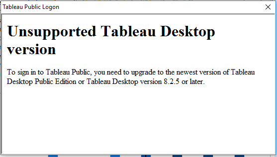
Lastly, the nail in the coffin for Tableau v8 is one that Tableau put in themselves – 8.0, the version I used, is no longer compatible with Tableau Public!

oooo dear.
