What is a Momentum Chart?
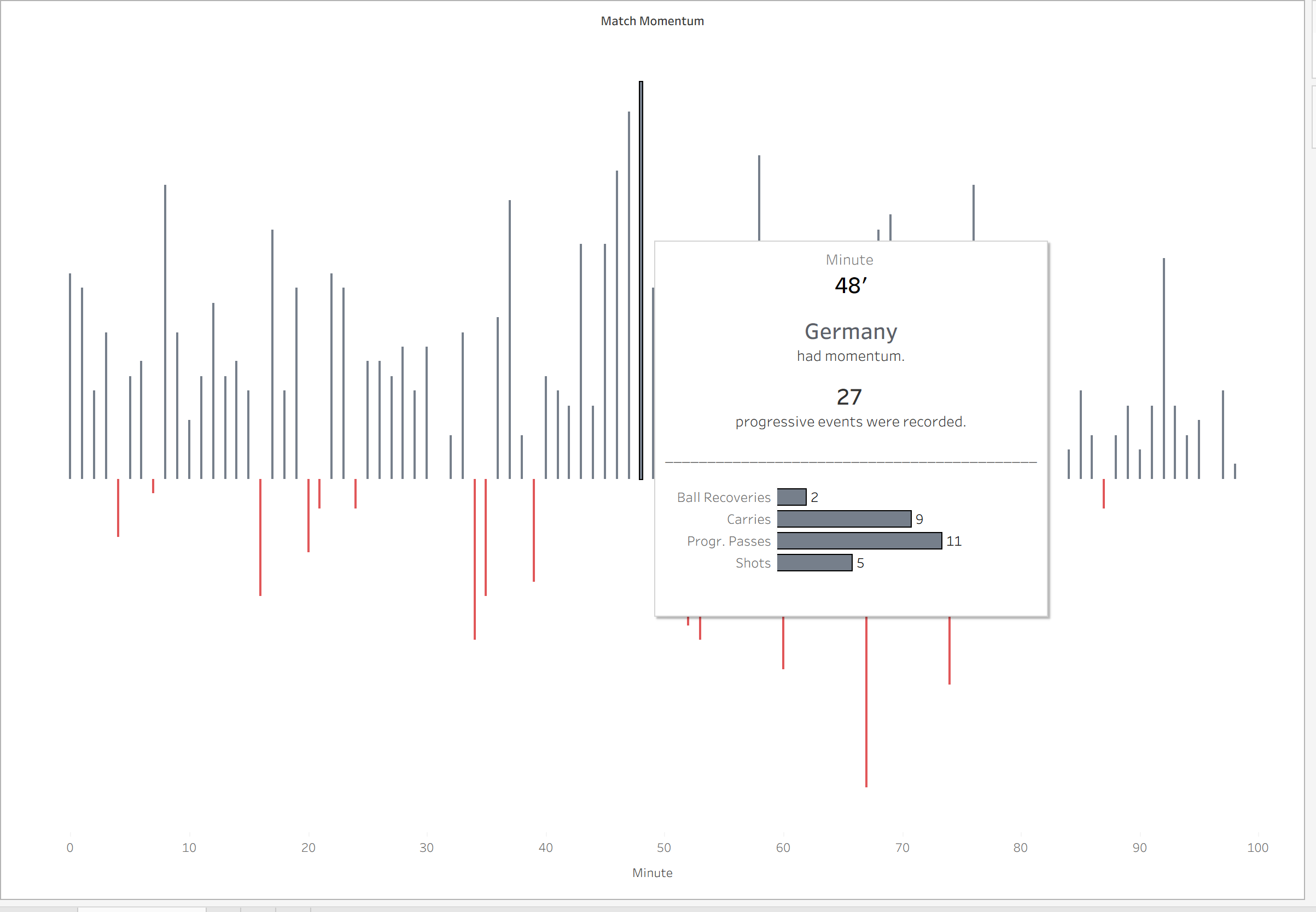
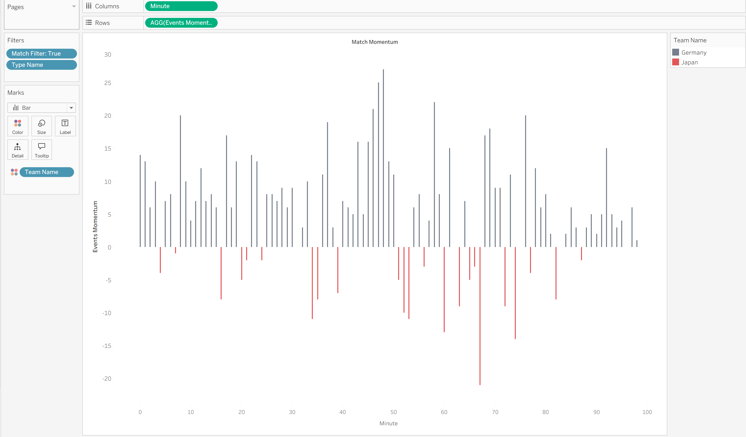
A momentum chart is a visual typically used in sports (primarily football) to display which team is controlling the game by either providing the most attacking pressure or the most progressive actions.
A "progressive action" in football is an action taken by the player that progresses the team towards the opposition's goal, which could ultimately lead to scoring. Examples of this include progressive passes, progressive carries, shots, dribbles, 1v1s etc.
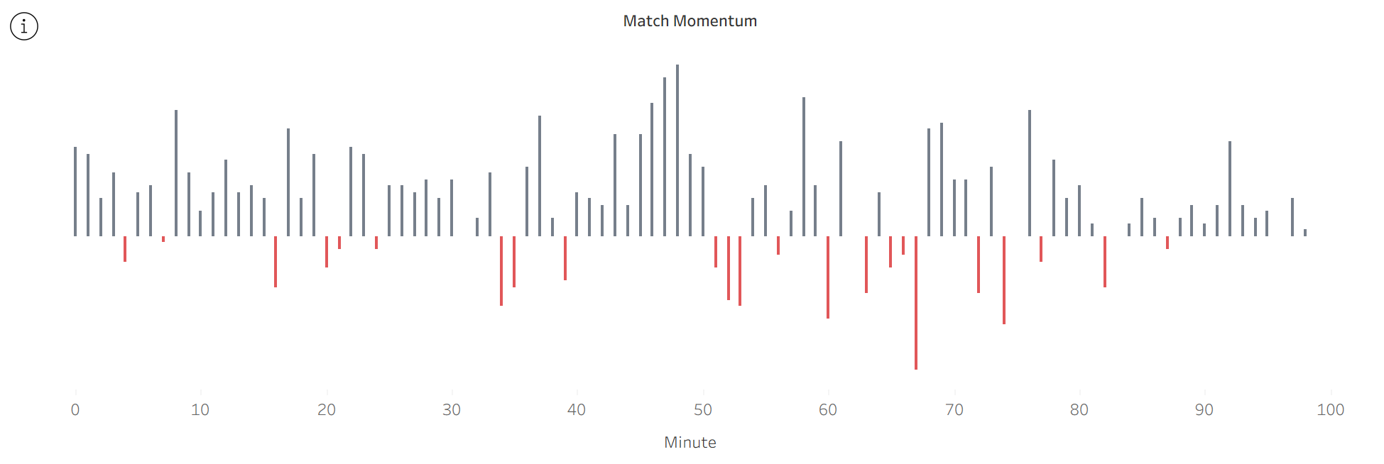
The chart is plotted along a linear axis (in football it's easy to break the game down per minute) with each team on either side of the "zero" line. Team 1's total progressive events pointing up and Team 2's total progressive events pointing down. Only 1 team should appear per minute as this shows who had momentum at this specific point in time.
The Data
Ideally you need your data to be aggregated so that one row in your table is the number of events per minute per team. You can also make the data more granular by including event types, more matches etc.
The data I used for the chart above looks like this:
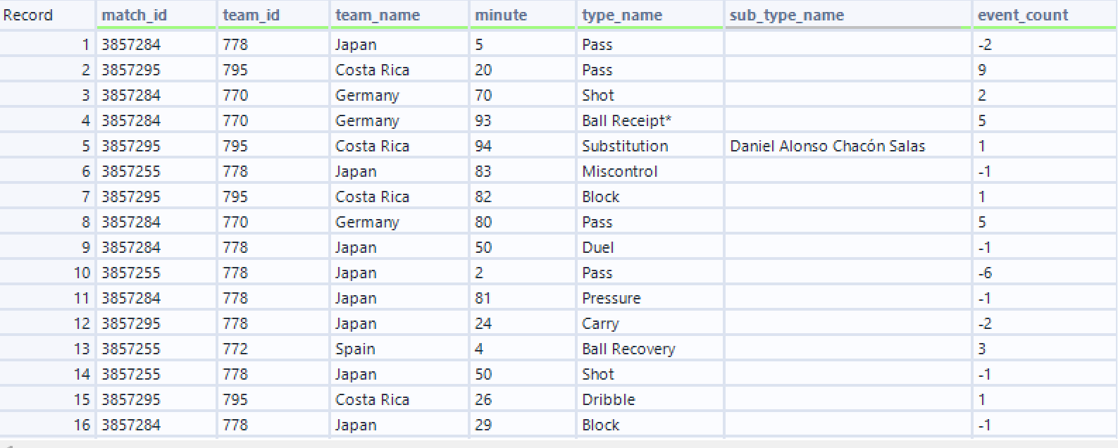
You'll notice that some of the "event counts" are negative - if you don't have this in your data already don't worry as I will run through how to change it in Tableau. Negative values are necessary to plot the converging bars.
Plotting the Chart
The "Time Scale"
The chart is plotted by using a linear field on the X-axis (columns). In our case we are not using a date but a "minute" field as we want to track which team carried out more progressive actions per minute.
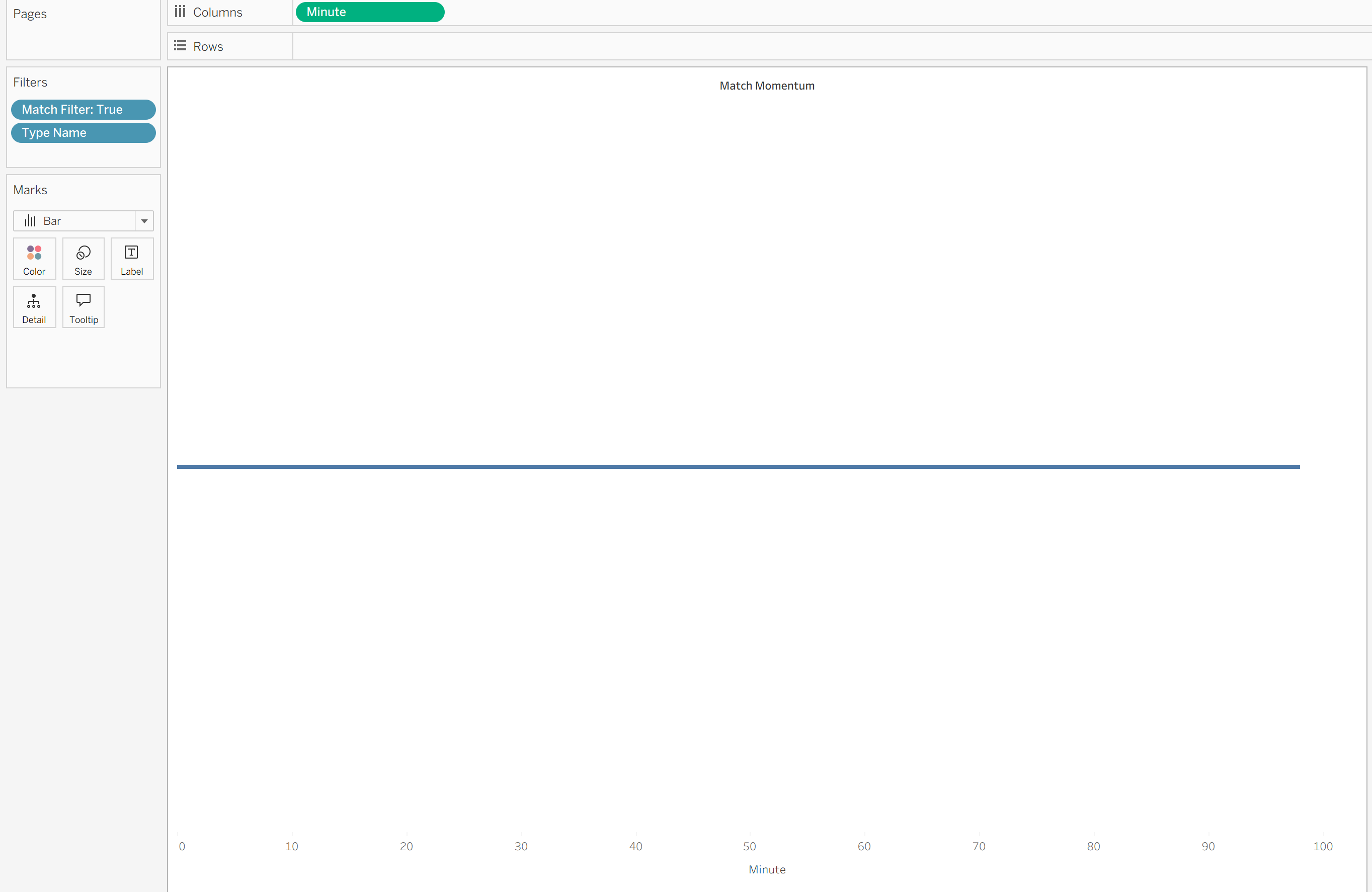
The minute field can be either discrete or continuous but it's important that it is a dimension and not a measure, as we want to plot each minute individually. Although our "minute" field is a number, we don't want to aggregate it in any way as it is not a metric but a time scale.
Events
We want our bars to be sized based on the number of progressive events that occurred during that minute. However, we only want the team with more progressive events in that minute to show (as they were the ones who had momentum at that time). Based on the nature of the chart we also need one team's values to be positive and one team's values to be negative - so that we can get this converging look.
Firstly, choose which team you want to show as converging down and which team converging up - it doesn't matter which way round you do it.

In my case I've chosen Japan to be converging down and so I've turned Japan's event counts negative. The other team (which is Germany or any other team in your dataset) will have positive numbers.
Next I need to find out the total event count per minute for each team.

Because I also have different matches in my dataset I need to include "Match ID" in the fixed calculation as well. If you only have data for one match then you would only be fixing on "Minute" and "Team Name".
Now we find out the maximum value of events for each minute (as we only want one team to show per minute)
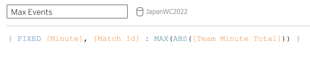
Notice how "Team Minute Total" is wrapped in an ABS() function - this turns our negative values into absolute numbers (positive numbers) otherwise Japan will never be the team with the "max" value.
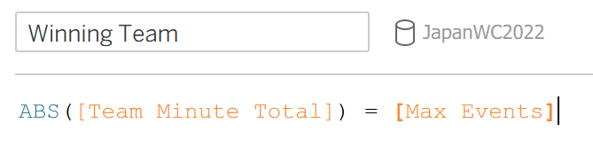
Now we find out which team had the most events per minute.
And finally we find the number of events for our "winning team".
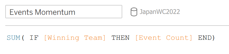
"Events Momentum" is the field we drag onto our Y-Axis (rows).
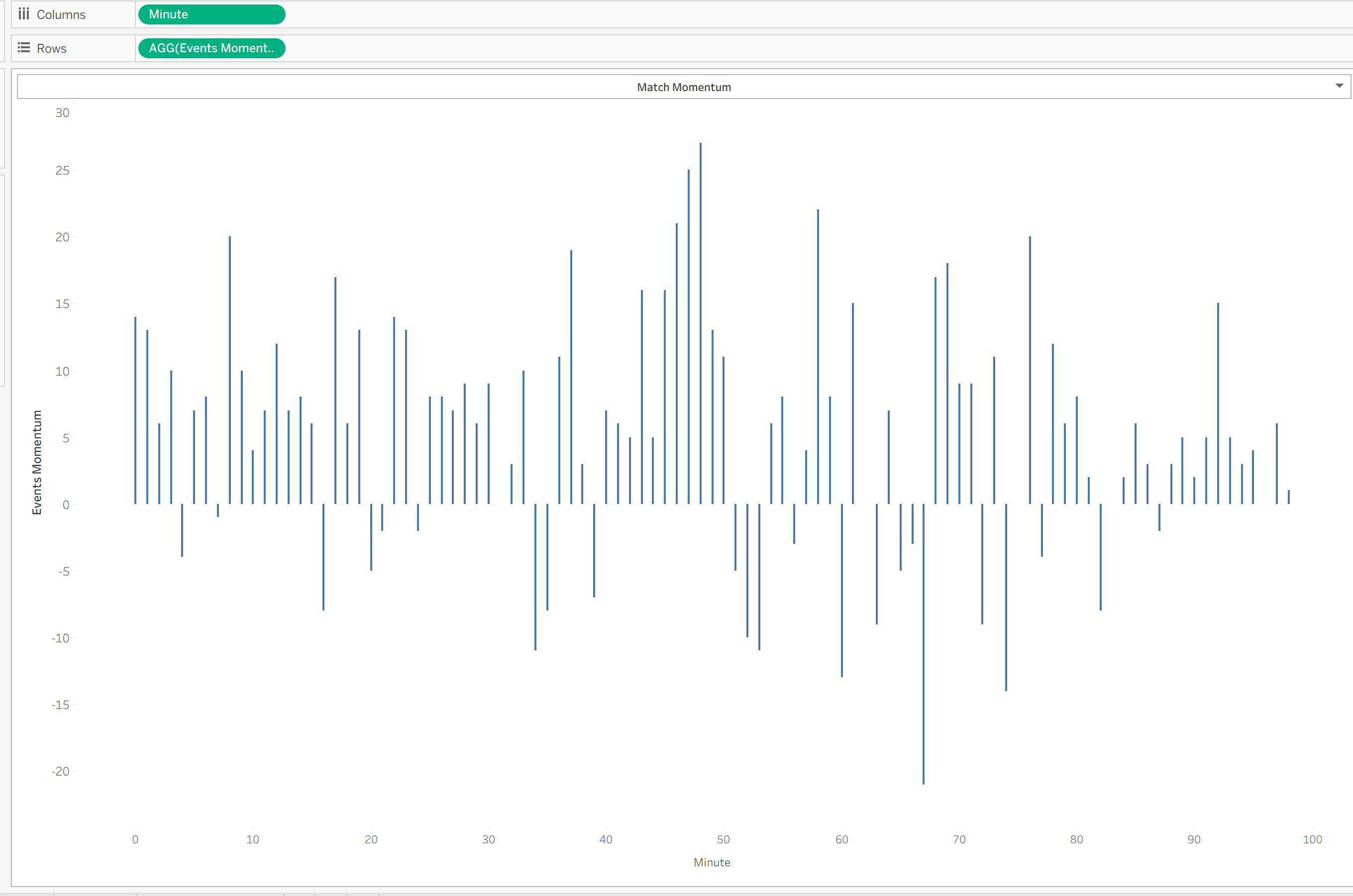
You can then drag "Team Name" onto the colours mark so that the bars are coloured differently.
Extra Functionality
As my dataset includes more than one of Japan's matches I've set up a parameter so that I can see momentum from each of their games.
All you need is a classic parameter T/F on filters:
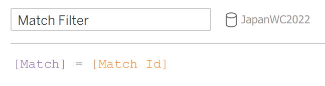
And because we set up our previous calculations to SUM our events based on Match ID, this will work.
I've also added in tooltips so that for each minute you can see a breakdown of the progressive events that gave the team momentum.